
100 COMICS
I bought a box of 100 random indie comics and this is a review of all of them

It’s April, 2024, and a vacancy has opened up at my local comic store. It’s the first time I’ve seen a job posting from the store in the three years I’ve lived here. These days I go in every couple of weeks; I have a subscription for the Energon Universe comics. Transformers has always been my window into comics, honestly.
Anyway, so every week, I go in, and while they’re getting my issue out of the filing cabinet, I’m like, “Hey, if you don’t mind me asking, have you been through the job applications yet?” And the guy is like: well, to be totally honest, no, the manager just needs to put in a shift to do it. But you can definitely expect to hear back!!!
In May, on Free Comic Book Day, I go in to get a Free Comic. But I’ve also got an Uno Reverse card in my back pocket. I give the guy a home-printed copy of a Pokémon comic I made. And he’s like: this is sick.
By the end of May, the situation at my own job at the local video game store has gotten so bad that I’ve just decided to quit next month, even though I have absolutely nothing lined up. I just can’t do it any more.
And after a few weeks of going in and asking about it, in June, I find out I haven’t got the job, because I go in and I see there’s someone new behind the counter and another cashier is showing her how to put through the transaction. And I don’t mention it. It’s fine. I’m normal. At a certain point I just kind of know how the story goes. But also, I hate her, and I hate them, and I hate comics.
Anyway, so a couple of days after that, I see a post online about how the store is selling off “mystery boxes” of comics. I can get 100 random Marvel and DC issues for £20. Or! I can get 100 random indie issues for £10.
No refunds.
And, like, I’m already taking the summer off to sell a bunch of my old crap from when I was a kid on eBay. Why not add some more crap to that?
Listen. I knew I didn’t want 100 comics. I in fact knew that I wouldn’t even want 1 comic in the mystery box of 100 comics.
What I did want, however, was 100 comics for £10.
Under ordinary circumstances, £10 does not even buy you three comics, which retail for £3.50 each. If we’re talking about back issues, £10 often buys you ten comics, because many stores sell back issues for £1 each: fill yer boots. Actually, twenty comics for £10 is just as doable—many stores do 50p each for back issues. That’s usually about as good as it gets though. If you’re really, really lucky, once or twice in your life, you might have the rare opportunity to get 100 comics for free. People give them away on Facebook sometimes, right?
What you don’t get—and I mean really, I’ve never seen it before—is 100 comics for £10.
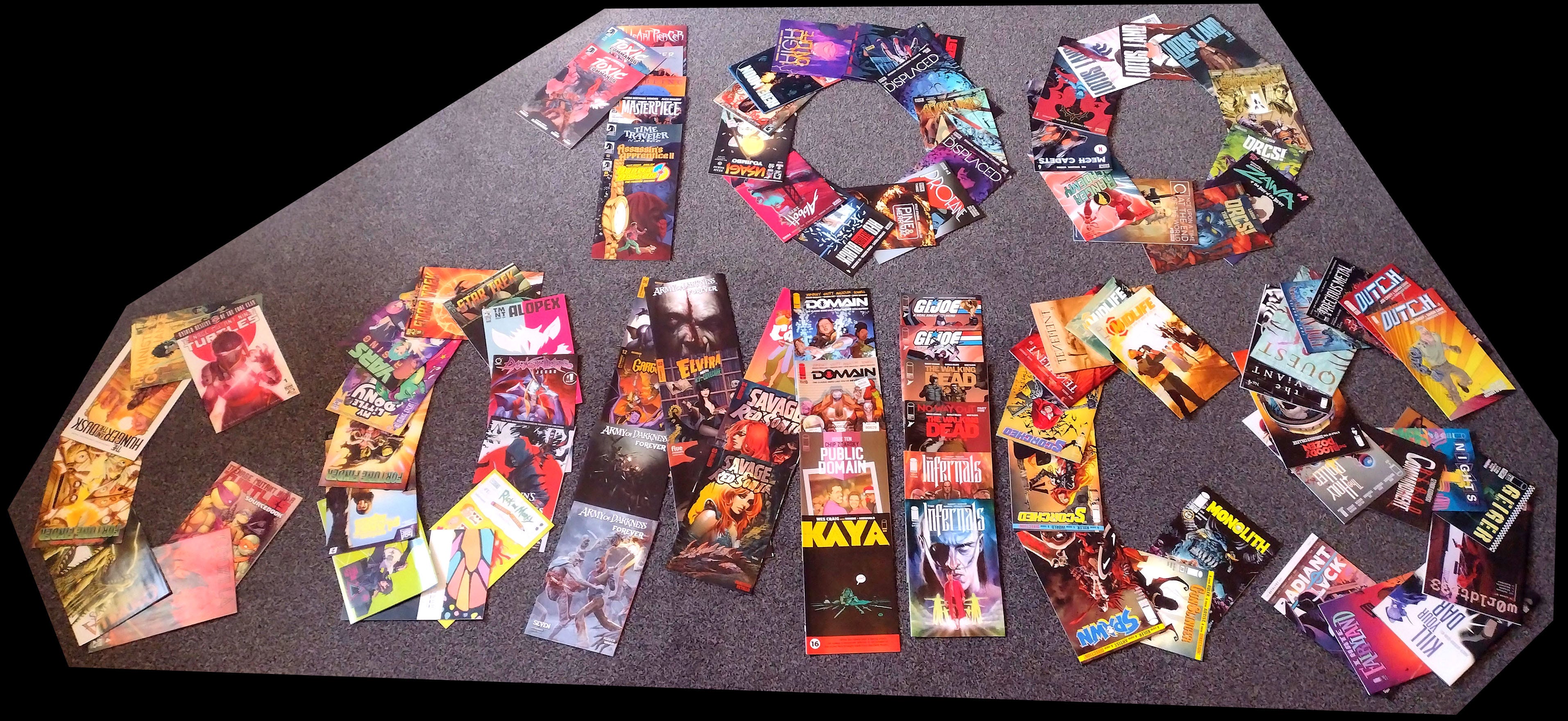
So anyway, I buy this big cardboard box of comics. It’s a DIAMOND shipping box. They’re the big comics distributors. I also get the latest issue of Void Rivals while I’m at it. I sit down outside the shop and open the box. The comics are arranged in two stacks, with a few oversized comics on top going across both piles. I rifle through them, then add the Void Rivals to the top of one stack, close the box again, and lug it all the way back to my work like a dung beetle. It’s too big to fit in my rucksack.
Eventually I get this thing home, and it’s just as I suspected. It’s just a bunch of random comics. Obviously.
96% of them come from 2024. 33% of them are from February, 32% of them are from March, 9% of them are from April; no other month accounts for more than 5%. What I’ve inadvertently ended up with is a bizarre cross-section of what all the non-Big-Two publishers were putting out in the space of about two months. Except not quite that, because these are specifically the comics that didn’t sell, the ones that the subscribers never bothered coming in to pick up, the ones that stayed on the shelves for a month, then another, then another after that.
I’ve got 100 comics like that to read. Well, it’s not like I have a job, or anything.
(Content warning: 100 COMICS consists of reviews for 100 random comics, with individual content varying immensely. A list of specific reviews which discuss potentially triggering topics is given in this footnote.1)
Dark Horse Comics
As far as the non-Big-Two publishers go, Dark Horse is definitely notable on paper but I’d be damned if I could tell you a single relevant publication of theirs. They had the Star Wars license for a long time in the early 2000s and pumped out a lot of comics that Star Wars fans got very mad at Disney for decanonising when Disney did that. I don’t know, man. Isn’t it enough to just enjoy a story without needing a rubber-stamp reifying it as True Events that Really Happened in a made-up universe…?
12% of my 100 comics came from Dark Horse.
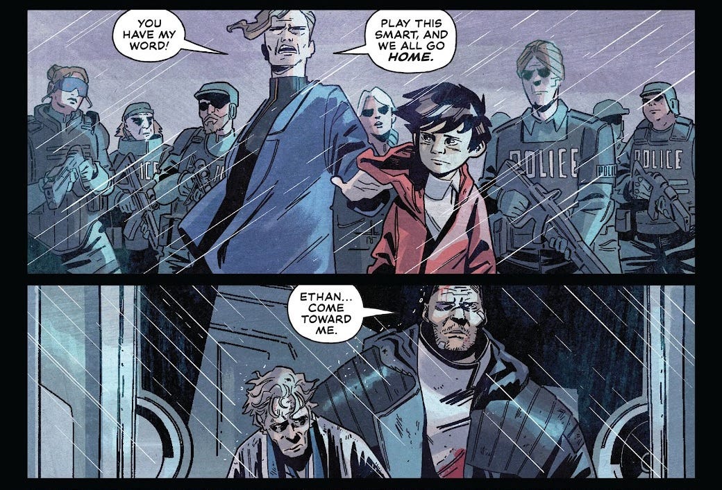
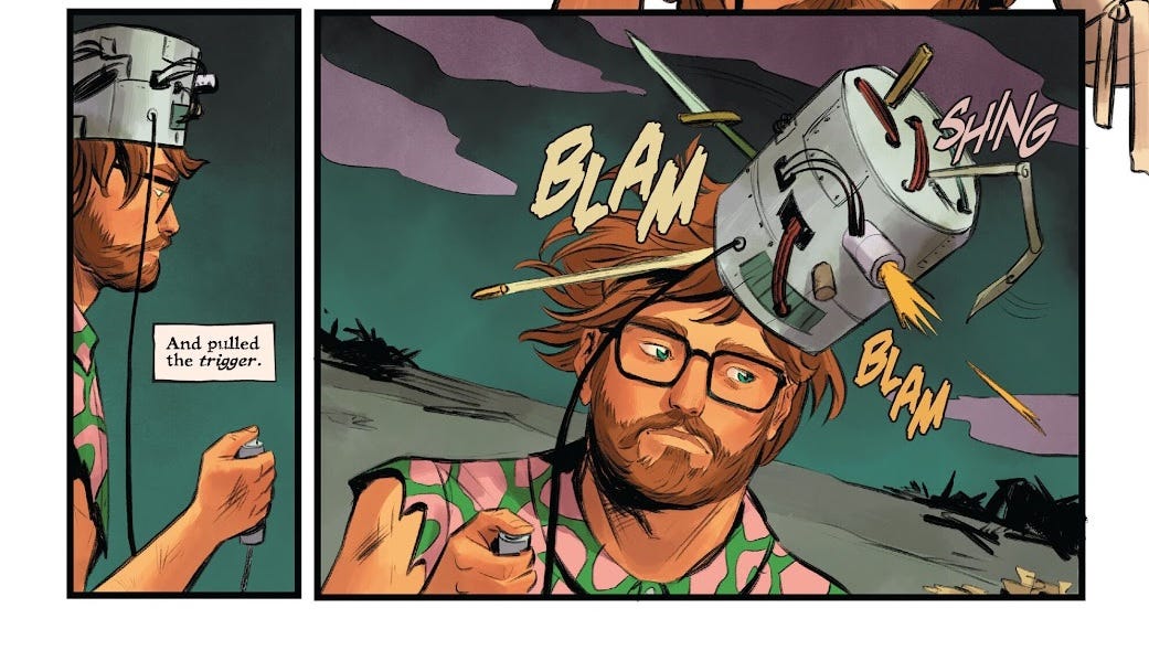
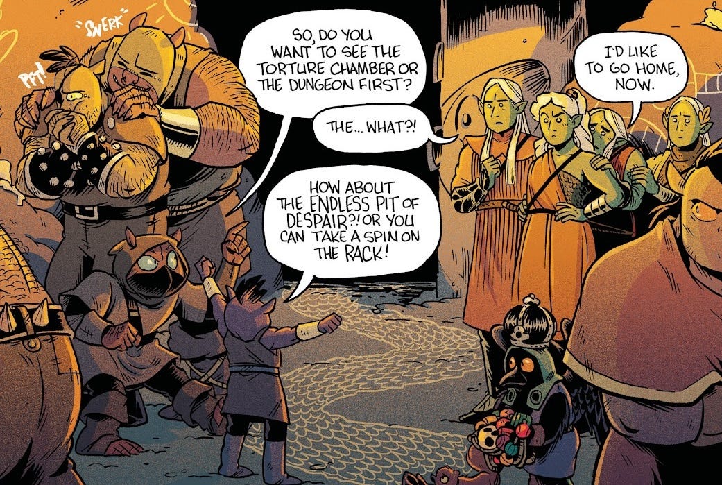
If You Find This, I’m Already Dead #2 (of 3)
YES!!! AHAHAHA! We did it. Even if every single other comic in this box ends up being good for cat litter, we’ve found at least one that’s actually alright. Let’s hold on to that.
This issue has no introduction, and needs none. The title itself leads directly into the narration boxes that carry us through the story. It’s a log. We’re following a human character stranded in an alien world (again, the multiverse—it’s in vogue). Vibes-wise, the whole thing is giving Chants of Sennaar, but a bit more bloody.
Dan McDaid’s art in this one is definitely a little crude, wobbly, but it’s got ideas, and Bill Crabtree has given the whole thing a pleasing muted palette. Weirdly, the whole magazine is presented in oversized format with thick paperstock and a card cover; I suppose this is the “Flux House” imprint it’s branded with? I always wonder what decides this. In this case, the idea seems to be to present it as a “pulp magazine” of some sort.
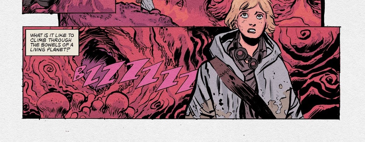
This is an issue of two halves. The first is a visceral nightmare about our protagonist being thrown into the bowels of a “living planet”, which tries (and fails) to digest her. The scant prose in the narration boxes is neither redundant with the gory artwork, nor disjointed: they’re a perfect complement for one another, with the panel layouts and sentence rhythm working in concert to create flow.
The back half gets a little weaker, on a narrative level: the protagonist winds up in an alien prison, and there’s some ham-handed commentary on structures of power and abuse. Still, at least it’s trying to say something. Letterer Jim Campbell gets to crack out the ol’ alien cipher fonts, so that’s fun; his work overall is very slick, blending seamlessly into the art. In the end the inmates escape by throwing themselves at the electric fences, until enough of them are dead that they can literally climb over the bodies. Cool.
In seriousness, if this turns out to be the best book in the box, I’ll be a little peeved.
John Carpenter’s Toxic Commando: Rise of Sludge God #1-2 (of 3)
By my reckoning, 35% of my 100 comics are licensed books. 7% of them are video-game tie-ins. And 2% of them are Toxic Commando stories! I initially got confused and thought it was some kind of The Toxic Avenger reboot. Turns out a completely different guy made those. Apparently John Carpenter’s Toxic Commando is a zombie-shooter video game that John Carpenter has put his name on. Most of the action in this book consists of army men pointing machine guns at zombies with BUDDA-BUDDA-BUDDA sound effects written next to them.
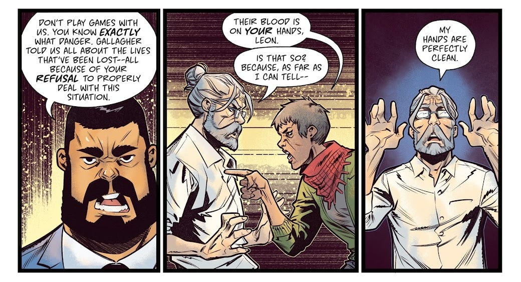
This is another entry in the rich canon of anti-CEO stories. You know them. Every other Marvel film is one. You’ve got a rich white guy who swears a lot and says things like, “I don’t care what’s happening!”, “Get these bleeding hearts off my property!”, “I’m making the future here!” and so forth. He undergoes a series of humiliations and ends up taking orders from our no-nonsense hero who’s reluctantly trying to save his dumb ass. Writer Michael Moreci has literally given this guy the surname “Dorsey” and the first name “Leon”, which sure is an anagram for something. There’s a line where he’s like “I’m digging to the centre of the Earth!” and his PA replies, “Well um technically you’re not the one digging, your workers are.” I’m sorry, what living PA would ever say something like that? In issue #2, there’s a big scene where his board members arrive and vote-of-no-confidence him, because they’re aghast at what he’s doing. Here’s a mental model of the world where everything bad that happens is because of a few individual, powerful, stupid men, and everyone surrounding them hates them and is desperately trying to stop them. I’m sure this model has tons of explanative power.
Who is this for? It’s impotent. It’s the burning of an effigy.
Alberto Jiménez Alburquerque’s art is very comic-book-y on the whole, quite stylised with thick inked outlines. To be honest, I think it’s largely being carried by the good use of textured shading from colourist Jason Wordie, who brings some very appealing tones. He’s made the choice to hypersaturate his use of red in contrast to everything else on the page, to make the bloodier elements stand out.
On letters, we have Nate Piekos! Nate is responsible for Blambot, a fantastic website and font repository that taught me literally everything I know about comic book lettering. Cool to see his work in the wild. Unsurprisingly, the lettering is pretty much perfect—the sound effects are repetitive, but that’s the script’s fault.
Dudley Datson and the Forever Machine #1 (of 3)
This boy-and-his-dog story is definitely pitched at a younger audiences, and smacks of “they would really like to make a film of this”. The basic premise is that all the great inventors of history were actually part of a secret society, and our protagonist, Dudley Datson, becomes the latest member. He has a talking dog.
Scott Snyder is clearly a competent writer who can string a sentence together and come up with a few bright ideas. I like the details about Dudley’s best friend starting a job at a waterpark. I like the literalisation of the stereotypical “suddenly naked while on stage” nightmare as Dudley’s smart-fabric invention accidentally turns transparent while he’s wearing it.
Overall, though, I don’t know. To me there’s a self-consciousness that soaks through into every line of dialogue, and every concept that crops up. This is a story that knows it’s a story. It’s pulling from a rich canon of stories that we’ve all heard a thousand times. Perhaps the best way to put it is… this story thinks it’s more offbeat than it actually is? By my count, 7% of my 100 comics have some kind of “secret history” angle to them. This one is nothing special.
Jamal Igle’s art here strikes me as workmanlike to begin with, but really not helping matters are the atrocious colours from Chris Sotomayor. I’m sorry to James Brown for sending strays his way, but these are what I consider “James Brown colouring The Transformers” colours. Gradients applied to every single surface and yet not the slightest bit of depth to the frame. Hues chosen seemingly at random with no intent of creating a cohesive or appealing tone. Desaturated and muddy shades, no distinctive light or shadow. Furthermore, Tom Napolitano’s sound effects smack of a stock library—like, they’re not, I think they are mostly bespoke, but they’re often visibly copy-pasted for repetition and don’t blend with the art. Scott Snyder’s a reasonably big name so I’m surprised to see him working on a book that looks as bad as this one.
Not hateful, but definitely a bit of a dud(ley datson and the forever machine).
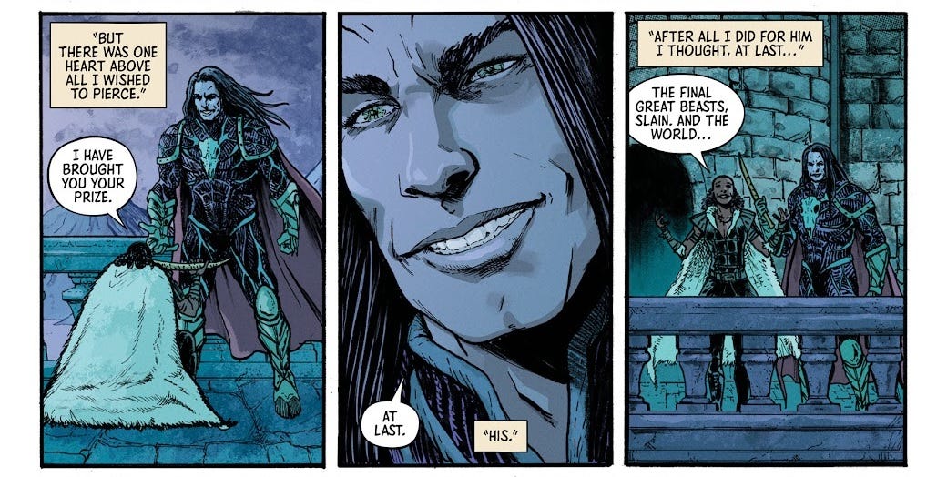
Heartpiercer #1 (of 4)
A brave warrior slays the last unicorn! And unwittingly brings about the end times. It turns out that her lord, who sent her on this quest, tricked her and is actually evil. Now she’s got to get revenge on him.
There’s a certain style of fantasy where you can tell that someone is putting on a voice. You know what I mean, right? Like when your friend Jacob is playing D&D, and he’s pretending to be a knight, and he’s like, “Listen… fair lady… my- companions, and I… will find your tiara, and restore your honour! I swear on my life.” And it’s like, cool, we’re playing a game here, it’s just make-believe, we’re all having fun. We’re just riffing. We’re improvising. None of us are any good at it, so it’s okay.
But sometimes you’ll see a story—a finished, plotted, planned, scripted, edited piece of media—that whiffs of this. It’s not that the writer has a mistaken impression of what people talked like in the past, what their lives for that. Rather, it’s that they have no impression whatsoever. It’s fantasy as a fancy-dress costume on Halloween. It’s fantasy with plumbing. Probably you would just call it, “bad fantasy”.
Gavin Smith’s art here is a little hinky, with some really pronounced linework that sometimes gives the impression of characters as cutouts superimposed into the frame. Colourist Nicholas Burgdorf brings a monotone approach to each page—here’s a red one, here’s a green one—that doesn’t leave much of an impression. But there is one splash page of our hero sinking into the sea that works out quite beautifully. Honestly, overall, I don’t mind it. Justin Birch does fine work on the letters, with some good exclamations popping out of speech bubbles; there is a noticeable difference, however, between Birch’s digital sound effects and those drawn by Smith straight into the art.
The immense popularity and cultural cachet of Dungeons & Dragons means there’s definitely a market for books like this, but there’s also a lot of fierce competition, and I can’t imagine this story leaving an impression on anyone.
The Witcher: Corvo Bianco #1 (of 5)
I’ve got a friend who’s big into The Witcher, and I’ve seen him play bits of it, but CD Projekt Red’s games have honestly never appealed to me. I gather that they have a reputation as the story-liking gamer’s games. I guess if I was the sort of person who’d enjoy a nondescript series of fantasy novels of presumably conventionally fine quality, I would just be… reading a series of fantasy novels, instead of playing a game based on them?
In this series, player character Geralt has retired to his vineyard to pursue his romance with romanceable-NPC Yennefer, only for a dispute over the land to bring foes to his door. I really like the first page, where we see Geralt’s forearms drenched in blood-red liquid, only for it to turn out that he’s crushing grapes. A page-turn gimmick like this is the sort of thing comics does better than any other medium.
Artist Corrado Mastantuono is billed as a legend of the Italian comics scene, and from this first impression I think that’s fair, he’s got lovely detail and a nice sense of perspective, together with some very atmospheric inks. The colourist, Matteo Vattani, has also done fantastic work here, with an excellent grasp of tone. The highlights are built up so gradually that I almost mistook them for gradients—but there are also some wonderful soft gradients for shading and light sources, especially with the sky. Sublime.
I want to draw attention to the letterer on this issue, though: Hassan Otsmane-Elhaou, whose YouTube channel Strip Panel Naked was what really turned me onto the idea of comics as a “serious” medium with its own visual language in the first place. Otsmane-Elhaou actually appears to be very prolific as a letterer: he lettered fully 10% of my 100 comics, across seven different series from various different publishers, which is more than any other letterer in this sample. It’s no mystery why he’d be in demand, as his command of the craft is impeccable: in this issue, he uses scratchy speech bubbles that blend seamlessly into the artwork, lowercase text to distinguish spoken asides, and viscerally-pointy sound effects. At one point a monster’s head bounces off the floor, and it’s seen to speak, “WUH—!”, which Otsmane-Elhaou has put upside-down to match the head. At a crowded market, the floating speech bubbles of the anonymous vendors are sized varyingly, half cut-off by the panel gutters. This kind of thing is rocket fuel.
Into the Unbeing: Part One #3 (of 4)
A group of climate scientists get swallowed by a giant, and navigate its internal landscape.
Until now, I’ve been leading with my issue #1s. That’s how I’m approaching this: publisher by publisher, moving numerically through all the series (technically, I’m also going to be frontloading series where I have two or more issues to work with). Here, I’m really appreciating that jumping in with #3 has left me missing something.
The main problem is that I cannot tell the characters apart. They’re all wearing the same uniform, and artist Hayden Sherman has usually rendered them tiny in the frame, as the focus is really on the dehumanising scale of this massive being (uh, Unbeing) they’re trapped inside. They’re having arguments about how best to proceed, it’s all very The Terror, but I can’t put names to faces, I can’t really decide whose side I’m on. Not to fault the comic. This is what I get for buying 100 comics instead of the 4 comics that comprise this series.
In terms of the premise and visuals, Zac Thompson’s story is superficially very similar to the film Annihilation (I have complicated thoughts on that movie, which this aside is too narrow to contain). In fact, it’s very similar to the sequence we saw in If You Find This, I’m Already Dead #2, right down to the narration being framed as a posthumously-discovered journal. The prose passes my basic standards for quality and originality.
Also like If You Find This, we’ve got Jim Campbell on letters. He’s chosen an unusually small font size here, I can only presume to match the miniscule figures on the page. One page consists entirely of someone’s dying words carved into a wall of the creature, and I do think it’s slightly let down by the fact that this message has been lettered with a digital font, instead of handwritten. It’s a curious thing where this comic runs 24 pages, including this one, so it’s definitely pushing at the pagecount (a standard comic is 22 pages in length, often reduced to 20), and I’m not sure how the budget/workload breaks down in cases like this; it would obviously have been much more labour-intensive to hand-write this page, so presumably the option wasn’t on the table.
What sets this comic apart is its occasionally-experimental panel layout. Nearly every single one of Sherman’s pages uses a unique and considered composition, with highlights including a spread laid out like a pair of lungs, and a spread that makes you turn the book sideways, to follow the characters’ descent across the full span of both pages. Sherman’s colours are vibrant and fundamentally biological—again, very Annihilation. The darkness of the Unbeing’s digestive system is all-consuming, but gets punctuated by a stylistic break for a hyper-saturated flashback. S’cool.
I’d gladly read this whole series—though the “Part One” in the title leaves me trepidatious. I like a miniseries which is planned as a one-and-done. How long are we planning on dragging this one out?
Masterpiece #3 (of 6)
Brian Michael Bendis is a huge name in comics, responsible for the highly-influential hit reboot Ultimate Spider-Man in the early 2000s. By the time I heard of him, the online consensus seemed to be that he was an overrated hack, or at the very least washed-out. I did not get very far into Ultimate Spider-Man.
Here we’ve got our second entry in our anti-CEO canon. Our protagonist, Masterpiece, finds out that her parents were infamous master criminals, who stole a bunch of money from this rich guy. Now he’s taking revenge by blackmailing her into pulling off a heist on his corporate enemy. As of issue #3, fully halfway through, we’re still at our “gathering the crew” stage.
I genuinely struggled to tell if this book is a superhero book or not. There’s an exchange where one guy tells another that he’s “got a superpower”, which to me implies not. But then everyone has snappy superhero codenames, and the newest member of the crew is a whizz hacker who makes some extraordinary claims, and… it feels to me like maybe, even when Bendis isn’t writing for Marvel or DC, he writes like he’s writing a superhero book.
It’s obvious what caught people’s attention about Bendis’ writing: his dialogue has a very distinct style. Faux-naturalistic, I guess. Talky. And you know what, it is refreshing. I just don’t get the impression there’s a good story underpinning it.
At a glance, I assumed that Alex Maleev’s artwork was heavily employing photo reference; many of the backgrounds in particular struck me as photographs with heavy filters applied. The characters’ faces are incredibly lifelike. Looking at more of his work online, I don’t know, maybe he’s just so good that everything he draws wraps back around to looking like it may as well be traced. I like how distinct the characters’ proportions are, how consistently they’re drawn throughout the issue. Ian Herring’s colours are fairly muted on the whole, but do manage to give the book its own visual identity. On letters, Joshua Reed’s work is sort of alright, but I definitely noticed some issues with his tails for connecting speech balloons. I put a particularly egregious example above. Why is the tail leading to the middle balloon? Why are the connecting tails curling the opposite way, and are they tapering so that a thin end leads into a thick end? My gaze is being drawn all over the place. It’s a freakin’ stick shift, and brother, I’m stalling.
Time Traveler Tales #4 (of 5)
There was a certain lo-fi production quality to the cover of this comic that drew my attention. Maybe it was the centre-justified credits shunted over to the left hand side. Maybe it was the oddly undersized title, or the cover art that looked less like a finished cover and more like the cover sketch you submit to propose a possible layout for a cover. Take off the “Dark Horse Comics” logo and this is the kind of thing you see in the small press section of your LCS.
But when I looked at the indicia, my eyes bulged out of my skull like a cartoon wolf. “Inspired by the hit web series from Karl Jacobs, ‘Tales from the SMP’!” This is— this is one of those Minecraft things, isn’t it!? This is that Dream SMP thing. I know what that is. Karl Jacobs is that guy from the MrBeast videos. To quote the famous MrBeast onboarding document, he’s one of MrBeast’s “special boys”.
I guess this is what comics writers do these days? Just kind of launder their work through celebrities?
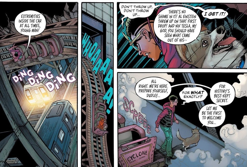
Anyway, check your excitement: this isn’t a Minecraft comic, sorry. It’s merely “inspired by” Karl’s storytime anthology series. We’re coming in with the penultimate issue here, and it’s clear that this is an origin story for the series’ villain, some sort of evil time god. The story is that this guy’s grandfather repaired watches, until one day he suddenly died. The kid wants more than anything to save him, and when he finds a box labelled “GRANDPA’S SPECIAL CLOCKS”, he finds grandpa’s special clock that lets him travel back in time. Now, the watch won’t let him change history—but it’s not the only watch, and if he gathers all of them, then he can change things. To put this in Minecraft terms for you, he needs to get admin powers. So he goes through history killing other time travellers until he’s got most (all?) of the watches.
I’ll be honest! I was actually quite charmed with this one! The joke pictured above made me laugh. There’s a real sophomoric sincerity to the whole thing. I liked the bit where the villain tries and fails to make a connection with a guy on a night out. I liked the image of the skeletal time spirits talking him into his temporal killing spree. Considering the series has an actual writer on the script, Dave Scheidt, who mostly seems to write Captain Underpants-like comics for children, if anything I’m surprised that it’s retained such an unpolished vibe. It’s real thinly-written stuff. I straightup do not think he made the best of what Karl gave him. And you know what? I would have thought less of this comic if he had.
Artists Kelly and Nichole Matthews are apparently twins! That’s so cute! I get the impression that Kelly typically illustrates, while Nichole colours…? Anyway, their style is exactly like the kind of thing I’ve seen coming out of the Dream SMP fandom. Soft boys and whathaveyou. Pitch-perfect for this story. The highlight of the artwork is the textures used for the special clocks’ powers, with a lovely print registration misalignment effect blurring into ink-black skeletal apparitions. Letterer Joamette Gil also gets plenty to do, filling out background easter eggs on storefronts, and breaking out the usual tricks for text messages, phone calls, ethereal rasps, echoing words, and exclamations. All told, the visual identity is surprisingly strong, but with just enough of a lo-fi edge to make it interesting.
Assassin’s Apprentice II #5 (of 6)
This is the second of three six-issue miniseries adapting a ‘90s fantasy novel by Robin Hobb (which I gather is a gender-concealing pen name for Margaret Astrid Lindholm Ogden). Considering this is past the story’s halfway point, I’m left oddly in the dark as to how it’s taken so long to get here; it feels like first-act material.
Our protagonist is young boy being trained in The Skill (which seems to be telepathy). Alongside other kids who don’t do anything in the story, he undergoes brutal training at the hands of an older boy who espouses John Harvey Kellogg-esque abstinence and whips him regularly. The two eventually clash using The Skill, but our protagonist loses, rendered imbecilic by the mental shock, albeit alive. Presumably he will go on to become an assassin—or at least the apprentice of one…?
To be frank, it’s obvious that nothing is gained through this adaptation. The panels are absolutely clogged with narration boxes that I can only assume are quoted near-verbatim from the book. As this section of the book does not seem especially concerned with the thoughts and actions of any of the other children, they mostly just stand around in the background, nondescript and anonymous. Nearly all of this issue’s dialogue consists of the cruel teacher being creatively cruel. And look, it’s not bad, per se, it’s just that this is not a good showing for comics as a medium. I should much rather be reading a book.
That said, for what it is, Ryan Kelly’s artwork is pleasingly expressive—though Jordie Bellaire’s colours are a little monochrome for my tastes. Hassan’s on letters again for this one, with beautiful torn-parchment narration boxes and some ethereal effects. Assuming that there is an existing following for this particular book, then from a fandom perspective, the appeal of something like this is just getting to see an artist’s interpretation of characters and moments that you otherwise were having to draw for yourself in your imagination. It’s hard to go wrong by coupling that with (presumably) verbatim narration and dialogue—I just don’t see it wooing first-time readers.
The Oddly Pedestrian Life of Christopher Chaos #7 (of 15)
James Tynion IV is a name I’ve been peripherally aware of, and uniquely, his name is on no less than 4% of my 100 comics, all different series, all being released more or less contemporaneously! This one perhaps explains how: the script is actually by Tate Brombal, with Tynion IV credited just for the “idea”.
The way the comics industry uses its talent—or more precisely, where it chooses to put its names—has always made me roll my eyes a little. The most popular artists will get put on covers for series they otherwise have no involvement with. Or perhaps they’ll launch a title, draw the first arc, then dip out to do something else, leaving some lesser-known jobber to follow their act for the rest of the run. (If you’re lucky, the same colourist will stay on, to at least give a fig-leaf of visual continuity.) Back in 2012, Marvel Comics did their “Marvel NOW!” line-wide revamp, where each series started over from issue #1 and all the creative teams got shuffled around. One of the most popular series at the time was Uncanny X-Force by Rick Remender; it came to a slightly premature conclusion, allowing Marvel to put Remender on new series Uncanny Avengers, while headline artist Jerome Opeña was put on a different The Avengers book with Jonathan Hickman. Meanwhile, Uncanny X-Force shambled on under an entirely new creative team, a shadow of its former self, alongside Cable & X-Force, a near-entirely unrelated series from another team. Suddenly Marvel had four books for the price of one!
The bottom line is that you need something on the cover that your average reader will recognise. My impression is that no-name people making indie comics often have the goal of catching the attention of editors for the Big Two, but that Big Two creators often return to indie comics hoping to catch the attention of film or TV producers outside the industry. Thus, high-profile indie series usually have at least one hotshot name on the cover.
Superficially, The Oddly Pedestrian Life of Christopher Chaos is in a similar arrangement to Time Traveler Tales—with the caveat that Tynion IV would have been capable of writing this book himself if he wanted to, while Karl Jacobs probably would not. It’s mutually beneficial to both parties: the celebrity gets to work on more projects simultaneously, while the up-and-comer gets to trade on the celebrity’s existing reputation with their fans to get a much bigger readership than they would otherwise. The trade-off, of course, is like co-authoring a paper: if your name comes second, nobody cares about you. Unless it turns out bad, in which case, congratulations, you’re a scapegoat.
Luckily there are no such worries in this case! The basic premise of Christopher Chaos is superficially very similar to Dudley Datson and the Forever Machine, right down to the title format with its Peter-Parker-esque name. Both are stories about a young, bright, eccentric modern-day inventor stumbling into a secret history of scientists, with pulp fantasy elements involved.
In terms of execution, they’re worlds apart. Christopher Chaos has a suffocating, anxious tone, with prose far closer to literary in style, and overtly queer themes. The random issue I have is obviously not super representative; it’s “The Perfectly Monstrous Life of Adam Frankenstein”, the first half of a story dealing with the origins of Christopher Chaos’ mentor, a direct riff on Mary Shelley’s original Frankenstein. To be honest, it doesn’t really do anything for me, but it’s perfectly well put-together on a technical level.
Patricio Delpeche’s colours are distinctive and appealing, and are doing huge favours to Soo Lee’s crude, detail-light pages. Letterer Aditya Bidikar mostly gets an endless series of narration boxes to churn through, but has a bit of fun when lightning strikes the laboratory. What’s most striking about this series on a visual level, though, is actually that logo on the cover—having seen this book on shelves, it stands out from a mile away! Dylan Todd’s work there really goes to show just how much of an impact good graphic design can have on a comic’s success.
Usagi Yojimbo #274
At just one issue published monthly, relatively few comics ever make it into triple digits. This one has apparently been going for over 40 years! And you know what, it definitely reads like a comic that has been going for 40 years and does not see that changing any time soon.
The story I have is technically “Ice and Snow: Part 5 of 5”, the conclusion to a little arc, and even then, it’s basically a one-and-done. Our rabbit-samurai protagonists arrive in a village of starving cats, and are taken in by their hospitality. But it turns out a trio of bandit enemies of theirs have also been taken in by the village! The bandits promise that they’ve turned over a new leaf, but the samurai resolve to remain to watch over the village until the bandits have moved on, just in case. Just as well, because the bandits are actually planning on doubling back to raid the village! However, it turns out everyone in the village is an evil demon. By the time the samurai finish slaughtering the whole village, the bandits have already been killed by the villagers, and the samurai, oblivious to what the bandits’ plans were, are like “oh no, just as their redemption arc was beginning!” before moving on.
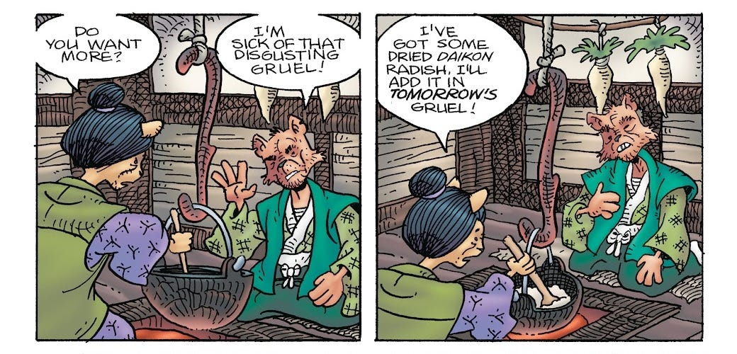
Like three pages at the start of this thing are devoted to these two random villagers complaining about gruel. The art is newspaper-comics-poor. Stan Sakai is a writer/artist auteur, which is unusual enough in traditional comics to be worthy of some respect, but it seems like a real jack-of-all-trades situation. I cannot imagine dipping into the back catalogue for this one.
Rebellion Publishing
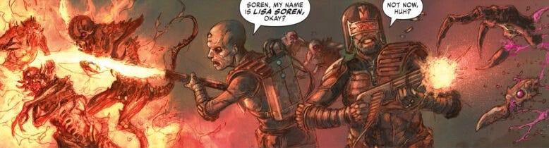
Wew! That’s one publisher down. Let’s have a little break with perhaps the iconic Bri’ish comic: Judge Dredd! Or rather, Judge Dredd’s parent title, 2000 AD, now owned by Rebellion Publishing. Of all the comics I got, this is the only one I’d be able to buy in a supermarket, or in WHSmith. If Joe F. Bloggs wants to read a comic, this is the one he gets with his cigarettes. It’s a proving grounds for up-and-coming UK writers and artists. Back in the day, big names like Alan Moore and Grant Morrison got their starts here.
1% of my 100 comics came from Rebellion Publishing.
I once had dreams of getting into the game industry, and here in the UK, Rebellion is one of those names that comes up when you search for game studios on job boards. But then you click on their website and it’s like, oh, here are 500 numbered instalments in a series about blowing up skulls. That’s what real video games are like. Those are the video games people want to play.
2000 AD Prog 2374
It’s much the same with 2000 AD, isn’t it? Here is a comic that is the same now as it was last week, as it was in the 1980s.
What’s surprising, for a magazine, is how little cruft it has in it. A scant one-page table of contents with a little editor’s note, cutely dressed up as a communique from “Tharg”, an evil green guy with a mohawk, alongside a set of blurbs for the stories herein. I skim them, steeling myself to jump into these stories in media res, but the plot points detailed seem to bear no resemblance to the contents of the comics. Like you could swap this page for the same page from next week, or from the week preceding, and not notice the difference.
And that’s it! No ads. Just five stories back-to-back, between five and seven pages in length, with a teaser for next week on the back cover. The main story is (in my experience) always standalone, so Joe Bloggs can feel like he’s at least getting a single complete unit of storytelling for his £3.60 even if he never buys another issue. The rest are serialised week-to-week; when one serial ends, a new one slots right in to take its place. In this way the magazine holds its momentum, following its own internal dream logic as it moves from anecdote to anecdote.
In my experience, when you look at well-regarded Bri’ish comics—the series looked at most fondly by grown men, lauded for their complex, gritty and original stories—there inevitably comes a point where you realise you’re reading the Beano except the characters say “arse” instead of “bum”. I mean it. This is not a serious critique of 2000 AD and its ‘80s contemporaries, but it is a serious observation. Maybe it’s fine. What I’m describing is a sense of humour, of social satire, of thumbing-your-nose at The Man. In this particular Prog there’s a panel spoofing Minecraft. They’ve called it Meinkraft. Y’know, like, Mein Kampf. That’s sort of like a joke, right?
The main strip is about a green alien travel blogger who winds up in Mega-City One, the dystopian setting of Judge Dredd. The alien escapes a run-in with some muggers, only to wind up getting arrested by Judge Dredd over a technicality. Writer Ken Niemand gets a few good gags in—the alien’s ship signals their “peaceful intent” using a display of “friendship lasers”—but as a one-shot, the story on the whole is necessarily throwaway, with no emotional impact whatsoever. Joe Currie’s psychedelic effects are great, but mundane colouring not so much—very flat and toneless. His linework blocks out the shapes using these very thin outlines, then builds up some shading using lots of tiny lines, and the effect is very spidery and underdetailed, not at all suited for a Judge Dredd strip; the poses also smack of having been traced from photographs, which I’m not opposed to on principle, but in this case they strike me as fairly awkward.
Next, we have Indigo Prime, written by someone called “Kek-W”, which unfortunately makes him sound like a Twitch streamer. Our protagonist is riding the back of a “bewilderbeast” (fun!) through spacetime, being bombarded by different realities, until finally he’s rescued by a pair of “seamsters” who sew up the hole. Lots of psychedelia in this one too, thanks to some stock tie-die textures that Lee Carter employs very effectively; I much prefer his art on the whole. Again, though, the script isn’t anywhere near efficient enough to leave any sort of impact in the pages it’s been allocated.
In Full Tilt Boogie, our protagonists have succeeded in retrieving a “Lazarus crystal”, which they bring to the bedside of the husband of one of them, so they can turn off his life support. Alex de Campi’s script is extremely sparse, and the Lazarus namedrop really doesn’t inspire confidence that this storyline is going to deliver a particularly novel or affecting take on death and grief. There are a couple of impressive establishing panels, where artist Eduardo Ocana and colourist Eva de la Cruz have clearly put the time in, but the rest of the comic is extremely underdetailed and flat.
The Fall of Deadworld: Retribution is another Kek-W serial, this time set in a parallel dimension from the Judge Dredd canon. Most of the strip sees a trio of Judges fighting off a bunch of demons; it’s very Doom-like, very Warhammer 40,000. I honestly have no idea who anyone is or what’s going on, but Dave Kendall’s art is fantastic, properly illustrative, almost painterly. Visceral stuff.
Finally, we have Thistlebone Book Three: The Dule Tree, which appears to be about a cult and the troubled production of an old horror film—past that, I truly could not begin to guess what the plot is. There’s a couple of pages where an actress gets in a confrontation with the director, and ends up glassing him with a bottle. T.C. Eglington’s script seems like a grab-bag of clichés to me. On art, Simon Davis has fully just painted the whole thing, which gives it an impressionistic and moody atmosphere, but doesn’t really lead to legible sequential storytelling.
I really did try to read and enjoy these stories. But the truth is that nothing of significance happens in any of them. They may as well be a series of unrelated posters. Dave Kendall’s artwork in The Fall of Deadworld is haunting, so it’s got that going for it, I suppose. But it’s impossible to escape the fact that each of these stories can progress only at a rate of six pages per week. Like a bullet in slow-motion, moving frame by frame through layers of skin, bone, blood, brain, bone, skin again.
From a commercial perspective, it makes total sense: the comic needs to cater for as wide a (mostly male) readership as possible, which means it needs to have diverse artstyles and a bit of range in the content of the stories. You need to be able to pick it up in the newsagents, flick through, and go, “ooh, that one looks good!” However, from a reader perspective, the week-to-week serial format flatly doesn’t work when the individual units of storytelling are so insubstantial.
Put it this way: if 2000 AD was a true anthology series, where each week’s issue is devoted entirely to a single standalone story—perhaps with some returning characters or plot threads month-to-month—then I could definitely be convinced to buy 2000 AD sometimes, as opposed to never. I would definitely check out the new issues habitually when I’m buying my groceries. Otherwise, as a serial experience, I don’t see how it could possibly compete with webcomics, or just buying American comics. Inertia, I suppose.
BOOM! Studios
I might be totally wrong on this, but I get the impression BOOM!’s business model is to crank out original properties in the hopes of getting them turned into movies or TV. Back in 2013, they made a deal with 20th Century Fox, giving those guys right of refusal over any of their properties, in return for a cut of profits from any projects that went ahead. At the same time, BOOM! was also making tie-ins for many of Fox’s franchises. Symbiosis! In 2017 Fox acquired some portion of the company, but after Disney bought Fox in 2019, BOOM! made a similar first-look arrangement with Netflix, and in 2024 BOOM! was bought by Penguin Random House, who also bought up Disney’s shares in the publisher. Another penguin feather in their penguin cap.
20% of my 100 comics came from BOOM! Sorry, that sentence wasn’t supposed to end with an exclamation mark. 20% of my 100 comics came from BOOM! Studios.
Underheist #1-2 (of 5)
Husband-and-wife team of David & Maria Lapham deliver this miniseries about a group of gamblers in NYC who catch wind of a heist taking place using the subway tunnels, and set out to steal the cash from the thieves.
To be frank, I found these issues hard to follow, and I don’t think that’s because the story was particularly rich or complex. Part of it I would peg as a sequential storytelling issue: the comic jumps from place to place, characters keep changing clothes or are drawn indistinctly in the panels, and the dialogue is really trying to avoid conventional exposition. I was hoping maybe the second issue would shed some more light on things, but not really.
Apart from the heist angle, the gimmick of Underheist is that there’s something supernatural going on as well. The rats are behaving weird. The protagonist gets a healing factor that he refuses to think about. A character says a bunch of strange stuff then commits suicide. Maybe there’s a big moment in the later issues where all of this blows up and it’s like, gasp, New York was built on hell, Satan’s here, oh no!!! Or maybe it’ll remain understated through to the end. I don’t really care.
I guess here’s how I’d put it. These supernatural elements are very obviously, on at least an allegorical level, a literalisation of the guilt and sin of the main character. There’s something karmic to it, something self-consciously, deliberately constructed. So it’s like… on an object level, Underheist wants me to be tugging at these threads, right? There’s a creeping sense of mystery and disorientation it is trying to build up. It wants me to wonder: what’s at the bottom of that cordoned-off hole in the subway tunnel?! But I don’t need to wonder. I already know the answer—at least, the answer with the most explanative power—is that these elements are in the story’s world as allegory.
David Lapham has hand-lettered the comic as part of the artwork, and the result is undeniably pretty stunning. It’s very legible, but it gets a lot more freedom to play around with the letters. Colourist Hilary Jenkins has done a good job on the whole; it’s often a bit monochrome, but effectively so in this case thanks to complementary yellow light sources punctuating the cool blues of the NYC dusk.
As a sidenote, my cursory Google search for this comic turned up a Reddit thread with a bunch of people getting screwed out of commissions by David Lapham. There are billions of cases in the comics industry like this. It’s very embarrassing for these artists. Remember that if you’re buying a commission, use PayPal Goods and Services to leave open the possibility that you can get a refund if the artist doesn’t deliver within the grace period. (I guess on the flipside, if you’re an artist, keep evidence of the brief, finished piece, and use tracked delivery, so you can dispute fraudulent claims.) And remember that if you draw the picture yourself, it’s free!
The Displaced #1-2 (of 5)
Man, I love an apocalypse story. This technically isn’t that, but it has all the same trappings: a group of survivors from all walks of life must quickly adapt as the societal structures they’ve come to rely on break down around them.
If you’ve read There Is No Antimemetics Division, the conceit here is similar: the city of Oshawa stops existing, and soon the antimemetic effect spreads to the survivors outside the city who once called it home. Webfiction writer Alexander Wales has an old short story based on a similar idea; this is like that crossed with his other old story “Upsides”, right down to the fact that I was only able to read the first bit of it.
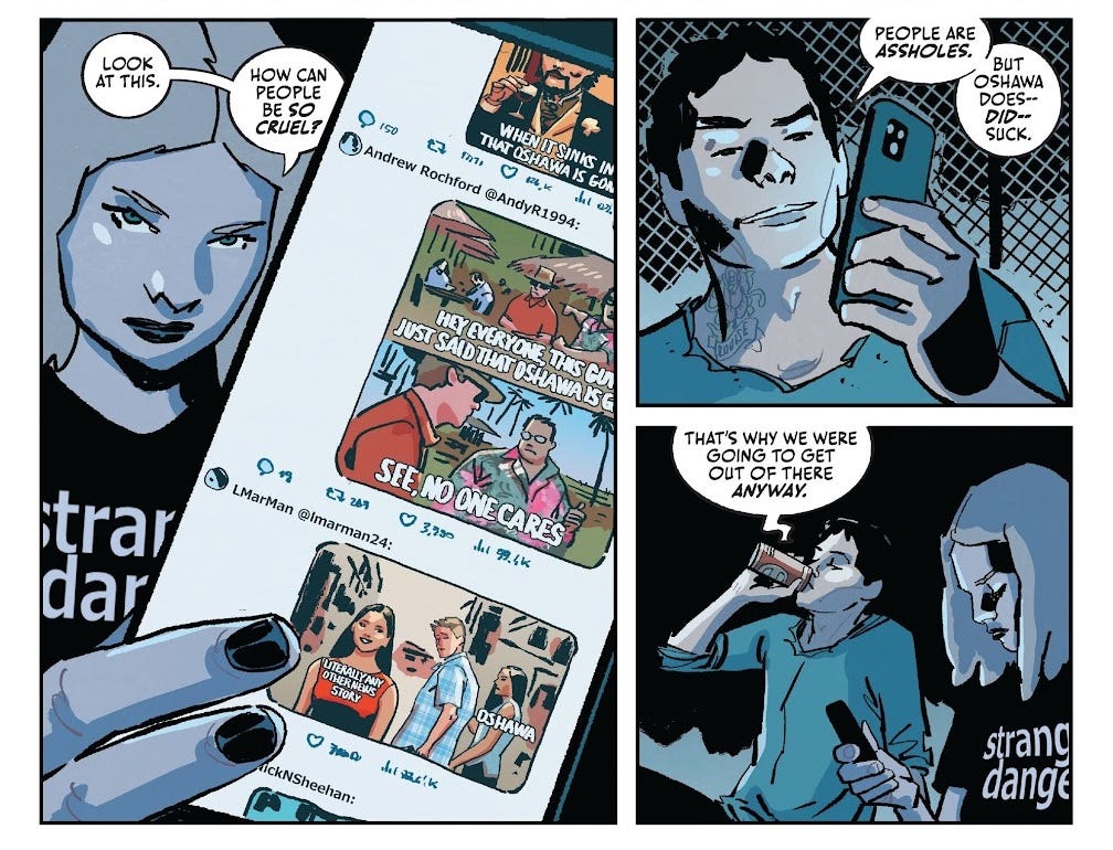
Ed Brisson’s script is pretty tight and does a good job of conveying the characters. There’s an obvious allegory (right there in the title) for refugees, the homeless, and slipping through the cracks in society; but the comic doesn’t beat you over the head with it, because it’s all firmly grounded in the object level of what’s happening and what the characters are going through. The supernatural mechanisms that have facilitated the story’s conceit are definitely an intentional mystery element, but they’re positioned at the periphery of the story; I want to keep reading not for the sake of the worldbuilding, but because I’m invested in the characters’ plight.
Luca Casalanguida does a good job of making the main characters stand out from the crowd, and delivers on the story’s more visually-striking images. Dee Cunniffe makes good use of colour hold to really make the most of the linework, and I really like the mix of soft gradient backgrounds with hard-shaded lighting on the characters. Hassan’s lettering takes a mostly understated approach here, but I really like the “RRRRRRRRMMMBLE” used as Oshawa gets swallowed up by the Earth. It’s a physically implausible image, but the comic gets away with it.
The Amory Wars: Good Apollo, I’m Burning Star IV, Volume II—No World For Tomorrow #3-4 (of 12)
I’ll be real, this was a 100 comics L. I had no idea what was going on in this one. But I mean, even under the best of circumstances—look at that title! What?
To break it down: The Amory Wars is apparently a long-running series of concept albums by prog-rock band Coheed and Cambria. Each of their albums has a corresponding comic series, co-written by band frontman Claudio Sanchez and his wife Chondra Echert, published years later, because otherwise how the hell is anyone supposed to know what the story’s supposed to be. They’re deliberately doing a Star Wars thing with the numbering: their first album was apparently intended to be chronologically second, so it’s called The Second Stage Turbine Blade. Their second album was third, so it’s called In Keeping Secrets of Silent Earth: 3. The fourth album, then, is Star IV, except that one’s split into two Volumes, and this is the second of those volumes. I’ve read Homestuck, this is baby stuff.
If I’d stumbled across The Amory Wars on TV Tropes during the 2010s, I’m sure I would have wasted lots of time trying to make head or tails of how to engage with it, I would have listened to the albums and found them incomprehensible, and then years later I would’ve seen that they’d finished releasing this final comic series, been like “huh, maybe I should read that”, before proceeding not to.
There is like, an entire set of aesthetics and ideas tied to the heavy metal scene that I just do not understand at all. It’s not something I’m proud of. Sometimes I look back at the media diet I had as a child, as a teenager, and I can’t even tell what went wrong. Maybe my parents were too precious about age ratings. Maybe having a younger brother fairly close in age to me meant I was only engaging with the same stuff as him, always pitched slightly down. Maybe I didn’t have enough friends to expose me to stuff outside my comfort zone. Maybe the fact that all my access to media was through my parents meant I felt some pre-emptive need to seek things which I predicted they’d find acceptable, justifiable, and I already subconsciously associated stuff like wrestling and rock music with a different class of people. Maybe I spent too long on the kids shows and never really got a taste for the normal things adults like.
To be clear, this isn’t a normal thing adults like; it’s a space opera only its father could love, or, like, the kind of teenage boys who would feel clever for understanding something this complicated—even if it’s not particularly complex.
Guillame Martinez’s art is aiming for realism, though the backgrounds are a bit too underdetailed on the whole to really pull it off. There are some sequences involving water where I cannot tell where lineart ends and colour begins; they look practically painterly, and I can only assume this is Valentina Bianconi going absolutely sicko mode. The textures go a long way towards compensating for the fact that so many of the panels are just a character drowning in negative space. On letters, Taylor Esposito (credited under Ghost Glyph Studios, which he apparently owns) gets very little to do, as the script is pretty sparse, but there’s a page of people running around and screaming that I thought was ineffective.
Lotus Land #4-6 (of 6)
Something that has always bothered me about the state of comics journalism is that you get a lot of buzz when books are announced, tons of reviews of issue #1 that say things like “this first issue shows a lot of promise!” and “I can’t wait to see where the story goes!”, and then.
…
It’s obvious what the incentive structure there is. It’s the same reason why the indie publishers go so hard on miniseries, it’s the same reason Marvel and DC are constantly relaunching their long-runners. #1s are comics’ bread-and-butter; 99% of the time, a book’s sales will dwindle asymptotically afterwards. Compared to other creative industries, comics are a drop in the ocean, with most of the net value coming from adapting the stories into other, more profitable media—so the comics journalism scene is small too, and heavily reliant on the direct support of the publishers to churn out timely content. It’s not that they need to be uncritically enthusiastic about everything that crosses their desk, sure, but it’s always seemed to me like there’s a finger on the scales. Search the title of a series like Lotus Land and you’ll find a bunch of articles on these different websites with the exact same press release, the same statement about how groundbreaking (and deeply human) this series will be, the same variant covers, the same preview pages, end of article. The same set of reviews couching the premise in terms of better stories you already know, in other media: it’s like Blade Runner, it’s like Cyberpunk 2077. A Reddit post: “I have no idea what's going on. The author seems so afraid to spell anything out that every page feels like a non-sequitor [sic].” 0 replies.
Is anyone even reading these things?
You know, it’s actually taken us this long to read a concluding issue! The 3% of my 100 comics that are from Lotus Land comprise the back half of the series. Considering it’s a noir mystery, and the first three issues are presumably devoted to establishing… what that mystery is, who any of these people are, what the basic premise of the story is… I’m hardly giving Lotus Land a fair shake here.
Buuut… a running thread of all of the reviews I’ve just seen for this series is that, actually, the information’s not in those first three issues, either!
The basic premise of the story is that it’s set in a utopia where people are living forever thanks to this medical company. Looking back at that Reddit comment— look, maybe that person is just an idiot, but they’ve clearly seen mention of this mysterious “Keeper program”, they’ve seen a character die and come back to life, they nevertheless do not seem to understand that this is what the premise is. The missing girl the protagonist is searching for, that the whole series is building towards, hasn’t even been named yet.
It’s just vibes, man. It’s just tropes. The police chief is corrupt. This goes all the way to the top! There’s a girl in a tube. There’s a guy with a big coat. There’s a nightclub for him to push his way through. What are we doing here?
To me, it feels like we’re playing a shell game. I’m promised that, somewhere in these six issues, there’s a “a beautiful, poetic – and often devastating – story.” If I look in issue #6, and ask where all that beauty, poetry, and devastation is, you say, “mmm, bad luck, it was actually in issue #1!” But if it had been issue #1 in my box of 100 comics…
I found Caio Filipe’s art to be pretty offputting, thanks to some really bizarre faces. There’s this one kid who appears in a couple of the issues that looks like he’s in a Pixar film, his neck about to snap under the weight of his boggling eyes in his big old head. There are three credited colourists, with Patricio Delpeche being the main one, and I’m honestly not sure why, as the rendering is pretty simplistic on the whole: muted tones, hard lighting, Filipe’s inks doing most of the work. At least the lettering is on lock, thanks to Nate Piekos doing his usual. Dude’s been at it for over 25 years, and I get the impression that lettering is dooming yourself to work on a remarkable number of very unremarkable comics.
Wynd: The Power of the Blood #1 (of 8)
Fooled you, this isn’t actually a proper #1—we’re jumping in with the fourth (and final) volume of this somewhat-long-running YA-targeted fantasy comic. I have no idea who anyone is or what’s going on. In fact, considering they’ve insisted on renumbering this thing at all, which does make it a jumping-on-point in industry terms, I’m baffled as to why they haven’t given a page over to a “story so far” segment. Hell, the story opens on a dream sequence based on Wynd’s memories—why not use that as a “and here’s how we got here” montage?
It’s fine, it’s fine, it’s my fault, I shouldn’t have bought 100 random comics.
Anyway, this book was actually written by James Tynion IV. I guess I was expecting something… weirder? By nature of being written for the YA target demographic, it’s very reminiscent of late-game Steven Universe, except that makes it sound better than it is, so I guess I’ll say it’s reminiscent of NEOKOSMOS for the two people who remember what that is. As I understand it, the backdrop for the story is a war between humans, faeries, and vampires (sorry, vampyres) ; by my count, 6% of my 100 comics involve a fantasy race war like this, and 5% of my 100 comics feature vampires. In this particular issue, the titular protagonist Wynd is stuck in a cell, being bled out by vampyres™, and doesn’t do anything whatsoever.
What’s striking about this one is just how decompressed it is. Decompression is a term you see come up in comics discourse all the time: comics are usually sold in this extremely regimented unit of storytelling, 20 pages in an issue, and a lazy writer can simply write less per page to stretch the same plot over several issues. Most trade paperbacks these days contain about as much story as your average single issue from the 80s—which, to be clear, is a good thing in most cases, they did not have room to breathe back then.
It seems that every issue of Wynd is what I’d call annual-length; this one has 40 pages of story (2x that of a regular issue for 1.5x the price, or 0.033x the price in my case), maybe four or five panels per page, most with a single speech bubble. Usually this approach puts greater emphasis on the art, but as Michael Dialynas has used a fairly cartoony style with minimal backgrounds, many of the pages really do feel very sparse. I wonder if it’s some sort of market-research thing where school-book-fair comics perform better if they’re longer? Or maybe this is how comics want to be, in their natural habitat, so to speak, and it’s only the publishers pushing for self-contained miniseries that makes writers compete to write more story per story.
Lettering has been farmed out to AndWorld Design, but is on a whole different level from JAME’s work earlier.2 It’s kind of a YA-comics house style thing where the dialogue is in sentence case, rather than uppercase. Looks good! The sound effects actually look like they’ve been hand-drawn into the artwork itself, as they’re all completely bespoke, which means either they’re probably Dialynas’ own work, rather than the letterer’s.3 That’s one of the big benefits of handling the colours as well: you can incorporate stuff like this straight into the workflow to make it completely seamless. It’s also allowed Dialynas to elide the typical panel borders, simply using a clean white gutter to separate the panels. Neat!
Profane #1 (of 5)
There was definitely something off about the first page of this issue that excited me: “This is a murder mystery, so there’s going to be a dead body. There are going to be clues and suspects. And, of course, there’s going to be me.” Either this comic was going to feature an annoyingly genre-savvy protagonist with lots of redundant narration, or the redundancy was the point, and I was getting into some metafiction.
And indeed, the conceit of Profane, which it takes the whole first issue to tease out, is that detective Will Profane is a fictional detective investigating the death of his own author. Is this clever? With only this one issue to go off, the jury’s out, honestly.
Colourist Giada Marchisio brings a nice faux-newsprint look to the comic that fits the pulp subject matter. I’m less enamoured with Raül Fernandez’s art, which strikes me as overly drawn from reference in many cases. Many of the expressions look a bit unnatural. Still, it’s at least very legible, which helps in a story like this. Jeff Eckleberry’s letters also fit right in with the linework and are very easy to follow.
I think the problem with this comic is that it’s frankly just the wrong medium for this story. This is an issue I’ve seen before—the musical adaptation of Fun Home springs to mind, as the elements of the story that are about being a comic-book creator fail to land when you’re not actually reading a comic—and it’s always a little frustrating, because it feels like the problem is entirely in the presentation. If this story is about pulp detective fiction, murder mysteries, then at least part of it needs to be that the medium is the message. The narration in this comic is meant to be lifted from one of these books, but because it’s squished into narration boxes, it’s nowhere near as verbose as your typical novel. I just didn’t find Profane himself convincing as an archetypal hardboiled detective, which I think is what the story needed at its core.
Part of the problem is that I’m a big metafiction enjoyer and I’ve just kind of seen it done before. The whole issue is spent building up to what I’d consider to be a Page 1 conceit. Still, there were a couple of good bits in the telling. I liked when Profane attempts “scrying” by setting fire to “bourbon, lipstick, cigarettes, an old Mickey Spillane paperback”—very cute.
Pine & Merrimac #3 (of 5)
Smack in the middle of another detective series, the gimmick of this one is that our protagonists are a married couple. Cute!!! Kyle Starks’ dialogue is lively enough to give an impression of chemistry between the leads.
In flashback, we learn that they left murder city (I presume it’s not literally the case that this world is operating on murder-mystery logic or something) to start their own agency in a small town. The main mystery is that they’re investigating a missing girl, a case which has quickly escalated to the point that, by this issue, they’re infiltrating a full-on death cult on an island. The mechanics of the mystery aren’t really the focus here;4 it’s all about the main character dynamic, and it kind of lives or dies on the strength of their banter. The comic blows several pages on an eye-rolling anecdote about a furry orgy. My, how scandalous! Zzz.
Fran Galán’s art is like nothing I’ve ever seen before, with extremely stylised comic-book proportions buried under incredibly sophisticated lighting and rendering. Like Minecraft with a full bloom HD shader installed. Uncanny. Not bad, though? Letterer Pat Brosseau has tried to match Galán’s muted colour palette by lettering with a coloured stroke, rather than just having the text be black as usual. It basically works.
Red Before Black #4 (of 6)
The title of this one, “red before black”, comes from a rhyme used to remember which types of snake are safe or poisonous. The more you know!
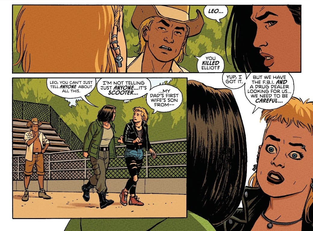
This book’s “thing” is that it’s set in Florida. It’s quite overtly about Florida. It has a three-page conversation on the subject. Two young women, Val and Leo, are on the run, having killed a guy in a previous issue. They stop by a not-blood-relative of Leo’s, an alligator keeper, who helps them ditch their vehicle and agrees to look after a baby alligator they found (not actually seen this issue). We get a flashback to Leo’s time being institutionalised over something to do with her father. Val appears to have a special power to create vines—a whole jungle, perhaps?—around her, which doesn’t really factor into anything here.
I mean, this is an issue #4, I get the impression it’s deliberately taking things easy, giving the characters a chance to breathe and reflect on their circumstances a bit. The pacing is fairly decompressed and the structure is a bit all over the place. Nothing in it really jumped out at me at all.
I can’t say I was too impressed by Goran Sudžuka’s art, which again has a bit of that drawn-from-reference vibe to it, like the poses and composition aren’t particularly creative, and some of the expressions are a bit awkward. Ive Svorcina’s colours are boring, but tie it together, at least. We’ve got Tom Napolitano on letters again, and as before, his dialogue is fine but his sound effects leave a lot to be desired.
Maybe Floridians would get something out of this book, but I don’t think that appeal really generalises, unfortunately.
Abbott: 1979 #4 (of 5)
Saladin Ahmed is a name I know from having written some later volumes of Ms. Marvel—not ones I’ve read. Hailing from Detroit, this comic is clearly doing for Detroit what Red Before Black was doing for Florida. Sometimes I wonder what it would look like if I wrote a story set in my hometown. Stupid, probably.
Anyway, the issue #4 curse is even worse here because Abbott: 1979 is actually the third in a trilogy of volumes telling this story. It’s funny how indie comics work, how the miniseries absolutely reigns supreme. So yeah, this is like the issue #4 of issue #4s.
The premise here seems to be that there’s a secret war between good and evil in Detroit, as the “umbra” seek to gain entry to the world, barred only by the efforts of some “immortal souls”. Fully 11% of my 100 comics have a kind of heaven-vs-hell situation like this going on, and this issue hardly does anything with the idea. I get the impression from online solicits that the series elsewhere would’ve focused on topics like police brutality and negligence, with the protagonist, Abbott, being a reporter looking into these deaths and disappearances following the death of her husband. In this issue, her dead spouse is back as a ghost. I can’t say I was particularly sold on the chemistry between them. The supposed political themes only rear their head in the form of Abbott debuting her new news show, some sort of vox populi thing which promises to let Detroit’s people speak on their concerns. We don’t actually see this in the issue itself.
Visually, this comic is a mess. Sami Kivelä’s art is strange-looking and often quite sparse-feeling, like it doesn’t know how to fill the page—though in fairness, Ahmed has hardly crammed this script with anything to draw. On the page where Abbott speaks to the camera, fully a quarter of the page is left completely blank. Come on now! Dan Jackson tries vainly to sell a ghostly effect on many of the pages, but in practise this just means blotching things with ugly green hues. We’ve seen Jim Campbell’s lettering before, but I’d say this is a pretty poor outing for him; I don’t like the look he’s chosen for Abbott’s dead husband’s ghostly speech, and think the sound effects in the closing fight scene are lazily done, incongruous with the art.
This is the penultimate issue of what’s effectively a fifteen-issue run, I presume, and it just has very little going on. An evil conglomeration of demons is about to take over the world! Your husband is about to double-die for good, forever, for some reason! You’re in Detroit, which matters apparently! Try to put your heart in it!
Ranger Academy #5 (of 12)
I’m an outspoken fan of the 2017 Power Rangers movie, and have fuzzy memories of watching Ninja Storm, Dino Thunder and S.P.D. as a kid. As a franchise, Power Rangers is in a weird spot where it’s basically entirely artistically bankrupt—it’s a long-running toy commercial comprised mostly of a heavy localisation/retooling of the Japanese franchise Super Sentai, which is itself a toy commercial. There is absolutely no artistic impetus going into it, as a story, though I’m sure there’s lots of talent involved at every level of production. In the West, Power Rangers is very much a ‘90s nostalgia property these days, barely sustaining itself on people’s fond memories of the very first series, Mighty Morphin Power Rangers. BOOM! have had a slate of Power Rangers comics set in their own continuity for some time now, and have received… a mixed response, I want to say? Some of my friends are quite into it. A lot of people have strong feelings on the designs of the suits or whatever.
For me, what I want out of Power Rangers and shows like it is really just to focus on the human element. So I was pleasantly surprised, checking out Ranger Academy, to see that an actual Power-Ranger-in-armour appears on just two pages! The rest are all these cadets with conveniently colour-coded hair, stressing out about whether they’ll be able to turn into Power Rangers or not. Maria Ingrande Mora is apparently a YA writer, and she clearly has the chops—her script in this issue feels perfectly pitched for its target audience of dorky teenagers.
In previous issues, protagonist Sage apparently succeeded in morphing into a Power Ranger, only (so I gather) it was “wrong” somehow, and she failed some important trial. In this issue, she’s keeping secret the fact that she’s holding onto a “cursed spectracite” (presumably something from her messed-up transformation) and that she’s morphed when her friends haven’t. I was really endeared to Sage’s narration, which peppers the whole issue with her doubts and anxieties. Her friends aren’t hugely memorable but they have lots of nice interactions. This felt like a fairly dense read on the whole, which I appreciated. Sage starts confiding in an older student training as a Red Ranger, and they spend time in a holodeck-like Battle Simulator. It’s clear that there’s lots of tension in Sage’s circumstances.
Jo Mi-Gyeong’s artwork is perfect for a Power Rangers comic, with a bit of a manga influence to it. It’s very expressive but I’d say it has some genuine technical craft to it as well, in terms of composition, perspective, posing, and backgrounds, a cut above many of the more straight-laced artists I’ve touched on elsewhere. The whole thing is buoyed by absolutely gorgeous colours from Joana Lafuente, who I believe got her start on IDW’s Transformers comics and has clearly only gone from strength to strength since. Each page feels cohesive without being monochrome, with some lovely soft shading and careful use of texture. Ed Dukeshire doesn’t get much to do in the lettering department, but makes some subtle choices here and there, and the comic is exceptionally readable on the whole.
There’s nothing mindblowing about it, but I’d be quite happy to check out the rest of this series!
Mech Cadets #6 (of 6)
So, confusingly, Mech Cadets is actually a follow-up to an earlier series by Greg Pak, Mech Cadet Yu, which was adapted into a Netflix animated series called Mech Cadets, which this series was released to promote. I have no way of telling which continuity, if either, this series is set in, or if there’s even a difference. From the title, I was kind of hoping for Ranger Academy but with mech pilots. It’s not, though.
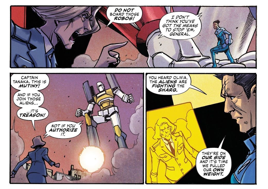
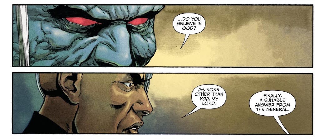
I know Greg Pak from the Jonathan Coulton graphic novel Code Monkey Save World, which also featured a large cast in a big sci-fi battle. With this being the final issue, I’m very much expected to already understand what’s going on, and I really don’t. I gather that there are some alien mechs, which are helping humanity fend off a different race of giant mind-controlling aliens. However, humanity has also built its own mech, which is the strongest, I think?
Most of this issue consists of the characters arguing with their commander, General Felix, about whether or not to send the human mech, Hero Force Two, to meet the evil aliens for battle in space, and what to do when they get there. I found the specifics of the disagreement impossible to follow, which I presume was another 100 comics L rather than a particular flaw of the comic. The story ends with the mech pilots and the mechs deserting the military to go off and do their own thing. Sure, I guess.
Coming from Transformers as I do, I found the mecha designs in this comic unspeakably boring and forgettable. The action wasn’t really choreographed to any great degree, so all seemed a bit arbitrary. I think that, as a comic book, it really struggled to create a sense of scale with the mecha. Technically speaking, Takeshi Miyazawa’s art didn’t seem that bad, but I think a story like this sort of lives or dies on the creativity of its visuals, and for me it’s dead. Ian Herring’s colours similarly fail to make much of an impression, though I liked the colour-coded lighting in the pilots’ cockpits. On the bright side, Simon Bowland’s letters are simple but effective, relying on plain white sound effects, which is quite unusual.
Just going off this comic, I don’t see what the Netflix execs saw in Mech Cadets, and indeed the animated series doesn’t seem to have set the world on fire. To me, the title change from Mech Cadet Yu to Mech Cadets sort of speaks to the executive mindset: mech cadets, you say? Sure, mech cadets, that sounds cool, greenlight it.
Once Upon A Time At The End Of The World #13 (of 15)
To be fair to me, this is a series of 15 oversized 30-page issues, each with two separate flashback story threads alongside the main story, drawn by three different artists, and I’m coming in right at the end. I was never going to understand it.
Maceo and Mezzy are two lovers that have known each other for decades in a post-apocalyptic world ravaged by environmental disaster. This issue opens with a flashback where Maceo invents some wacky McGuyer-esque inventions to try and kill himself; none of them work, so eventually he gives up. The comic actually includes a suicide-hotline message above the indicia as a result of this subject matter. To be honest, I did not find the scene particularly affecting in the slightest; Alexandre Tefenkgi (I think) didn’t really sell the physical presence of Maceo’s inventions in the artwork, so the whole thing just comes off quite silly. Probably it was a script problem: Jason Aaron says something like “Maceo tries to hang himself using a stick launched by two rockets”, and Tefenkgi thinks, well, that sounds stupid, and does his best with what he’s given. (In the very next panel, we see Maceo build what’s basically a gallows. Phenomenally stupid stuff.) Lee Loughridge’s colours on these pages are fine, with soft blues and pinks adding to the overall sense of ennui.
In the present day, Maceo and Mezzy fight their way through mobs of “ravagers” while bickering. Nick Dragotta is an artist whose name I have heard before, I can see why; his work is absolutely phenomenal, full of energy, detail, and precision. Colourist Rico Renzi puts some brilliant red and green hues on these sequences that really sell the idea of a noxious, boiling wasteland.
Meanwhile, in Mezzy’s flashback sequence, she’s leading a band of survivors, having separated from Maceo, and she must give judgement on a group of thieves who tried stealing from their camp. Leila del Duca’s art is appealing, for sure, but a bit too underdetailed to sell the squalor of the apocalypse, and I don’t find Tamra Bonvillain’s colours interesting at all.
Letters for the whole issue are just credited to AndWorld Design again; I’m not sure if this is studio founder Deron Bennett or someone else. Either way, it’s solid work, with irregular speech bubbles creating a sense of instability with the characters, and grisly sound effects coloured to blend with the art.
Jason Aaron is fairly well-liked for his run on Thor, I think, so perhaps this series, read as a straight shot, would have lots to offer. I don’t think his prose or his dialogue was particularly good on the micro level, though, and the broader narrative/worldbuilding seemed extremely vibes-based in a way that’s basically anathema to me. I’m the sort of person who does, unfortunately, quite enjoy stories about the basic mechanics of post-apocalyptic survival, and this story isn’t really concerned with that kind of material reality in the slightest.
Zawa + the Belly of the Beast #4 (of 5)
This is the only comic I got from the BOOM! Box imprint, which apparently was intended to showcase stories that were “experimental” and “gleeful”; it was launched with a series from Dinosaur Comics creator Ryan North, to give you an idea.
This series is the sole work of Michael Dialynas, the artist we saw on Wynd earlier. His art fares a little better here, full of detail and with very appealling colours. Again, a lot of the sound effects and the like are hand-lettered, and the dialogue has coloured text thrown in almost at random, so the text ends up being quite visually overwhelming—but I appreciate the effort!
Zawa is a mountain spirit in the form of a young girl. The humans in the story have settled around the mountain and are obsessed with junk food, sugary sweets and the like. In this issue, it’s revealed that the mayor set up a conspiracy to villainise and kill the periodically-reincarnated Zawa, so they could expand around the mountain unimpeded.
Pitched for younger readers, there’s an obvious environmentalist bent here, and the story co-opts a lot of the imagery of modern-day activism. To be perfectly frank, this is an artist’s story, not a writer’s. It’s a really rare thing to get an auteur who’s good at both, and Dialynas just isn’t it. I realise this makes me sound like an insane person when I try to articulate it, but sometimes you can just tell that a concept isn’t a story so much as it is a drawing. There’s an immediate resonance to it—fast-food town, girl with mossy hair, cute cat—that doesn’t have any sort of “unfolding” quality to it, no hidden depths, no range. It’s just imagery.
I’m pretty sure that at the kind of age where I’d have access to this sort of comic, I’d have felt pretty talked-down-to by the script here. It kind of wishes it was Nimona, but lacks the subtlety and humour that gave Nimona a bit of genuine bite.
Orcs!: The Gift #1-2 (of 4)
Again, this is actually the third and final volume of a larger storyline, because something something new issue #1 in stores now!!! Not only that, but each of these two issues is something like 50 pages, so this is practically a full trade paperback’s worth of story I’ve got here.
And you know what? I take back what I just said about writer/illustrators. Christine Larsen brings a lot of Adventure Time DNA to this story (indeed, they seem to have worked on Adventure Time tie-in comics in the past), with a large and colourful cast, lots of humour, and some shades of darkness lurking around the edges. Apparently Orcs! started life as plans for a webcomic, and wound up being a couple of minicomic zines Larsen took around to shows; when given a chance by BOOM! to pitch, Larsen showed them these minicomics, and got the full series greenlit under the kaboom! imprint for younger readers.
Summarising Orcs! is kind of tricky, especially jumping in like this. To me, it was immediately reminiscent of Dungeons & Dragons with its focus on adventurers in a world of fantasy tribes, but Larsen states that they don’t actually play tabletop games, which means all the influence comes direct from Tolkien. By the time of this third volume, the cast has ballooned to dozens of characters, and I admit I had trouble telling them all apart, as the comic doesn’t waste its pagecount to re-introduce them all.
In issue #1, the orcs throw a feast and are joined by some friendly elves, only for wolves to gatecrash the party, believing the orcs to be responsible for the destruction of the Tree of Memory (the real culprit is actually the evil wizard that’s the series’ main antagonist). In issue #2, a crew sets out to visit the dwarves, to try and repair a broken magic sword. These high-level summaries really fail to do the story justice, though, as there’s lots of little escapades and imaginative beats that broaden the scope considerably. I really liked the thread in the second issue where one character is magically given the ability to understand any creature, prompting conversations with gnomes and monsters.
Larsen’s art is absolutely perfect for a story like this, full of funny expressions. The panels are often crammed full of characters which helps communicate the sense of a lived-in world. The colour tones and the hand-lettered speech balloons are appealing as well. I’m sure that any young person who liked Adventure Time would be enchanted by this series, if you put the volumes in their hands.
Titan Comics
Wow! Great job making it this far. Should we take a break and do something else? Okay, well, um, all I have here is 100 comics, so I guess let’s… review some different comics.
2% of my 100 comics came from Titan Comics! They’re pretty much the UK’s only notable trad-comics publisher apart from Rebellion. Their output is almost entirely licensed tie-ins; comic stores here in the UK are usually swamped with their Doctor Who slop.
Rebel Moon: House of the Bloodaxe #2 (of 4)
Writer Magdalene Visaggio was already on thin ice with me for having done Transformers vs. Visionaries, one of the worst series IDW put out during their long tenure on the Transformers brand. In that case, a big part of the problem was that Visaggio had clearly been handed off a bunch of plot elements from editorial that she flatly had zero interest in. I wonder if the same is true here, on this tie-in to Zack Snyder’s serial-numbers-filed-off Star Wars film Rebel Moon—which I gather was a flop on Netflix, like the majority of films on Netflix. In the general cultural zeitgeist Snyder’s films seem to be a bit of a laughingstock, so I’m always wondering how he gets anyone to give him money these days, considering his work has an almost avant-garde uncompromising self-indulgent bent to it. Rebel Moon was so bloated that they split it into two films. Did Visaggio watch the first one and go, “whoa, this rips!!!”, or was it more of a “I’m very excited to be working on REBEL MOON(TM). I look forward to helping shape these characters’ journeys leading into their appearances in REBEL MOON(TM).”?
The best thing about this comic is the cover by industry darling Daniel Warren Johnson. I don’t like Clark Bint’s interiors, which have spindly linework and awkwardly-posed, malproportioned figures. Francesco Segala’s colours are kind of one-note here; he’s easily the most prolific colourist amongst my 100 comics, having worked on 8% of them across five different series, so we’ll have to see if he fares any better with stronger lineart.
Letters are credited to “AndWorld Design’s JAME”, who’s apparently taken one look at Segala’s cohesive tones and block shading, and gone, “Ah, screw it! Random colours and digital gradients let’s go!” I realise it’s technically possible that the workflow was such that JAME only had the black-and-white lineart to work from, depending on turnaround, but this is shoddy work regardless. Sound effects are rarely drawn to follow the perspective of the elements in the art, or even the basic line of action. There’s a couple of panels showing a download on a computer screen, and the same font size has been used from one to the next… despite the image zooming in so that the second panel’s screen is twice as big as the first! A pathetic little “doot doot doot DEEEET” noise punctuates the scene. Me when I’m hacking the computer. The gunshots on the next page are rendered as a bunch of BLAM sound effects just sort of put wherever, with an effect equivalent to if you slapped the Loadout logo on the page a few times. So yeah, I’m not surprised that this is agency work. I could not imagine, as an editor, seeing JAME’s portfolio and going “ooh, yeah, give me some of that, specifically.”
High on Life #3 (of 4)
This is a tie-in to a first-person-shooter video game created by Justin Roiland, co-creator of Rick and Morty and voice-actor of both the titular characters until 2023, when it came out that he’d done a bunch of sexual harassment and domestic abuse.
This comic came out in 2024, so Justin Roiland’s name doesn’t appear anywhere on it. I presume he must receive royalties for it in some form. Purely from a creative standpoint, it’s very depressing when a creator who has such a distinct voice gets booted off their creation, because all the other names in the credits just sort of have to live with it and keep making the damn thing. The machine takes a while to grind to a halt.
Writer Alec Robbins (a name you might know from those Mr. Boop comics on Twitter, lord help me) is also the credited writer on the game itself, which lends it a certain pedigree. Reading the dialogue just makes me think what an unenviable task it must have been to emulate Roiland’s “Interdimensional Cable” word-vomit. Robbins has his own unique edge, though. There are a few turns of phrase here where I’m like… Twitter user spotted.
The basic idea of High on Life is that it’s a first-person shooter where all the different guns are these little aliens that gibber at you incessantly. This comic tie-in doesn’t really hew too closely to the game’s hyper-saturated visuals; colourist JP Jordan has instead made the odd choice to render this whole comic in tones that are outright muted at times. Meanwhile, Kit Wallis’ linework is scratchy and detailed, a far cry from the glossiness of the game itself—but in spite of its intricacy, the art really sells the action thanks to some strong compositions and energetic lines. Letterer Dave Lentz is having a lot of fun with the different guns, who all get their own coloured text and sometimes different fonts; I like his sound effects too, there’s this great THONK that gets used a bunch of times. There’s a two-page interstitial from the perspective of a character called “Knifey”, who’s a knife, and it’s drawn to look like a child has done it in crayon—not an uncommon device in comics and animations these days, and one that often ends up looking uncanny, but here they pull it off.
Anyway, you know what? It sort of works for me. It appeals to the part of me that used to think I liked Deadpool. Like, there’s a density to this style, isn’t there? You can’t help but engage with it. When it makes a reference, you have to Know What That Is. Steve Buscemi is in this comic and at one point a character refers to him as “Ghost World”. And it’s like, oh snap, I did see Ghost World! Suddenly I remember that whole movie. That thing kind of slapped. Ghost World was based on a comic, did you know that?
IDW Publishing
In a way, IDW is my home when it comes to comics: their Transformers books were what got me into the medium, and Locke & Key was the first serious comic I ever read in full. I’ve only ventured into their original properties a few times, and truth be told, I’ve found them to be a mixed bag at best. 13% of my 100 comics were from IDW, nearly all licensed books (IDW having relied on the same handful of licenses for over a decade, I feel).
Dungeons & Dragons: Fortune Finder #3-4 (of 5)
Released to tie into the release of a specific sourcebook, Planescape: Adventures in the Multiverse, this series is written by Jim Zub, who I gather has written pretty much every single one of IDW’s Dungeons & Dragons miniseries since the release of the game’s 5th Edition.
I was excited to see Modrons on the cover to issue #4, strange geometric fantasy-automata that populate a purely Lawful plane—I remember coming across them at some point years ago, perhaps while planning a D&D campaign, and being struck by just how unlike anything else in standard Tolkien-esque fantasy they appeared. The Dungeons & Dragons logo is extremely small on the cover, which combined with the strange creatures and Sebastian Cheng’s monochrome colour palette, can’t exactly have made this an appealing item on shelves; the issue #3 cover isn’t very good either. Thankfully the interior art for both issues is much more appealing, with José Jaro delivering pleasantly detailed and expressive linework supported by nice enough hues from Adam Guzowski. On letters, Amauri Osorio uses a torn parchment effect for the protagonist’s running monologue, which to me looks kind of dated, and the sound effects are often kind of ugly, but the speech bubbles are competently done, which is the main thing.
The story centres on the titular “Finder”, an amnesiac who finds themself in the city of Sigil, a sort of interplanar melting pot. They basically just bumble around from one situation to the next. Though I haven’t read it and can’t say for certain, to me this comic reads like a walking-tour of this specific new sourcebook, fairly cynically-motivated.
Still, Jim Zub is clearly a competent writer with decent range; I enjoyed some of the comedic beats in these issues, and was endeared to Finder’s plight. I particularly liked their brief interaction with the “tinker orc” in the bowels of Mechanus—”Things are more real when they break,” opines this NPC.
If you’re a diehard D&D fan, you could probably do much worse than this comic, but truth be told you will absolutely have more fun if you just sit down with your friends to play the damn game. Uncharitably, my gut feeling is that Wizards of the Coast’s sourcebooks are crutches for DMs who lack the imagination to come up with their own worldbuilding, and that these tie-in comics are similarly an aid to the imagination: a way of saying, look, here’s the D&D world—there are people living in it!
Godzilla: Here There Be Dragons II: Sons of Giants #4-5 (of 5)
This is the second of three miniseries placing Godzilla and various other kaiju in a historical context. Like The Transformers: Hearts of Steel or Sector 7, or the movie Prey, or whatever. Basically, it’s yet another “secret history” comic; in this miniseries, the protagonist seems to be President Thomas Jefferson, with other historical figures like Napoleon and Benjamin Franklin revealed as being aware of kaiju. Aaron Burr is an alien. Sure, whatever.
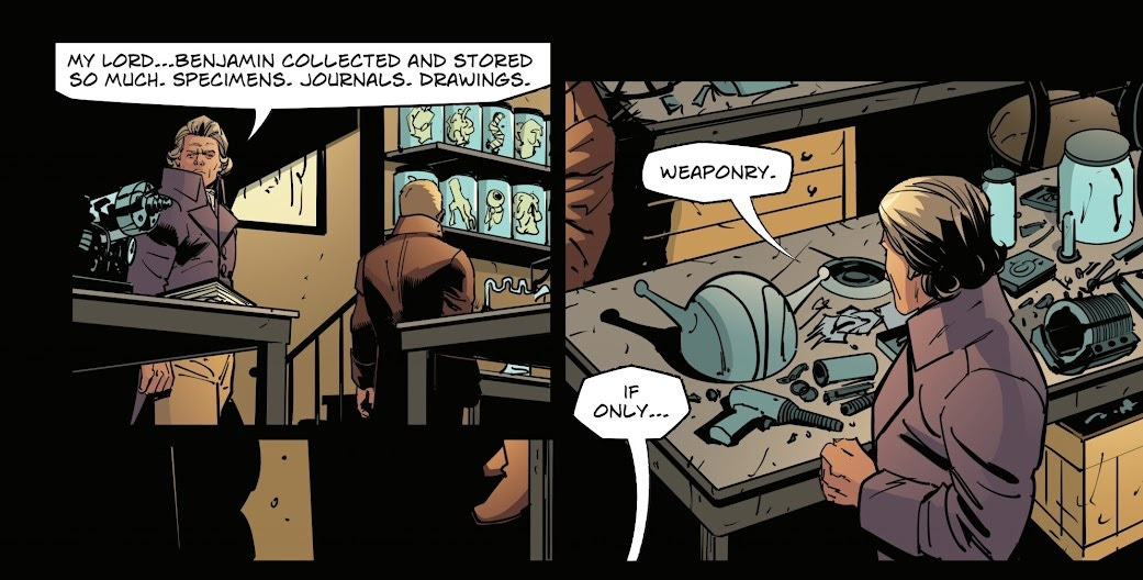
Both issues I have open on an ancient legend about the kaiju: in issue #4, we learn how the Mayans worshipped the pterodactyl-like Rodan, while in issue #5, we learn that King Ghidorah inspired the Greek myth of the Hydra. Fully six pages are devoted to the Mayan backstory, communicating very little of substance. Artist Inaki Miranda renders these pages in a stereotypical Mayan-artwork style, but frankly it just looks poor. The pages rely heavily on copy/pasted elements, which are often scaled to different sizes, resulting in noticeably inconsistent stroke thickness; just a really basic error, in my view. The actual figure drawings themselves are still extremely comic-booky, and the overall effect falls completely flat (as in, in a bad way, not as in like ancient murals). The art in the present-day sequences is also quite awkward, aiming for a fairly realistic style but just being too underdetailed to make it work. Eva de la Cruz’s colours aren’t particularly inspiring either. Tell you what, though, the letters from Steve Wands demonstrate some good versatility, with a range of narration box styles for different time periods, idiosyncratic polygonal speech bubbles, and well-chosen colour tones for sound effects.
The present-day plot thread is about Jefferson recruiting a fictional apprentice of Benjamin Franklin to find a secret workshop in the scientist’s basement. For the sake of getting some kaiju action in there, Jefferson’s exposition occasionally veers into depictions of their battles. There’s lots of dialogue, but somehow none of it is funny, interesting, or emotionally compelling.
I definitely am sympathetic towards this kind of pop-culture-remix, where you’re taking a longstanding established property and making a little pocket continuity to situate the elements in a new context. In fact, in the adverts of these issues alone, IDW is pitching us on a slate of Godzilla stories like this: Tom Scioli’s Monsterpiece Theatre, which pits Godzilla against a rogue’s gallery of literary heroes like Sherlock Holmes and the Great Gatsby (I hear this one’s actually quite good); and Louie Joyce’s Skate or Die!, which sees a gang of Australian skaters take on the kaiju.
The thing is, you really need to have some substance to it, where the IP elements are giving you a new lens to explore history (or whatever your gimmick is), instead of the historical elements just being a new coat of paint for your lucrative IP. Despite theoretically being in its own continuity, I presume, this series relies heavily on intertextuality with prior Godzilla media. I imagine the fans liked it, but it’s certainly not making me interested in the franchise, even as someone who’s enjoyed Godzilla films in the past.
Star Trek #17-18 (ongoing)
I have tried to enjoy Star Trek—as a lifelong nerd, I think it’s basically obligatory for me—but the truth is I just don’t. I thought the one with the whales was pretty fun. Otherwise, I find it too po-faced and slow-paced. It doesn’t interest me at all.
This ongoing series from IDW Publishing comes from writer duo Collin Kelly and Jackson Lanzing, who apparently were responsible for a previous series Star Trek: Year 5, which was set in the unseen gap between The Original Series and The Motion Picture. This new series is similarly set in the gap between the end of the various ‘90s Star Trek series and the Nemesis film. The gimmick is that it pulls together loads of different established characters for the crew of the ship: Sisko of Deep Space Nine is in charge, joined by Data from The Next Generation, and Scotty from The Original Series. There’s some original characters thrown in as well, for spice.
The specific issues I got were actually the final parts of the five-part “A Savage World of Glass and Bone” story arc, labelled as such on the cover. I really appreciate this approach to numbering, with it clear that I’m well into an ongoing series, but with the individual storylines within that series clearly delineated to create jumping-on points.
This storyline sees Sisko’s crew trying to stop war breaking out between the dinosaur-like Tzenkethi and the Cardassian Reclamation; only the former get much pagetime in these issues. The war is being orchestrated by the Romulans for some reason. To be honest, I didn’t have much to go off in terms of the moral conflict in these issues: Sisko is like, “don’t do war, war sucks!” and the dinosaurs and Romulans are like, “too bad we’re going to do war :)”. The situation is complicated when Starfleet decides diplomacy is a lost cause and blows up a Tzenkethi shipyard, but Sisko refuses to accept that war is inevitable and tries to “diffuse [sic] the situation”.
It turns out that the core of Tzenketh is dead, inert, which threatens to wipe out all life on the planet, so the crew do the Tzenkethi a favour by jump-starting it using their ship. This earns the Federation enough kudos to sway the Tzenkethi, who agree not to go to war.
Honestly, I thought these issues were alright! The dialogue has a bit of life to it, the pacing does a good job of juggling three different plot threads, and even having jumped in like this, it’s perfectly clear what the stakes are. Marcus To’s artwork is very legible and often striking, and does quite a good job of capturing the actors’ likenesses to my untrained eye. Lee Loughridge’s colours are boring, but this is an ostensibly-in-canon Star Trek comic, of course they’re going to be boring. Kelly and Lanzig also make use of a couple of text-only pages in addition to the standard 22 pages of artwork, which helps each of these issues feel a bit more substantial; I always appreciate writers who go the extra mile like that. Letterer Clayton Cowles tackles these interstitials with aplomb, and adds lots of little flairs throughout the comic to create a pretty slick reading experience: little captain’s-stripes details when he speaks off-panel, blurriness on viewscreens, even something as simple as the understated SHH of a sliding door or the KLK of a button.
This series has apparently won various awards in the comics industry, and while I frankly don’t see how it’s anything to write home about, I can tell that Star Trek fans are well-served by it.
Yars: Rising (one-shot)
Like Toxic Commando and High on Life, this is another comic tie-in to a video game; in this case, it’s a prequel to the game’s events written by the game’s co-writer, Adam Tierney.
I could not for the life of me have told you what the video game itself would be like from reading this comic. It turns out that Yars’ Revenge is an old, forgotten Atari space shooter, like Space Invaders, and Yars: Rising has unrelated gameplay (and seemingly an unrelated story as well?) but makes reference to classic Atari games like Yars in the form of hacking minigames. This is a horrendously generic cyberpunk story and setting; the premise of this one-shot comic is that our crew of young hackers are trying to make a program to skim off the earnings of a casino. There’s a running joke about “skim milk” that almost makes me question whether the writer understands where the word “skim” comes from.
Man, this has got to be the most annoying script I’ve yet seen in my 100 comics. The main character’s fun quirk is that she’s constantly overthinking idioms and turns of phrase: “We don’t need a multipronged attack. Wait, don’t PRONGS all face the SAME direction? That’s a weird phrase…” Christ! Everything about this story is trying to be cute—the player character looks and reads like an attempt to synthesise cuteness in a lab—but the whole thing comes off phoney, like Tierney is using this poor e-girl as a sockpuppet. One of the side characters is written to make heavy use of slang—”epic”, “yo”, “bet”, “no cap”, “soz”, “AF”. How do you do, fellow kids?
It’s just so cynical and slimy. Listen, I like to think I’ve got my gamer bonafides, but Yars is a property so dated and forgotten that I’d never heard of it in my life—and here we are trying to make a buck on this franchise by making it cool and hip with the kids. It’s not! It’s so not! Making matters worse is the repackaging of the politics of cyberpunk as a genre, too. The main character’s narration harps on about how cool and good these guys are for stealing from the corporations, stickin’ it to the man… but the real mindset, which I read as Tierney’s own attitude leaking through, seems to just be “get yours”. Tierney is literally a Director of Business Development at WayForward Games. I’m sorry, but it’s not punk.
As mentioned, the big heist here is to steal from a casino—a place we never actually see in the pages of the comic—and it’s like, in a better story, we’d be maybe touching on the idea that gambling is used to prey on the desperate and bleed dry the working class, instead of just using it as a shorthand for “place with money that’s evil”. It’s not even that I expect a comic like this to be some kind of polemic—obviously not, it’s for the kids! But I do think that having a good mental model of the world does often precipitate better storytelling, and sometimes you can tell from bad storytelling that a writer is completely out of touch.
The comic’s dramatic ending is that the crew is actually being conned, and they have to chase the mysterious culprit through their building. The protagonist ends up confronting him alone, and he appears fully ready to shoot her… but then decides not to, seemingly just because she asks nicely. Which, in turn, gives her the chance to pull a last-minute switcheroo with the USB sticks to get the one with all the money on it. It’s like, I’m sorry, but in any other world, her “cute brains” would be on the floor and that would be that.
Anyway, at the very least, the poor production team on this one has done the best with what they’re given: Ele Bruni’s manga-style art is charming, with some really sugary hues throughout, though the characters are drawn way younger than they actually are (I think they’re meant to be in their 20s?). Maria Letizia Mirabella makes the unusual choice to ditch the strokes from her speech bubbles, which actually fits right in with the art and looks quite effective. If this team were given a script with an ounce of cleverness, they might have a good comic on their hand. As is, I don’t think Yars Rising as a video game set the world on fire, and if the writing in it is anything like this, I can’t say I’m surprised.
My Little Pony: Mane Event (one-shot)
In the 2010s, My Little Pony: Friendship is Magic was genuinely a phenomenon, infamous for attracting a large adult fandom while still being a big hit with its target demographic of young girls. The show ran for nine years, by the end of which a lot of the adult fandom had sort of moved on. I remember hearing about the reboot, the 3D-animated film My Little Pony: A New Generation, only in the context of the worldbuilding being kind of insane. The ponies have, like, a race war. Anyway, that span off into the show Make Your Mark (mark, because the ponies have “cutie marks” on their butts) along with the supplemental 2D-animated show Tell Your Tale (tale, get it, like a pony’s tail), which wound up outliving the main series, only to get prematurely cancelled a few months after the release of this particular tie-in comic.
This special bumper-length issue includes three stories from different creative teams, all themed around “hair”. This is the kind of thing comics does better than most other mediums, in that it can devote a one-off issue to a specific idea outside of any sort of broader serialised narrative. Though the three stories have fairly distinct art styles, the fact that Neil Uyetake has handled the lettering throughout the whole one-shot helps them to cohere as a reading experience; he takes a competent, no-frills approach.
In the first story, by Stephanie Cooke, Pipp Petals is launching a new line of beauty products and gets a delivery of samples. At the same time, she’s babysitting a baby dragon, Sparky. She cracks into the delivery (“Let’s do an unboxing!”), but everything is mixed up, and Sparky swipes the instructions without her realising. So she just sort of tries all the products, and for some reason uses one of them on Sparky? This causes the baby dragon to grow beautiful long hair. She panics, but finds the instructions and is able to reverse the effect.
Really, what I didn’t like about this comic is that it seems to get a bit muddled on what Pipp’s mistake actually was. At the end, she says, “I learned my lesson about testing out mystery products!” And I’m like, was that the problem? Surely you just… don’t put stuff on babies, period? Those guys are sensitive! Plus it’s not even her baby!!!
Still, considering that this entire story needs to be carried on a single character talking to herself, Cooke’s dialogue basically does the job. Abby Bulmer’s artwork delivers some really funny expressions, and highlights the stylistic shift with this new series by drawing the ponies with very soft, rounded features. It would have been nice to see more background details, as the pages look a little sparse at times. Colourist Rebecca Nalty chooses some very rich tones that complement one another well, giving the story a much stronger colour identity than the screenshots I’ve seen of the cartoon itself.
The second story is basically one long conversation between Zipp and Hitch, who compare their approaches to getting their manes done in the morning. Zipp thinks that Hitch wastes too much time on pomade and “mane spray” to achieve the “perfect pompadour” every day, but Hitch expresses that he prefers to “ease [his] way into the day” by taking time with his routine. Shenanigans ensue, causing both their manestyles to get messed up, and they agree that both approaches have their merits.
This was my favourite of the three stories, with Robin Easter’s script having a very clear idea of what it wants to do and managing a few jokes along the way. Jack Lawrence’s art is also the closest to what I remember from Friendship is Magic; he draws the ponies with slightly more angular features, and manages to give them a sense of three-dimensionality. Notably, Lawrence has also created his artwork in colour, which allows him to use interesting techniques like gradients, colour holds, and often eliding strokes entirely to achieve a style that’s nearly spot-on for the show.
The last story is both written and drawn by Shauna Grant, and sadly is the worst of the three in both departments. Her ponies have kind of strange faces and odd proportions, her backgrounds may as well be nonexistent, and her compositions are sterile and repetitive. The whole story is basically Izzy Moonbow going through her mane routine, talking to herself. Unfortunately, her dialogue is just quite stilted and boring. The moral is that “every pony has their own way of doing their mane”, which is definitely a nice message for kids… but one that would be better communicated by actually having more than one pony in the story! (The other manestyles just appear as anonymous floating heads to illustrate the narration.) So unfortunately, the book ends on a bit of a dud.
I will say, though, I’m a grown-ass person and I have no idea what goes through the minds of young girls or how they’d feel about a comic like this. Coming at it from the perspective of Transformers and the culturally-dominant action-adventure properties like it, I’ve had an impression that studios want to “bring in” female audiences by having strong female characters—but so often, what this means is that they have to be good at fighting, right? It’s fine if you’re a girl, so long as you play the boys’ game. So what struck me about Friendship is Magic was that it was a show for girls, but it wasn’t overtly “girly” in the same way as its contemporaries, on a narrative level, and often not on an aesthetic level either. And I think that’s what was frustrating about the whole “brony” thing, in retrospect… as if the minute you ceded that territory, suddenly My Little Pony was a boys’ show too.
So taking this comic as representative of the new series—which I realise is unfair, it’s literally a hair-themed special—I can’t help but feel like it’s a step back, in a way. It is quite girly, even if there’s a boy pony there, now! I feel like the internet is making things worse than ever for young kids, by conditioning them to obsess over their appearance, and here’s a comic issue where all the characters are preoccupied with how they look, and how to achieve different looks, and… I don’t know, to me, it’s crazy-making. In the closing pages, Izzy is seen with a bunch of different hairstyles, but in the end settles on the same nondescript look as her character model, opining: “A classic style is always good.” And my immediate thought was… so, if I don’t have a classic style, you’re saying it might not always be good?
Teenage Mutant Ninja Turtles Sourcebook #1 (of 4)
3% of my 100 comics were Teenage Mutant Ninja Turtles issues! Let’s start with this guidebook, in the vain hope that it makes the other two remotely intelligible to me. I think the basic idea of this kind of reference series goes back to The Official Handbook of the Marvel Universe, published back in 1982. Unlike the rest of my 100 comics, this one is mostly text-based, illustrated using repurposed artwork from IDW’s TMNT continuity, which was undergoing a big relaunch around this time: not a full-on reboot, but writer/artist Sophie Campbell’s huge run from issues #101-150 was coming to an end, to be replaced with a continuation by Jason Aaron (whose work on Once Upon A Time At The End Of The World we saw earlier).
The usual format for one of these books is to devote a page or two to each character, in alphabetical order, covering their individual biographies. For example, IDW used this format for the Hasbro Heroes Sourcebook, which covered the shared universe that ballooned out from their Transformers comics; when that continuity came to an end in 2018, they released the one-shot Transformers: Historia, written by megafan Chris McFeely, who gave a chronological prose summary of the entire continuity.
With the Teenage Mutant Ninja Turtles Sourcebook, writer Patrick Ehlers has found the perfect synthesis of these two approaches. In format, it takes a page-by-page, character-by-character approach, but it eschews the alphabetical order in favour of a much more considered structure: the pages are organised to carry a loose throughline, and this first issue stops right after the events of issue #100. For me, as someone who hasn’t read any of IDW’s TMNT comics, this was a huge stroke of luck: I could actually follow along! The big-picture concepts and core characters are introduced first, contextualising the rest of the ensemble, with pages occasionally being given over to summarise key moments in the continuity. The compromise, unfortunately, is that the individual character bios still mean there’s a lot of redundancy in the write-ups, where the same events get mentioned a bunch of times.
Still, the point is that I really wasn’t expecting to do anything more than skim a few of these profiles, and instead I read the whole thing cover to cover. Like McFeely before him, Ehlers is similarly an ascended fan with no significant prior comics credits—though actually, he did write a Transformers one-shot that I really liked, I knew I recognised his name from somewhere! He’s clearly a very talented writer, at least in this more curative medium, and his encyclopaedic knowledge of TMNT is up to the task of documenting these comics. I felt like he took a particularly creative approach to the prose, which prevents it from being too dry—in particular, he has themed asides written in-character, with the various in-universe commentators each bringing their own unique insights to the profiles.
Designer Shawn Lee has given each of these characters their own graphics for their interjections—nothing crazy. I like the sewer-pipe border he’s applied to the artwork. The focus is on the text, plain on the page, in a pretty miniscule font, to cram in as much information as possible.
I’m not someone who has any interest in TMNT—I just don’t “get it” as a franchise—but this publication was a good pitch for IDW’s comics as a whole. I mean, in over a decade of publication, you’ve got to manage at least a few moments of genuine pathos, right?
Teenage Mutant Ninja Turtles: The Untold Destiny of the Foot Clan #1 (of 5)
Ahahaha, yes, it worked! I know who these characters are! I can understand this comic!
Bridging the gap between the aforementioned end of Sophie Campbell’s run and Jason Aaron’s ongoing, this miniseries by Erik Burnham—who has written a bunch of TMNT stuff in the past, but I know him for his Transformers/Ghostbusters crossover, naturally—focuses on Shredder’s granddaughter, Oroku Karai, leader of the Foot Clan. These are the turtles’ main antagonists, but the turtles themselves are literally nowhere to be seen in this issue.
The basic premise is that the Foot Clan are hired to steal something from an underground facility—not with a stealth mission, but with a full-on assault involving all the Foot Clan’s heavyweights. The big opening fight scene involves a handful of mutant animals, and sees Bebop and Rocksteady take on a mutant whale. Inside the facility, however, the others are taken by surprise by a pair of mysterious cyborgs. Karai is beaten nearly to death; in the aftermath, the Foot Clan’s elderly combat instructor uses magic to save her life, at the cost of his own.
To be honest, there’s not much going on here on the narrative level, but artist Mateus Santolouco carries the whole comic on the strength of his action scenes. Though he employs a stylised look overall, his linework belies an obvious craft. It’s detailed, precise, and well-proportioned, with good use of perspective to situate the characters in their environments. The page with Karai’s magical restoration has a fantastic composition to it, as we see a cascade of faces—Karai’s healing as Toshiro grows older—which finally settle into the hospital bed at the bottom of the page. I also enjoyed Marco Lesko’s colours, which create a good sense of tone while maintaining a subbdued, gritty realism. Shawn Lee appears to be the resident letterer for much of IDW’s TMNT output, and his approach seems to mostly be to get out of the way, using small type to obscure as little of the art as possible—though he’ll occasionally use a different font to help the big moments land.
No wonder TMNT has had such a successful run with IDW, if this is the kind of talent they’re deploying.
Teenage Mutant Ninja Turtles: Best of Alopex (one-shot)
So far as I can tell, IDW started this line of 100-page reprint anthologies in 2020; each of them picks out a handful of comic issues to showcase a particular character. They copied this format for Transformers in 2022, to squeeze a few more bucks out of their material right before they lost the license to Skybound, so I’m familiar with how these reprints work. Usually, the 100-page format means they can squeeze in four 22-page issues and some manner of short story. The trouble is that not all characters have four standalone spotlight stories and a short story. This one for Alopex manages the four issues, and throws in a few pages of design work for the character at the end, but Alopex barely shows up in the last of the four issues.
The complete lack of a budget on these collections is perhaps best exemplified by the simplistic cover artwork from James Biggie. Genuinely, “artwork” might be generous—perhaps “design” is the better word to use. Biggie often uses vector artwork for his covers, a rare sight in the comics industry, and to put it bluntly, I don’t think they look very good. I presume they can be churned out cheaply and on a fast turnaround, though, and the simple face-on headshots with simplistic colours give this reprint line a cohesive visual identiy. Just, like, not a good one.
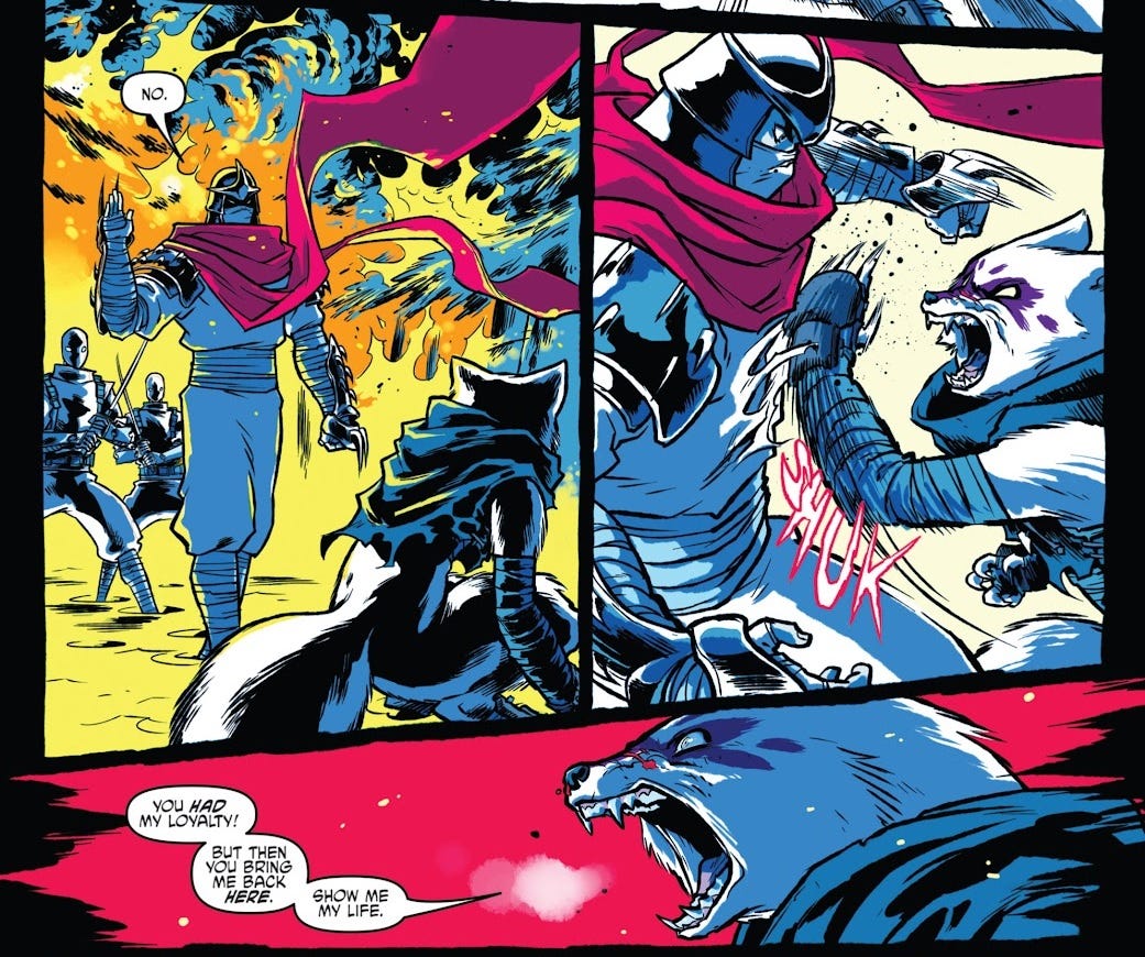
Anyway, technically I have five stories to review here, which seems a bit excessive, but that’s the 100 comics guarantee babey! We start with TMNT: Villains Micro-Series #4. I presume these are the equivalent of The Transformers: Spotlight, one-shot stories focused on specific characters tying into the ongoing. This one for Alopex is written by Brian Lynch, and I’m not sure if he’s expanding on backstory elements given by the writers of the main ongoing, or if he’s originating them here. Either way, I really like it. The basic premise is that Shredder takes Alopex back to the Alaskan research facility where she was mutated from an ordinary arctic fox. There, Shredder destroys the forest that was her home when she was a simple animal, as an initiation ritual for Alopex to become chunin (second in command) of the Foot Clan. Unfortunately for him, this backfires somewhat, securing Alopex’s loyalty in the short term, but causing her to swear to kill Shredder in the future. This story’s appeal is all in how it portrays Alopex’s psychology, looking back on her life in a family of foxes with intelligent hindsight. Artist Sophie Campbell, who would later graduate to writer of the main series itself, delivers some ferociously stylised artwork, using a simple but striking colour palette to sell this rather raw story.
Her art continues into issue #66 of the main series itself, but if you hadn’t told me, I probably wouldn’t have recognised it as the same artist! The lines have a softer, sketchier quality to them, but really it’s Ronda Pattison’s colours that have made all the difference, bringing painterly rendering that’s a far cry from the hard shading of the preceding story. The sequences set in Alopex’s mindscape—as she fights off the influence of Kitsune, who takes the form of the polar bear that terrorised her as a fox—are fantastic. Kevin Eastman and Tom Waltz’s script also devotes some pagetime to Raphael, who has a complicated romance with Alopex, trying to track her down. The characters and their dynamic felt very well-formed to me.
With the main story from TMNT: The Armageddon Game—The Alliance #3 (god knows what’s going on there) we have Juni Ba, another writer/artist who kind of fails to make much of an impression as either. The story seemed to be a standalone fight scene featuring Alopex, but I couldn’t make head or tail of it. Although the artwork has a good energy to it, with a heavily stylised approach, and I like the idea of carrying on a parallel fight scene using the bottom third of each page… the sequential storytelling just leaves a lot to be desired, and the characters are sorely lacking the sense of interiority that made the preceding stories work for me. It just so happens that Pattison has coloured this story, too, but it looks completely different, taking a minimalist, paper-cut-out approach that’s quite distinctive, if nothing else!
Four pages of this reprinted issue were given over to a backup strip, written by Erik Burnham, where Alopex and Angel form an alliance with Karai. Presented standalone, it failed to land with me, and certainly wasn’t helped by some ugly art from Roi Mercado and offputting rendering from William Soares.
Finally, we have issue #140 of the main series itself, a baffling inclusion in this themed collection because Alopex hardly appears in it! From the asinine Reddit threads that crop up whenever I Google any of this stuff, it seems that Sophie Campbell has been a controversial writer among the die-hard turtle-heads—and actually reading this issue, I can get a sense of why that is, but don’t necessarily agree with it. Bluntly, I think a lot of it is probably sexism—the word “deviantART” gets used as an adjective to describe the storytelling.
I glanced at an interview with Campbell where she expresses that she identified “family” as being the main theme of Waltz and Eastman’s run—in particular, the idea that “family is forever”, literalised through the reincarnation of Splinter and his sons in the form of the mutant rat and these turtles. Campbell sought to develop and/or interrogate this theme by exploring the idea that family might not be forever, presumably drawing from less-than-rosy experiences with her own family. Sure enough, I can see that much of this issue is given over to what I can only describe as domestic disputes among the turtles and their extended family. Frankly, I’m much more interested in this kind of thing than the ninja fight scenes that most TMNT fans are presumably here for.
That said, I still get the sense that Campbell isn’t a seasoned writer. It is a bit rough around the edges. The script has a kind of redundancy to it, in places, circling back to touch upon the same beats multiple times in the space of the issue. The dialogue feels a little simplistic and isn’t really funny or clever at all. Still, I just think these are very endearing characters that Campbell clearly has a lot of love for, and it more or less worked for me.
The Ministry of Compliance #3 (of 5)
This comic is billed as an alien-invasion-spy-thriller, so here I am jumping in halfway through and… yeah, I have no idea what’s going on. All the stuff about people’s secret agendas completely falls flat when I have no clue who they’re supposed to be loyal to in the first place. Look, it’s my fault, 100 comics was my dumb gimmick.
The premise of The Ministry of Compliance is that aliens have been secretly on Earth for decades, manipulating society: “all the political and social turmoil you see in the world? That’s these motherfuckers trying to turn us against each other,” explains Kingsley, the protagonist of this issue. A well-designed variant cover by Tim Leong printed at the back of the comic (I really appreciate cover galleries like this, but find it funny how they sort of undercut the exclusivity of variants: it doesn’t matter which cover you buy, because you’ll get all of them anyway—just in a different order!) lists a few of the aliens’ methods: “false context”, “satire or parody”, “manipulated”, “fabricated”, “false” and “misleading” content. A “psychological assessment” for the “average human” claims we have low “optimism” and “openness”, and are motivated primarily by “fear”, “greed”, and “narcissism”. “Empathy” is lowest of all. So now you know!
Internal to the events of this issue, though, there’s very little of this on the page. What’s mystified me is that reviews for issue #1 seem to present not Kingsley, but her boss at the Ministry of Compliance, Avigail, as being the protagonist of the series. So is issue #3 just an interlude from Kingsley’s perspective, or does every issue focus on a different character…? Anyway, Kingsley is helping the humans lure Avigail into a trap, but the trap goes wrong and Kingsley ends up needing to kill one of the humans to maintain her cover. The narrative is fairly isolated and claustrophobic, and any intended broader political subtext fails to come across.
John Ridley is known for writing the Oscar-winning adapted screenplay for 12 Years a Slave (which I haven’t seen) so I get the impression he’s a reasonably big pull for the script here; in interview, he expresses that he’s specifically keen on comics as a medium, which perhaps explains why he’d choose this over other gigs. In truth, though, I wouldn’t be surprised if this comic was something Ridley had wanted to make as a film, or had even written as a screenplay, and doing it as a comic was his second choice. Every single page of this issue consists of full-width panels, clearly aping the widescreen composition of cinema.
Artist Stegano Raffaele employs a realistic style with no frills, while colourist Brad Anderson uses desaturated hues and precise lighting, which again creates a cinematic feel. The art is… fine, I suppose, but not really my cup of tea. There’s a cool moment where the SHING sound effect of a sword going through someone is written around the blade itself forming the “I”, as blood splurts through the centre of the “G”, which I presume was the work of letterer Nathan Widick. But apart from that one beat, the story really seems to have no interest in making special use of the comic medium. Conceptually, it seems like a much better fit for one of those Netflix films that nobody watches.
The Hunger and the Dusk #6 (of 6)
I was looking forward to reading an ending for once, but as it turns out, The Hunger and the Dusk is actually the first of two six-issue miniseries, meaning this issue is actually a cliffhanger exactly at the halfway point. Argh!
Like Orcs! before it (and an increasing number of stories in a similar vein), this is a fantasy comic from the point of view of the demonised villain race from Tolkien’s The Lord of the Rings, which presents them as a fully-fledged culture who exist in tension with humanity but are not ontologically evil. This trend is an outgrowth of the increased cultural awareness of the orcs being othered by Tolkien’s narrative, even if he wasn’t consciously trying to pull on racial stereotypes; discourse fuelled by the fact that in Dungeons & Dragons, orcs are often used as generic enemies to be guiltlessly slaughtered by the players.
G. Willow Wilson is perhaps best known for her Ms. Marvel series, aimed at young adults, which also touched on the theme of race. I read about half of her initial run last year, and while it wasn’t bad, it wasn’t really for me. The Hunger and the Dusk is clearly pitched at a slightly older audience, and it’s more up my street. The premise (which I’ve mostly gleaned from other reviews) is that orcs and humans—who have been fighting over the diminishing fertile land in their dying world—are forced into an uneasy alliance by the arrival of an external threat, the Vangol. Our protagonist, Tara, is an orc healer who had hoped to marry her older cousin, Troth; but after Troth unexpectedly became leader of their clan, forcing him into a political marriage with an outsider, he sent Tara to cement the treaty by joining some human mercenaries in fighting the Vangol. Tara overcomes her differences with the humans’ leader and they have a sort of romance.
In this issue, Tara is alone, travelling back to her home, which is abandoned and in ruins. In her memories, we see Tara’s interactions with Troth when they were both young, and later, after the death of Tara’s mother sees Troth becoming Overlord of the clan. Most of the script’s interest is in these conversations, which present a believably warm dynamic between the two characters, and although the actual comic is fairly decompressed, the inclusion of these flashbacks makes the issue still feel substantial. In the main present-day sequence, the only thing that happens is that a couple of human men come across Tara, and attack her, their dialogue tinted with both racial and sexual violence. Tara manages to kill them with a burst of magic. Without the full context of what Wilson is doing elsewhere in the series, I wouldn’t want to judge whether she’s handling these themes well or not—but taken in isolation, the conflict is impactful and convincing.
The artwork is really great. I love the way that Chris Wildgoose renders the fantasy landscape, his figures are expressive without being cartoonish, and there’s a sense of physicality to everything. You see it in the small details, from the clothing, to the textures of the environment, to the way the composition helps situate the characters in the scenes. Msassyk’s colours are lush, with the dusk lighting carrying a feeling of exhaustion and oppressive heat. The flashback sequences aren’t even coloured that differently, but somehow get across a completely different vibe, with a rose-tinted impression of Tara’s childhood and sombre lighting when she’s in mourning. The night scene makes good use of contrasting warm and cool shades depending on where the characters are relative to the fire, creating a scary and violent atmosphere. Simon Bowland doesn’t get much to do in the lettering department, but makes some subtle choices; I like his use of angled tails for characters speaking off-panel.
I will say, though—and, look, I haven’t read the rest of this series, I’m calling it as I see it based on this issue—I find it really funny that this book deconstructing the racial coding of orcs generates its conflict by making up a new kind of evil fantasy species, the Vangol. Maybe in Book Two the twist is that we learn more about the Vangol and they actually have their own rich non-evil society too! There is literally no way of knowing. I cannot physically find out. I only have 100 comics.
Dynamite Entertainment
What’s that? You want to hear about more comics? Well, you asked for it.
Dynamite is the main indie publisher that I know the least about. They seem to rely heavily on licensed properties, and not really any of the evergreen juggernauts—the closest they come is Army of Darkness, Robocop and Terminator, apparently. Just 9% of my 100 comics were from these guys.
Savage Red Sonja #4-5 (of 5)
Right, so the thing with Red Sonja is, she’s a warrior redhead who cuts about in a scalemail bikini. Let’s let that sit for a moment.
Genuinely, what do you do with a character like that? Borne out of flatly sexist ‘70s comics, the product of horny minds. Do you lean into it, go full-on exploitation, use the narrative as an excuse to put the poor woman in as many fetish scenarios as possible? Do you deconstruct it, maybe get female writers onboard, try to hold up a mirror to the sexism that runs through so much of fantasy as a genre?
Or, do you do what Savage Red Sonja does, and just kind of… act like it’s not even a thing you guys???
Okay, so writer Dan Panosian is—so far as I can tell—an artist first and foremost. The covers for these issues are actually illustrated by him, and they’re much closer to traditional fantasy paintings than any of the comics we’ve looked at so far. They’re really pretty.
The interior artwork could not be more different. This was apparently Alessio Petillo’s first published work—on his Instagram, you’ll mostly find fanart and the like—and while it’s perfectly alright digital artwork, with striking inks, it’s such a baffling choice for this book. It’s so not hot. Red Sonja is drawn on-model, i.e. practically naked, and she’s just kind of… standing around! It’s partly the script’s attitude, as well; although she interacts mostly with men, not a single interaction she has is gendered.
It’s like if I’m playing Skyrim, and I’ve picked a female character model, and taken all my avatar’s clothes off, and everyone I speak to doesn’t even know whether I’m a man or a woman (the dialogue is the same either way), let alone what I’m (not) wearing. I’m walking around and the viewpoint camera sits there gormlessly while I interact with menus. That’s what Savage Red Sonja is like. I feel like I’m losing my mind.
The actual plot is— god, what am I doing here— look, the actual plot is that Red Sonja is involved in some sort of snafu about a ruby and a sceptre. There’s a guy called Markus, there’s a mayor, and there’s a witch, who are all after these items. Red Sonja has the ruby, but she wants the sceptre (for some reason), so she allows herself to be taken before the mayor, who has the sceptre and demands the ruby; she snatches the sceptre and jumps out the window, and somehow nobody is able to stop her. Markus sends thieves to steal both items from her, but she kills them. It turns out the mayor is secretly a witch (I think? But then later the comic implies the mayor is still around??? So maybe the witch just impersonates him?) who reveals that the ruby and sceptre only have value together, if combined in dragonfire to create a single powerful magic item. Red Sonja goes with the witch and her men to visit a dragon and bait it into reforging the items. However, Red Sonja has switched the ruby for a fake, and traps the witch in a cave-in. If it sounds like these shenanigans are kind of ill-defined and nebulous, that’s because they are. Panosian’s dialogue fails to spice things up being full of clumsy exposition as well as limp snark and run-on sentences like this one.
I don’t understand what anyone is supposed to get out of it. Dynamite has a nasty habit of interrupting the story with ad pages promoting their other series, and most of the ones seen here—Sweetie: Candy Vigilante, Elvira meets H.P. Lovecraft, and Vampirella, to speak nothing of the ads for Red Sonja: Empire of the Damned, which may as well be pin-ups—seem obviously marketed as cheesecake stories. But there’s nothing titillating about these two issues in the slightest! If it’s not hot, and it certainly doesn’t function as a Dungeons & Dragons-esque fantasy caper, then what the hell is it for? Am I missing something? Have all the Red Sonja fans and writers been looking at her for so long that they’ve forgotten what she looks like?
I don’t even understand why this series is called Savage Red Sonja! There’s nothing savage about her! She mostly stands around jawing away and engaging in very basic trickery. There’s very little violence, and what little there is gets obscured or downplayed. It’s just so ill-conceived on every level. Listen, listen—Dynamite, c’mere, this one’s free: put Alexander Wales on a Red Sonja book. You’ll be getting Eisners out of nowhere. People will be baffled. They’ll go, “What? That?” Yes.
Army of Darkness: Forever #5-7 (of 13)
Like I say, Dynamite went solo entirely off the back of their Army of Darkness license, over 20 years ago, and they’ve been publishing Army of Darkness titles to this day. I’ve never seen any of the Evil Dead films, so I’m not really equipped to do this review, but here goes.
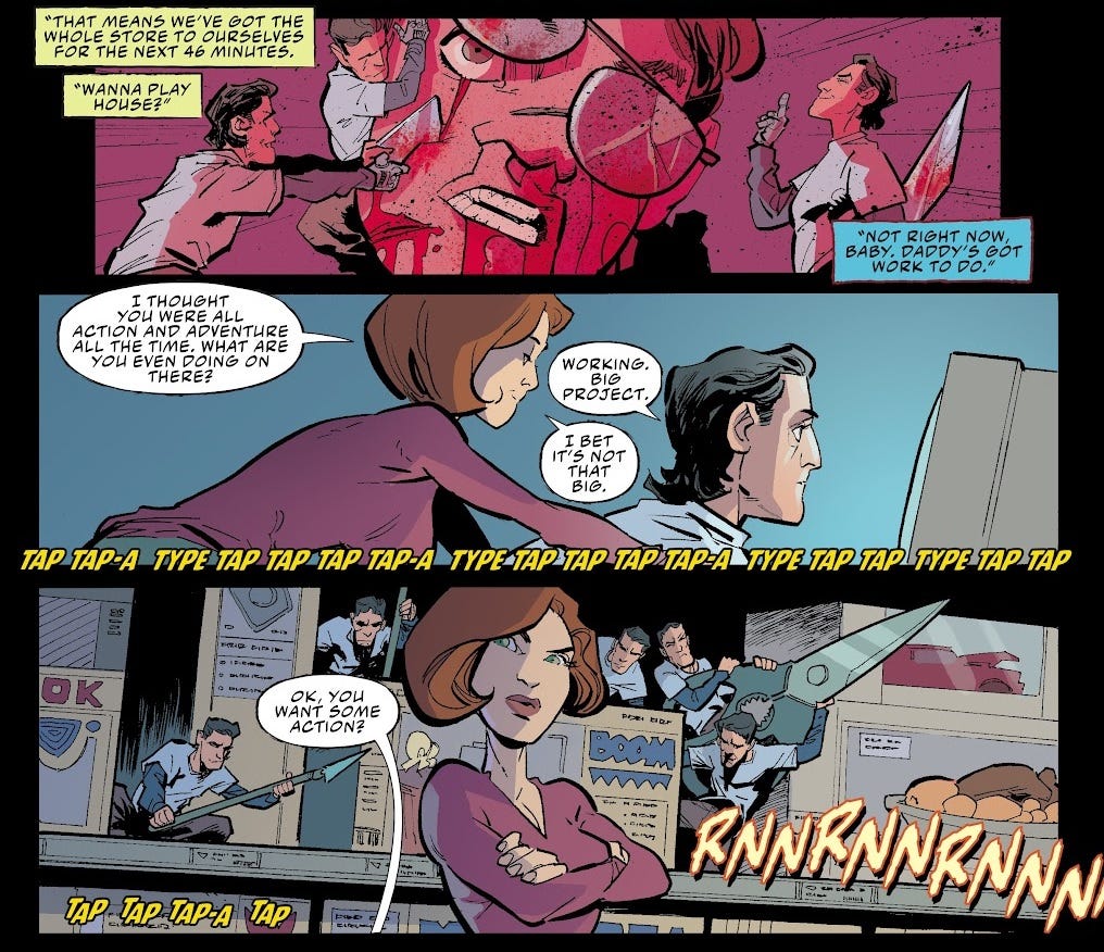
Apparently, director Sam Raimi filmed two endings for Army of Darkness, the third instalment in the series: with much of the film being set in the Middle Ages, the intended ending saw series protagonist Ash sent into the future—a post-apocalyptic London—but the producers thought this was too depressing and had Raimi film a happy ending where Ash safely made it back to the present, instead. Seemingly in keeping with some later comments from Raimi, Army of Darkness: Forever takes as it premise that both of these endings are canon: it’s actually an evil version of Ash who’s back in the present day, while our Ash is forced to gather the scattered pages of the Necronomicon in the future. The comic also continues the plot thread set in the 1300s.
Unsurprisingly, I couldn’t really tell what was going on. Having assumed that all the Evil Dead films were set in the present day, I was initially quite taken with the multiple-eras approach of this comic, which seemed very original; realising that it comes straight from the film itself, the series is less conceptually radical than I thought. Tony Fleecs is another writer/artist double-threat; I recognise his name from the first story in My Little Pony/Transformers: The Magic of Cybertron #3. Here, he’s just on writing duties, and—unless he’s also cribbing lines directly from the films—I felt that his script was reasonably witty, with some good moments. As Ash confronts his own chopped-off hand, crawling back to attack him: “You’re not some missing piece of me… you’re just some shit I didn’t need anymore.” Metal.
Unfortunately, Justin Greenwood’s linework on the first couple of issues didn’t hugely impress me, with inconsistent proportions and underwhelming detail work that just doesn’t sell the kind of gore and gristle that a book like this should rely on. Pop Mhan takes over with issue #7, and I think his faces are a little better, with his linework feeling much more precise and considered overall. Letterer Troy Peteri is given lots to do, with demons, robots, narration and sound effects, but to be honest I feel like he makes a lot of ugly choices with his fonts and colours.
Issues #5 and #6 have disturbing covers by Francesco Mattina, which make good use of chiaroscuro, but Bjorn Barend’s cover for issue #7 is like nothing I’ve seen in my 100 comics, seemingly making use of 3D models? It’s kind of more unsettling to look at than anything in the story itself, and not in a good way.
Gargoyles #12 (of 12) and Gargoyles: Dark Ages #6 (of 6)
Couldn’t decide on whether I should be reviewing these together or apart. Both are set in the same continuity, both written by one of the main creative forces behind the Gargoyles cartoon, Greg Weisman, though the stories themselves are unrelated. In case you don’t know, the premise of Gargoyles is that a few gargoyles are brought to New York City, where during the night they come to life, becoming the city’s protectors; Dark Ages meanwhile is a prequel miniseries set back in past before they got turned to statues for 1000 years or whatever.
From a glance at the Wikipedia page, the problem with Gargoyles was apparently that they kept making too much of it. After a tightly-written first season, a full 52-episode order was given for the second season, more than the show staff had the capacity to deliver without bringing a lot more hands onboard. The show was nevertheless written to a conclusion, but suddenly Disney wanted another 13-episode third season, of which Weisman wrote the first episode before being kicked off. In the 2000s, though, Weisman got to come back and overwrite that third season in the form of a new series of comic books; Dynamite Entertainment is now putting out the equivalent to a fourth season, which apparently has sold like gangbusters.
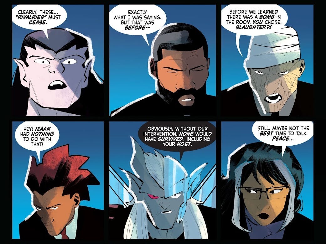
Even if I had the full 12-issue series to go off, then, I wouldn’t have a clue who any of these characters are or what’s happening. There’s like a dozen people in this one, and to be honest, I couldn’t get a sense of any of their personalities. All the Gargoyles speak in the same faux-medieval voice. The issue ends with a meeting between the various New York gangs, which plays out using a double-spread 24-panel grid of headshots of seventeen different characters all saying their piece. Yeah, I got nothing.
Artists George Kambadais does a serviceable job of sticking to the style of this kind of cartoon, while colourists Giovannia La Pietra and Valeria Verdi try to elevate it a little beyond the simple shading that’s feasible in animation—which, to be honest, I think ends up looking a little uncanny. Jeff Eckleberry makes the rare choice to ditch strokes from the speech bubbles, to try and blend in with Kambadais’ extremely fine linework, but I feel like his tails were kind of inconsistent, overly spindly.
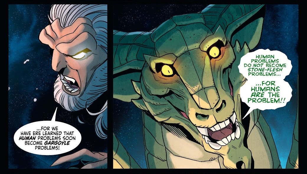
As for the Dark Ages, I preferred Drew Moss’s artwork and felt that Martina Pignedoli did a fine job creating a moody night-time atmosphere, though the visuals really aren’t much to write home about. It strikes me as obviously a natural choice for ancillary media like this to flesh out unseen parts of the show’s timeline; it’s simultaneously inessential while doing something new that the fans presumably appreciate. However, the obvious issue is that it means you lose out on the whole premise of Gargoyles, which (I presume) is the fish-out-of-water element. The plot here sees the Gargoyles defending a human castle from a fierce dragon, while some of them try to steal Excalibur from the dragon’s unguarded hoard. Again, all the characters are indistinguishable personality vacuums as far as I can tell. Still, Weisman appears to have gone the extra mile to include three pages of prose at the end of the issue, which I refuse to do more than skim. Weisman is absolutely not a prose writer and we shouldn’t act like he is.
I couldn’t help but notice that both of these issues, which conclude their respective series, end with the sign-off “never the end…” In fact, the prose story ends with the storyteller opining, “no good story ever truly ends…” implicitly stating that Gargoyles has lasted this long because it’s a good story. I’d just like to point out that this is an example of denying the antecedent, because it remains possible that a bad story might never truly end either.
Elvira meets H.P. Lovecraft #2 (of 5)
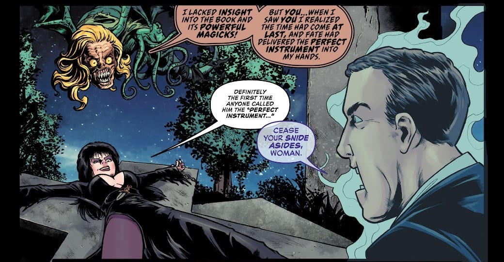
See? Chains and tentacles, that’s what Red Sonja didn’t get right.
Anyway, I had to Google who Elvira was. If you don’t know, she was the host of Elvira’s Movie Macabre, a showcase of B-movie horror flicks in the ‘80s. She’d basically make risqué jokes around whatever public domain garbage they’d dug up for broadcast. Elvira’s actress, Cassandra Peterson, is given a “special thanks” in this comic but presumably had no direct involvement in it?
The basic premise, as you can tell from the title, is that Elvira runs into “the ghost of famous dead racist author H.P. Lovecraft” and they try to find the Necronomicon; in this issue, they visit a library only for the librarian to turn out to be the Dunwich Horror. Lovecraft’s racism doesn’t really factor into this particular issue, and the comic obviously isn’t making any kind of serious point about Lovecraft’s work, beyond just poking fun at it in a light-hearted manner. David Avallone has worked on various books of this ilk and he can definitely Do Jokes—”Yog sogoth, who is the gate and the guardian of the gate!” / “That sounds like a conflict of interest, really.”—but I’m not sure I’d say it’s actually that funny, relatively speaking, for a comedy? It sort of has convention-script-reading vibes: a very thin plot and some groanworthy quips.
Kewber Baal’s artwork is fine for what it is—like, it occasionally has kind of a drawn-from-reference vibe, but the poses and expressions suit the farcical story. I felt like colourist Walter Pereyra made good use of textures but struggled to make the drab brown interior of the library much fun too look at. We’ve seen Taylor Esposito’s lettering before, on The Amory Wars, but this time he gets to have a bit of fun with ghostly speech, eldritch rasps, and yelling through doors, making judicious use of lowercase here and there.
Alice Cooper #5 (of 5)
Oh, christ! This Alice Cooper chap seems like a real wanker. Good thing this comic sucks balls.
The premise of this one is a pretty straightforward “The Devil Went Down to Georgia” affair, which has somehow taken five issues to resolve. Alice Cooper, a born-again Christian and idiot who once said that voicing any sort of political stance as an artist is “treason against rock-and-roll”, must compete against Satan himself, who’s never said anything bad in his life, because he doesn’t exist. Gee, I wonder who’s going to win, in this comic titled “Alice Cooper”?
Alice Cooper, who in interview describes transgenderism as a “fad” and thinks that if you let transgender women use women’s bathrooms then “somebody’s going to get raped”, wants to play a new song that will totally own the devil, but he can’t get it right, and the angel Gabriel tries to suggest he play a classic song instead. The rock and roll battle happens, but because comics are a silent medium, we have no way of telling who’s won until Satan says “I’ve lost,” and Alice Cooper, who once let a crowd rip a live chicken to pieces, confirms, “Yes, you have.”
There’s this bit where Satan is collecting on various contracts he’s made with unnamed younger rockers, who’ve sold their souls for stardom, and one of these rockers is what I can only describe as a woke caricature, this young woman with dyed blue/purple hair doing an SJW snarl, for lack of a better term—but they’ve sexualised her as well! Artist Edu Menna has drawn her with big tits and a bare midriff. In the next panel Satan immolates her. And it’s just like, that’s sort of the thing with so many of these creeps on the right—they hate these women, they want to punish these women, they want these women to get what they deserve. Say, what do you look like without your clothes on? They need to know. It’s very important.
In a bizarre choice, Menna has extended the art into little slivers of panels butting right up against the edge of the pages, gutters thrown around at random. This seems to serve no metatextual purpose and is absolutely inexplicable. In general, the figures and faces are some of the worst I’ve seen so far; I’m almost certain they’re traced from stock photography, but at times they look so weird that I’m doubting myself. Colourist Adriano Augusto throws some god-awful pillow shading on everything, covering the pages in clashing hues that lack any sense of cohesion. All the work of portraying the music and energy of the crowd seems to have been left to letterer Troy Peteri, who halfheartedly throws the same stock musical notes into the negative space as needed, and ad-libs the cries of the audience in this ghastly yellow font. I cannot believe I clocked Peteri as a hack just from his work on Army of Darkness: Forever earlier on, that was a crazy call from me. 5% of my 100 comics are about music and all the others do a better job of depicting music than this one. This is like cursed Murder Falcon, people. It’s like we’ve got Murder Falcon at home, and it’s evil. It is, dare I say it, treason against rock-and-roll.
Listen, listen—Dynamite, c’mere, this one’s free too: I get that you announced this series the month before that interview came out, and you hate to see hard work go to waste… but consider the fact that nothing of value would have been lost if you’d just cancelled it on the spot.
Image Comics
Okay, this is the last of the indie publishers I got more than one different title from, and by no means the least: the #3 biggest comics publisher after Marvel and DC, Image, was responsible for 35% of my 100 comics—over a third.
The big thing with Image is that everything they put out is creator-owned. Created by a gaggle of Marvel artists in the ‘90s, who were mad that all the characters they’d invented doing work-for-hire for Marvel were owned by Marvel outright, Image took an approach to intellectual property that’s standard in other industries: if you come up with it, you own it. The most high-profile Image creator in the mainstream, at least these days, is Robert Kirkman, whose series The Walking Dead and Invincible (both published under his own imprint, Skybound) are major phenomena—because he owns them both outright, he’s made bank on their adaptations for TV, animation, video games, and merchandising.
Dutch #1-2 (of 3)
So tantalisingly close to having a complete story for once! Alas, there was also an issue #0 published the previous year. Plus, Dutch is apparently an established character from the ‘90s, from Rob Liefeld’s comics, created by Chap Yaep—so I have no idea who he’s supposed to be. I get the impression that the pleasingly retro look of the logo and graphic design (by Sonia Harris) is intentionally playing homage to the character’s origins.
The plot here is shoestring thin. Dutch is a retired cyborg who’s recently been attacked in his home. He breaks into the Pentagon’s sublevels to speak with an old teammate of his, Erika, who’s become a bureaucrat and pleads ignorance of whatever is going on. While he’s staying at a hotel, a bunch of flying robots attack him. He defeats them and breaks into an abandoned Cybertech facility to trace their point of origin. Meanwhile, Erika is putting together a new team.
Joe Casey is a bad writer, I’ll put it bluntly. The comic is suffocated by Dutch’s pulpy narration, which is written with an intonation like he’s doing dry one-liners but none of it is actually clever or entertaining. Dutch is a character archetype that had already been parodied to death by the ‘90s, and rather than tell a story in conversation with those parodies, the best Casey can seem to manage is a maudlin Skyfall-esque “Does the world have a use for James Bond any more?” coming-out-of-retirement narrative. No ideas, no point, and the action’s not even any good.
Although this is a story about a cyborg, where the enemies are robots, the story exhibits a kind of incuriosity towards technology. Dutch says he plans to “reverse the polarity of the battery cells… set up a callback signal that’ll lead me right back to him”. It’s really not even trying. Issue #2 features a scary robot serpent on the cover, which narratively is treated like an ordinary giant serpent and is dealt with in four pages—Dutch punches it, clubs it, then stabs it through the throat. Scintillating.
In the art department, Simon Gane has an angular, slightly sketchy style that’s got a good kineticism to it, but I don’t know, it’s a bit boring, at least in terms of compositions—though I get that he hasn’t been given much to work with here. I can’t quite decide how I feel about Francesco Segala’s colours, which seem to be aiming for a look that’s simultaneously retro and muted. I guess it sort of works? I know letterer Rus Wooton from his work on Daniel Warren Johnson’s comics, and think he’s good, but he’s got nothing to do here; both issues are devoid of sound effects, and sorely missing them, to be honest. I presume this was Casey’s mistake, that he didn’t script any in, but I am entertained by the thought that maybe Wooton has just gotten too used to DWJ drawing all his own sound effects on the page.
The Infernals #1-2 (of 5)
The son of Satan is old and dying. He calls upon his three children to do a job for him—take out the altruistic tech CEO who’s formed an alliance with heaven—in order to decide which of the three will be his heir. Simultaneously, he’s fending off attempts by his ex-wife and the leader of a hitman organisation to muscle in on his empire.
If this was the first miniseries of its ilk I’d come across in by box of 100 comics, I’m sure that The Infernals would come off as a bit more original. Instead, it’s a grab-bag of indie-comics clichés: devils, CEOs, conspiracies, and familial legacy. Noah Gardner and Ryan Parrott are collaborating on the script here, and they succeed in injecting the dialogue itself with plenty of life and bitterness, but the actual concepts, themes, plot, and emotions are underwhelming. There are two characters aligned with the modern age—the aforementioned tech CEO and the hitman boss—but none of their actions or dialogue betray anything more than a superficial understanding of tech and business on the writers’ part. Like most secret-history comics, what it wants is to create a feeling of being let in on a secret, but it has no great truths or hot takes to impart, neither in a literal sense (“did you know that—”) or on a subtextual level (“it’s almost as if—”).
It’s a shame, because the artwork from John J. Pearson and Lola Bonato is extremely unusual and very raw. There are a few pages of Pearson’s process at the back of issue #2, which is fascinating but leaves me in the dark as to what exactly Bonato’s influence is—the colours, maybe? Soft pencils are fully rendered out with an ink brush, an illustrative style that embellishes realistic figures and environments with impressionistic composition and lighting. At times, it uses mixed media, such as textures, clip art, and vector graphics.
Hassan Otsmane-Elhaou is on letters, and he’s really pushed the boat out to complement this style. His speech bubbles are irregular polygons, creating a coarse feel that matches the flagrant profanity, with uniformly-thin tails that sometimes wobble like they’re unravelling; you almost never see this kind of thing, but here it works. Extremely scratchy fonts are used for sound effects and scene transitions. The narration boxes have jagged edges like they’ve been cut out from the page, again complementing the mixed-media approach. Finally, different colours are used for demonic speech and supernatural influence—rippling black for the demons, and a glowing halo for the angels. There are so many interesting lettering choices here, effects that are used for just a single panel to create unique moments. It’s crazy to think that, from a craft perspective, this art might not even be the best part of this comic.
Again—I just wish the script had this much going on!
Public Domain #10 (of 10) and The Domain #1-2 (of 5)
I was a bit mystified that 3% of my 100 comics were from Domain series; strangely, The Domain had a “Dallas Comics” imprint, while Public Domain was just plain Image. Similarly, the credits on the cover for The Domain were crossed out, replaced by those of Chip Zdarsky and co. So what’s the deal?
Public Domain is a story about a Stan Lee vs Jack Kirby-esque dispute between the creators of a big superhero property. We follow the family of the artist, Syd Dallas, who apparently created The Domain, as they try to rush a new series to stands before writer Jerry Jasper—who has taken credit for the comic for decades—can do the same. This is the explanation, then: The Domain is actually the fictional comic book from Public Domain, made real. Narratively, they’re pretty much unrelated.
Zdarsky is a prolific and successful comic book creator and I gather this series won an Eisner award for Best New Series, so between that and the metafictional premise, I had high hopes for these issues! Sadly… I don’t really see it?
Much of the bumper-length issue #10 consists of a flashback to Syd and his wife, Candy, during his time working on the comic in the ‘80s. Syd’s gruelling workload keeps him from spending much time with his family. This leads Candy to fall into an affair with Cynthia, Syd’s editor, which in turn naturally deteriorates due to the power imbalance in their dynamic. In the present day, Candy finally comes clean about all of this to Syd. The Dallas Comics team are wrapping up after a not-SDCC, having successfully finished and sold copies of an ashcan (preview) of the first issue of The Domain, successfully beating Jasper to market and securing their use of the trademark. However, the end of the issue implies that Jasper isn’t going to give up quite so easily. I was a little surprised to realise that issue #10 both is and isn’t an ending; it’s sort of an end to the arc, and there isn’t an issue #11, but it doesn’t actually deliver much of a sense of resolution, because the series is presumably going to continue after a hiatus.
Zdarsky’s writing is… honestly just not compelling to me. This is a wordy comic, relying on dialogue, but the dialogue isn’t particularly charming and the domestic drama is dull and predictable. As a commentary on the comic book industry, the impression I get is that it wants to be a distillation, the archetypal form of these artistic disputes—but perhaps it’s flying too close to the sun, presenting reality with the serial numbers filed off, in a way that comes across like an oversimplification, less than the sum of its parts. What can I get out of Public Domain that wouldn’t be better told as nonfiction?
This is a real auteur piece, with Zdarsky handling the art, colouring, and lettering. In every department, his work comes across as flat and sterile, and not even in a way that captures the dull reality of mundane life.
So what about The Domain itself, then? This gives us a sense of what Zdarsky’s work might be like on a conventional cape book, and it’s not looking good. The premise is that three friends find a crashed alien ship with three armbands that grant a physical boost as well as the ability to steal knowledge from people in a radius—the catch, however, is that only one of the armbands can be activated at once, so they end up fighting over who gets to use the superpowers.
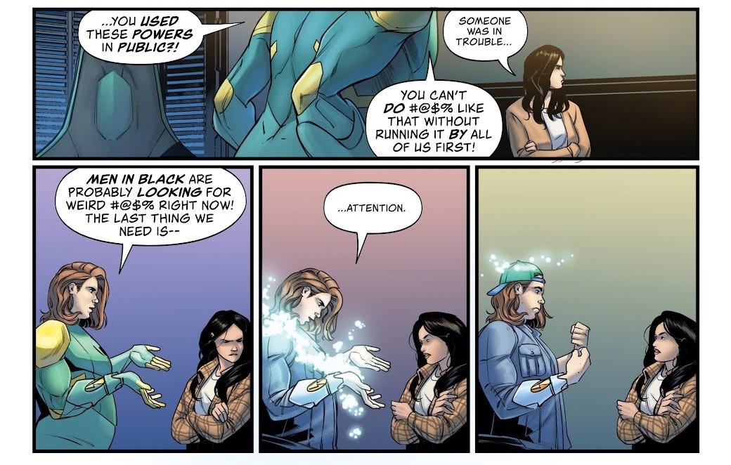
We open with a quick two-page flashback where group leader Liz rescues shrinking-violet Destiny from a bully. Comics generally love to show bullies, because most comic book readers and writers are big nerds who people love to pick on; often the entire escapist fantasy is in the empowerment, which allows you to get one-over on the bullies, maybe save their lives so you can be the bigger person, you get the idea. Zdarsky’s emulation of a mean girl is cringeworthy, not helped by some awkward expressions from artist Rachael Stott.
The main conflict is similarly frustrating. Destiny uses the Domain to attack a guy who’s yelling at his girlfriend, only for it to turn out that the girl doesn’t want her help. Liz uses the Domain to threaten her boyfriend’s mom’s landlord. The third member of the trio, Max, is a stick-in-the-mud about it. There’s also a thread about some government agents in a just-for-show extraterrestrial department, and a thread about a group of alien villains hunting down the Domain. None of these characters are likable, or even flawed in a way that’s particularly fun to watch or thematically compelling; they just suck because having stupid characters makes it easier to contrive conflict.
Eren Angiolini’s colours remind me of that era of comic book colouring when people were getting their hands on digital gradients for the first time, and made everything just sort of look awful—except the lighting in these pages seems not to use gradients, but soft applications of tone, closer to airbrushing? Either way, it’s neither gritty and realistic, nor stylised and appealing. As for the lettering, Jeff Powell is given some interesting stuff to do in the form of text messages and alien speech, but I think he makes some ugly choices.
Intertextually, the fact that The Domain is such a wet fart of a comic only makes the triumphant moment of its publication in Public Domain kind of laughable in hindsight. All that—for this!
Midlife (or How to Hero at Fifty!) #5-6 (of 6)
I was slightly worried this was going to be yet another story about an ageing hero needing to prove he’s still relevant—luckily, the midlife-crisis narrative proves to be a much more transitional one. Ruben is a desk-bound firefighter with a fear of fire, whose father was a superhuman hero firefighter who died in a fire. On his 50th birthday, he learns that he’s actually been fireproof his whole life, prompting him to try and become a superhero to achieve something meaningful and honour his dad’s legacy.
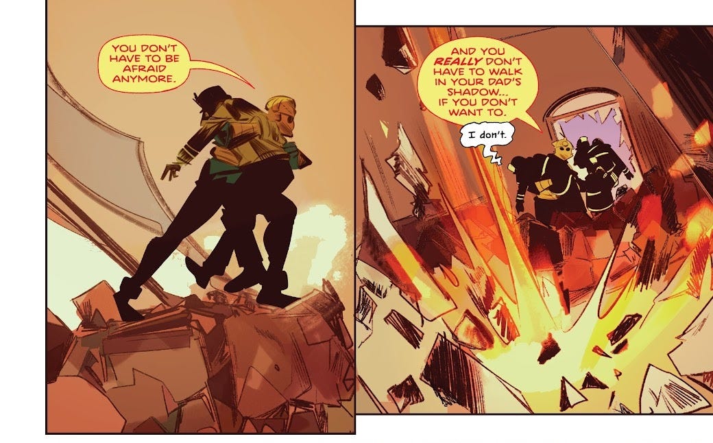
In issue #5, we open on a flashback to 1982, with Ruben leaving the cinema with his dad, having just seen Star Trek II: The Wrath of Khan. Spock’s famous sacrifice in that film (“the needs of the many outweigh the needs of the few”) is used to discuss firefighting. In the present day, Ruben has some random woman handcuffed to a motel bed—presumably this Agent Brown was hunting him down in previous issues. She reveals the origins of Ruben’s power over fire, which tie back to an old Puerto Rican legend (presumably first told in previous issues), where the real version of events is apparently that a Spanish soldier deserted his post to fall in love with a “firefolk” woman; Ruben is descended from them. They’re interrupted by news of a fire, leading Ruben to go deal with it, using his pyrokinesis to save a firefighter, but injuring himself. He has a heart-to-heart with his wife, where he’s thinking of giving up on the superhero idea, but she talks him into persevering. Back at the motel, he frees Agent Brown, and by coincidence she references Wrath of Khan, prompting another discussion of the film’s depiction of sacrifice. She claims that Ruben’s dad didn’t die in the fire after all, but he refuses to believe her. Once she’s gone, he gets a call from Brown’s partner, who’s taken Ruben’s cop friend Shaun hostage, gasp! Issue #6 opens on its own flashback, where Ruben’s mom and dad have a playful conversation with him over which of his parents he prefers. Most of the issue is a confrontation between Ruben and the Office of Fire Prevention agents threatening Shaun, but it ends on a conversation between Ruben and his mother, which pulls one final twist: that Ruben’s fire powers don’t come from his dad, but from his mom instead.
Honestly, while I found it a little didactic—particularly with all the Wrath of Khan navel-gazing—Brian Buccellato has delivered a fairly warm and heartfelt script here, clearly drawing on his own Puerto Rican heritage. Both issues I read clearly had their own twists to create interest, and the core magical-realism of the superhero conceit is thematically tight. I found the bondage imagery with Agent Brown in the motel room to be kind of inexplicable—there’s a brief joke about it, and maybe it was significant in the previous issue—because it doesn’t really tie into the characters at all. I kind of feel like Buccellato just wanted to put it in there.
Stefano Simeone lists his work on a Cars 3 graphic novel as his foremost credit, and honestly there’s very much a Pixar sensibility to his work. This is partly because he’s drawing in colour, so there’s a very strong sense of tone, and it’s also down to the stylisation of his figures. He draws Ruben’s mom like a Pixar mom. There’s a sequence where Agent Brown is recounting the fairy tale and its events are seen playing out in the wallpaper behind her, which is right out of one of those films. It’s great work overall.
Otsmane-Elhaou is on the letters for this book, as well, and he’s on fire. Highlights include speech bubbles passing behind foreground elements, mixed case for asides and whispers, a heart-shaped balloon for a sarcastically-sickly reveal, the unintelligible scribble of ball-gagged speech, the sound of someone being beaten over the phone line, a shotgun blast directly out of the panel, occasional use of underlining for BIG emphasis, and—most notably—a fire alarm going off throughout the climactic sequence, crowding the artwork with a “DING-DING-DING-DING-” that most letterers would struggle to make effective instead of annoying. The longer I pore over these pages, the more his efforts reward me with subtle details. Although—sorry, this is the smallest of nitpicks—I felt like the kerning was off whenever the acronym “O.F.P.” was used; it ended up looking like “O .F.P.” But that’s literally the only time I have ever found fault in Hassan’s work, and it hardly matters.
Tenement #9-10 (of 10)
I remember back when I had a job, I was at the counter, and a guy came in with a bag from the comic shop. And he seemed like he wasn’t going to bite my head off, so I asked him, oh hey, what did you get? And he showed me an issue from Tenement, which piqued my interest because I had read and enjoyed The Underwater Welder from Jeff Lemire, its writer. That was the only time I remember talking to someone at my shop about comics. I remember wishing I was at the comic shop instead. The grass is always greener.
Anyway, the premise of Tenement is that there’s a scary tenement!!!!!!! Seven people get lost in a Lovecraftian world inside. The whole thing is apparently supposed to be a bit Lynchian. I could go beat-by-beat with it, but frankly that strikes me as a waste of time, the plot being as abstract as it is. In issue #9 the mom takes her eyes off the son for a minute (kind of an annoying horror-movie contrivance) and of course he gets separated, so the other characters have to go after him. In issue #10 pretty much the entire cast beefs it, one after the other, leaving the mom and the kid as the only ones left alive. Lemire is an incredibly prolific writer and his dialogue is that of an old hand, very comfortable giving the characters their own voices and some big emotions.
No, what’s interesting to talk about here is Andrea Sorrentino’s art. I’ve talked before about artists drawing from reference (or, to use a word that’s slightly more taboo, tracing), which has always been controversial in the comics industry. There are a couple of main problems with tracing as I see it. First, there’s the creator-rights lens: if you’re tracing from someone else’s photo, then you’re profiting from their labour without compensating them—or usually even crediting them, because the very fact of tracing is something artists like to keep secret. Secondly, there’s the artistic lens: any time you rely on a photo, you’re sacrificing a bit of your own artistic control. The best-fit expression you could find might be slightly off from the emotion in the script, creating an uncanny effect. Or, the posing might be a little awkward on the page, creating useless negative space, breaking visual flow, or introducing unfortunate tangents that confuse the eye.
However, there is a big benefit to tracing: it makes it much easier to produce lots of art on a quick turnaround and meet deadlines. The fact is that much of the craft of creating a comic isn’t in the linework itself, so much as it is in the layouts, the composition, the storyboarding. And of course, the importance of elements like writing, colouring and lettering mean that even if the artwork isn’t at peak performance, you can still end up with a banger of a comic. I think particularly for commercial artists, making heavy use of reference and stock art is the right thing to do, from a professional perspective. If artwork was purely about illustration as a craft, we would not have jobs like “concept artist” and “graphic designer”; there would be no use for the word “artist” in visual media; we would just use the word illustrator.
But I do think from an artistic perspective, if we’re talking about illustration, then there is a world of difference between creating art “from reference” and art “from imagination”. With the latter, an artist needs to have an understanding of perspective and anatomy that allows them to visualise an original image entirely in their mind, and put it to paper. An artist who has mastered their craft is not limited in terms of certain angles being easier than others, or some expressions being easier than others. You could have them draw the same figure three-hundred-and-sixty times, each from a different angle, and you could put those drawings in a slideshow and watch that figure spin. (A from-reference artist could do the same, but you’d have to give them a 3D model, and most of the time people don’t use 3D models as reference, they just use stock photography, which is more limiting.)
So! Andrea Sorrentino! Issue #9 of Tenement is 28 pages long, still $3.99, so you’re getting a bit more than usual for your money, at least in a certain sense. The issue begins with 11 pages of abstract, impressionist interpretations of the backstory of the “darkness” that infests the scary tenement. There is fairly little art on the pages, and even fewer words, but on the eleventh page I noticed—hang on, that’s not a drawing, that’s a photograph with a simple red/black gradient map applied.
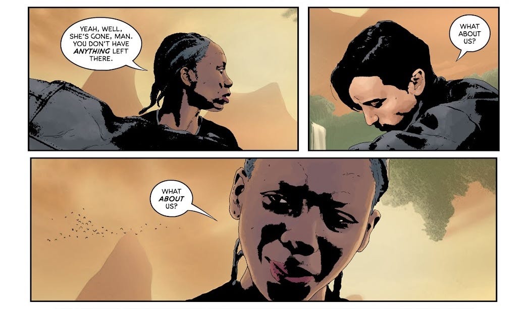
On the next page, we get our actual characters in a scene, and it’s immediately obvious that what I’m looking at is screenshots of some film or another with some sort of filter applied. It’s so, so obvious. Maybe the characters are from two different films; there’s a vibe like in filmmaking when you have to have a character interacting with themself, so the characters are rarely in frame together, they don’t touch, they don’t quite meet each others’ eyes. Whatever filter Sorrentino has applied has obliterated many of the fine details of the screenshots. Lizzie,5 who is half-blind and does not read comics, saw this one when it was sitting open on the sofa and said, unprompted, “That looks bad.” It does look bad! It looks blatantly, obviously bad.
Perhaps if you recognise Sorrentino’s name (I didn’t), or just if you can tell I’m not saying something, then you’re waiting for the other shoe to drop. Well, here it is. In addition to the flagrant use of screenshots, Andrea Sorrentino is obviously using AI to construct anything remotely complicated in his artwork.
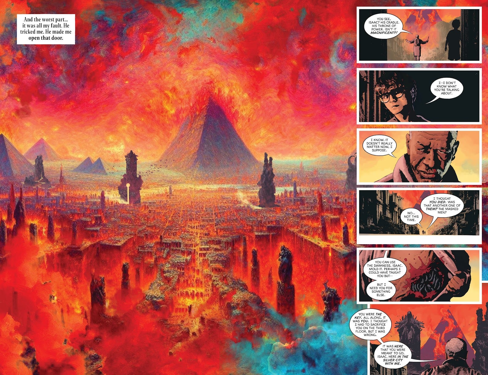
AI is obviously used to generate issue #9 pages 8-9, and issue #10 pages 1, 4-5 (above), 17, and 22-23. These issues came out over a year ago, so it’s not even subtle tells I’m going off; the images are riddled with the conspicuous grid-like irregular details which were well-documented at the time as the “house style” of certain AI models. It’s frankly not that far off from Google DeepDream. I’m also pretty sure about the mob on page 7 of issue #9 and the ruin on page 10, though there’s no dead giveaways that I spotted, just vibes. I’m not the first person to have noticed this on Tenement, but Andrea Sorrentino has drawn much more attention for his use of AI on Batman. Like, imagine getting the gig to draw Batman, and you get the freakin’ computer to draw it for you! The mind boggles!
I think there was definitely an argument to be made, at one point, that the use of AI in the horror genre makes perfect sense. AI-generated imagery is often unsettling to look at, in a subtle way that’s hard for a layperson to put their finger on. The idea of a comic where regularly-drawn characters navigate an AI-generated environment does, in its own way, make sense. But I would now argue that it makes no sense whatsoever, that there is nothing unknowable and scary about AI art. It is perfectly comprehensible. I can press a button on my computer and generate any number of landscapes like it. What I’m looking at isn’t the fabric of reality unravelling, the depraved influence of demonic forces—it’s computational, mathematical. It’s pixels. It’s transient.
And the thing is, the AI guys aren’t even relying on the uncanny effect, no—they pretend it’s not there, that AI is just as good or better than human artists. The horrible fingers are getting patched out in the next update, don’t you know? Meanwhile, human artists—cavemen—will struggle to draw hands forever. Andrea Sorrentino doesn’t use AI as part of some grand artistic vision, because to hear him tell it he doesn’t use AI at all.
I’m sure this is very transparent to you, but yeah, I’d like to write comics, one day. By now, I think I can use my words to create an image in the reader’s mind—but it’s nice, as well, to have an artist create that image for me. A picture is worth a thousand words. Coming from a family of artists, I’ve been lucky to have had them draw for me, in the past—but for the most part, I’m on my own. Years ago, Marvel Comics released a dreadful little “Create Your Own” app that let you create your own comic. It used renderings of 3D models with a filter applied to let you pose a limited selection of characters. It was a glitchy, uncooperative mess, and I spent hours with it, until eventually I had a 22-page Spider-Man comic. I was so, so proud of it.
It looked a lot like Tenement, actually. And the sad thing is that if someone like Andrea Sorrentino took my script and used AI to turn it into a comic that looked like Tenement—well, it would still be better than nothing. That’s all writers have, nothing, just words on a page.
In 2025, Jeff Lemire announced that his collaboration on horror comics with Andrea Sorrentino would “not be continuing”, citing poor sales but also alluding to “personal reasons”. I bet that what happened is that he found out about the use of AI on Tenement. I’m sure that he doesn’t want to ruin the career of his creative partner by making some kind of statement, not over something like this. But it must have felt like a betrayal, mustn’t it?
The Scorched #26-27, Spawn #351, Gunslinger #29 and Monolith #1 (of 3)
Cripes, where to start? 5% of my 100 comics were set in the universe of Todd McFarlane’s Spawn, a character who’s pretty much the face of Image Comics. To the untrained eye, Spawn looks like a serial-numbers-filed-off cross between Spider-Man and Venom, McFarlane having made a name for himself in the pages of The Amazing Spider-Man. Decades later, Spawn is the longest-running indie comic series, though (unlike contemporary title Savage Dragon) large swathes of the series were written by other people. In the 2024 period my issues come from, McFarlane is occupying himself on the Gunslinger spin-off, though he contributes “additional script” to Spawn and The Scorched, whatever that means. I was slightly disappointed that not one of these issues had any art by McFarlane, but apparently he doesn’t do much drawing these days—fair play to him.
My problem is that I’m missing Spawn #350, the landmark issue that establishes the status quo that drives most of these issues: as the banners proclaim, “A new RULER. A new ARTIST. A new DIRECTION!”. As I understand it, Spawn is a “hellspawn” created as part of a war between heaven and hell, who’s basically just an antihero. In issue #350, he apparently installs a new ruler in hell, but as a consequence of this, the whole Earth is covered in “dead zones” that mean all the heavenly or hellish beings on the planet lose their powers.
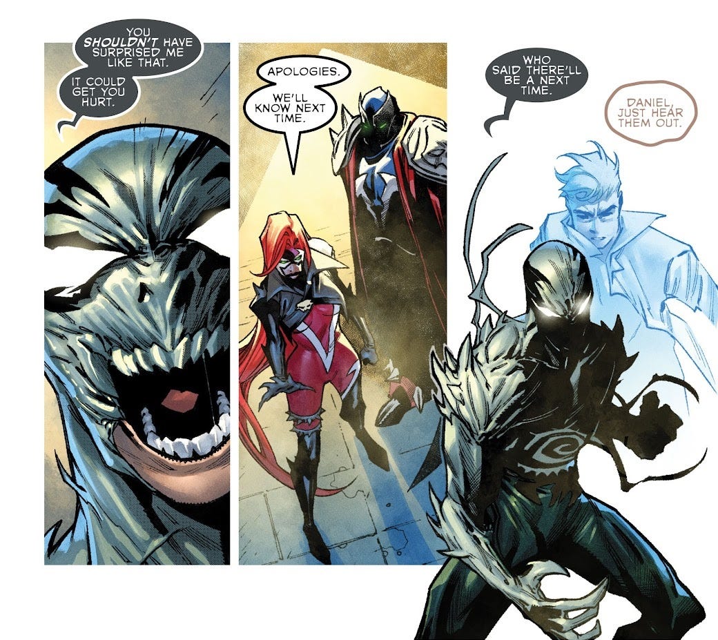
The Scorched #26 features the character of She-Spawn dealing with the return of an old enemy from her time as a black ops soldier; together with Medieval Spawn and Redeemer, she tries to recruit Haunt, only for Spawn to interrupt them just in time for Spawn #350’s big event. By issue #27, all this stuff is apparently resolved, and we’re in an entirely new situation, with all except Haunt having lost their powers due to the dead zones, as they try to hide from agents of She-Spawn’s old black-ops boss. John Layman’s script is clumsy, with superfluous narration and stilted dialogue: “Why does a cat play with a mouse before crushing it? Revenge needs time to really satisfy.” Here’s a guy whose working model of cat mentality comes from Tom & Jerry. Artist Stephen Segovia has a pleasingly angular style that leads to energetic action, carried by Robert Nugent’s strong lighting work for gunfire and blood splatter.
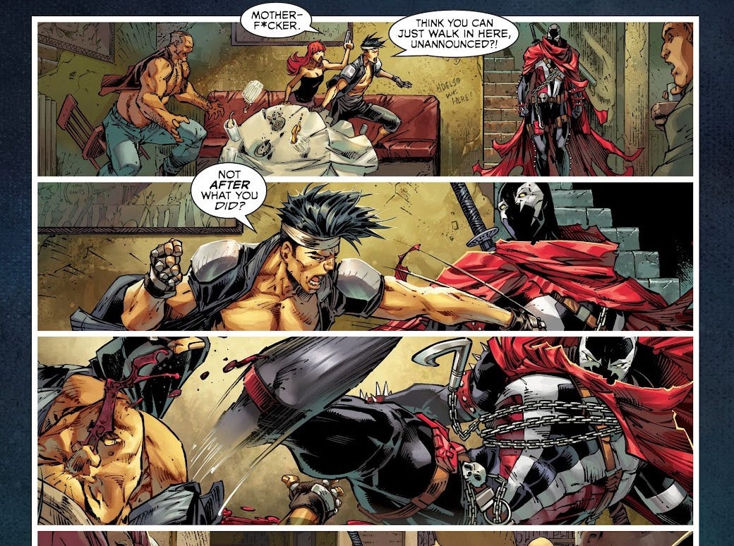
In Spawn #351, we follow Spawn as he tries to track down a cure for vampirism, for reasons which weren’t exactly clear to me. He visits Purgatory, a basement bar that serves as a neutral watering hole for beings of heaven and hell alike—cute idea! He also gets in a couple of fights, while a few pages are devoted to B- and C-plots with the villains. Unsurprisingly, it seems that the biggest talents are being put to use on the main Spawn series: Rory McConville’s script is technically strongest of all these issues, on a craft level, while Brett Booth’s art is closest to what I imagine McFarlane’s own work is like, Daniel Henriques’s inks are precise, and Jay David Ramos’s colours have kind of a ‘90s feel with the benefit of having had 30 years to stop being Like That.
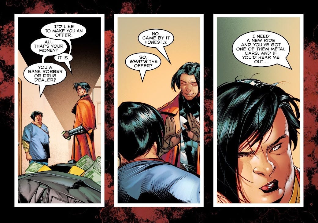
McFarlane seems to just be doing what he wants over in Gunslinger; issue 29 sees Gunslinger cooped up in a motel, struggling to heal, where he forms a friendship with the cleaner, Linda, after he fends off some crooks. Although McFarlane clearly isn’t that good a writer in terms of his prose and dialogue, the story itself has a bit more of a spark to it than any of the others. Gunslinger’s intervention on Linda’s behalf prompts some simplistic but nonetheless charming gender commentary, as Linda pushes back on his white-knight behaviour. A few pages of flashback give Carlo Barberi some action to work with—I particularly like the way he draws Gunslinger’s wounds—while Ivan Nunes renders the whole thing in complementary blues and oranges, which feels like cheating but very much does the job. Perhaps the strangest artistic choice in this issue is the panel where Gunslinger “opens his jacket, briefly flashing his guns and knives”—something we don’t actually see, it’s just told to us in narration, while we look at a close-up of his face! Odd, misguided, but weirdly it kind of works?
Of these books, Monolith #1 impressed me least. Part of a slate of New U titles set in the Spawn Universe but spanning a range of genres and timeframes disconnected from the central Spawn storyline, Monolith is about a new hellspawn in space in the far future. If you’d told me this was a Doom title, I genuinely would not have batted an eyelid. Sean Lewis delivers some shockingly poor narration, like this: “Now all he has to do is wait. The tactic is clear. Get the prison guards to open its gates in an attempt to send something in; their troops. When in fact, he wanted them to open the gates so something could get out; him! So, he can hunt down the stench he’s just smelled.” The stench he’s just smelled! If you’re wondering if this stench is established on the preceding spread, or is leading into something on the second, no, it’s just a horribly clumsy way of saying that Monolith has sensed his enemy. Because he’s, uh, smelled his stench. Valerio Giangiordano’s art is very detailed, but struggles with awkward compositions and poses, while Ulises Arreola’s colours are often clashing.
In terms of letters, Tom Orzechowski on Spawn and Gunslinger makes some odd choices in terms of variable font size and colour for emphasis; one of Linda’s speech bubbles has words in red, green, blue, yellow, and purple for some reason? C’mon, pal, this isn’t House of Leaves. Some of his tails also seem a bit too short and stubby for my liking. Meanwhile, The Scorched and Monolith are farmed out to AndWorld Design, and the letterer there seemingly couldn’t even be bothered to vector-in their own tails for the speech bubbles; most of them just have a random isosceles triangle jutting out from wherever, while others use a stock lightning-bolt shape. Dreadfully lazy work. The thick strokes they apply to the bubbles are also unusual, a good fit for the heavy inked outlines on Segovia’s work but not for the fine detail of Giangiordano’s. Still, I felt like the radioactive yellow cover dress across most of the line would have really made them pop on the stands, and definitely drew my attention.
The Walking Dead Deluxe #84-85 (of 193)
So, The Walking Dead is the only series from my 100 comics that I’ve actually already read. Alongside Invincible, it was one of the series that got me into comics as a teenager, on the recommendation of a friend in the year above me. The 48-issue Compendiums that Skybound released were an easy Christmas present I could get my parents to get me as they came out; both my brother and my dad would read them once I was done. They left a big impression on me because they were immediately much more mature and sophisticated than the kinds of stories I’d been allowed to engage with up to that point. It wasn’t long, though, before I discovered the web serial Worm, which I felt “solved” the superhero genre as a whole (and is substantially better than Invincible), and since then I’ve been much more focused on the webfiction scene—which means that Kirkman retains the dubious distinction of having written more of the comics I’ve read than any other writer.
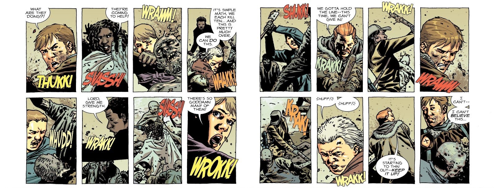
In his commentary for issue #85, Kirkman says: “The Walking Dead is a soap opera. That’s really apparent in this issue. It’s something people say as a negative to criticise the comic [but] that was the whole idea.” I’m one of those people! I think that Kirkman is a fantastic soap opera writer. But it’s not a mode of storytelling I actually have that much patience for.
Like, there’s this tension to The Walking Dead, which is hard to notice at first, but becomes hard to ignore the longer it goes on. In a lot of respects it’s a rationalisation of the zombie apocalypse story, right? It’s not caught up in its own lore, it’s preoccupied with the object-level logistics of surviving in a zombie apocalypse. It takes the approach that nothing is sacred, nobody is safe, anyone can die. Early on, it establishes a lot of crises used to drive the plot, while working towards a long-term goal of having these survivors find a safe haven for themselves. The mechanics of how they work towards that goal are fairly simulationist: they’re always trying to find the best solutions to their problems, as real people would.
The tension, though, is that despite this grounded tone, there are in fact strong narrative forces being exerted on the events of the story. The main thing is that Rick Grimes, as the protagonist, is “safe” in a way that the other characters aren’t. But secondarily to that, the story needs to generate conflict for Rick, and it has two options: introduce extant threats, or turn some of the established cast against him. Rick is a flawed guy, he makes some mistakes, acts selfishly, and most of all makes his decisions unilaterally—and the narrative brings him consequences, sure, but simply by nature of the fact that it’s his story, he always gets the last word. These narrative cycles eventually create an ineffable sense that, if only Rick beefed it, maybe the rest of the characters would finally get some damn peace.
Issue #84’s commentary gives a tantalising look at a different version of the series, which would have been half as long: having finally found a safe haven in Alexandria, Rick’s optimistic speech would cut to an image of a statue made in his honor—only for the frame to pull back, revealing the post-apocalyptic settlement to be ruined, as a zombie passes by. I get the impression Kirkman came to feel this ending was sophomoric and unsatisfying, once the time came—but you know what, it is cool! It gets to have its cake and eat its brains too. For me, personally, I think that if the series had been just 84 issues long, I’d look back on it much more fondly. It’s not to say that there’s ever a big dip in quality, because Kirkman is one of the most consistent writers I know of—just that what follows is mostly variations on a theme, and I think 84 issues would have been enough for me to say, “Okay, I get it!”
Anyway, regardless of my mixed feeling on the series itself, I find this kind of behind-the-scenes commentary fascinating and wish that more writers would do the same. These Deluxe reprints pack in lots of letters from readers sharing their passion for the series, which is genuinely nice to see. Of course, the main difference is that the comic is colourised this time around—which, truth be told, is a downgrade in my view. The idea of seeing The Walking Dead in colour is an interesting thought experiment, and I think Dave McCaig has taken a just-for-fun attitude to it, but I worry that readers coming across the series in the future will assume that the colourised versions are “definitive”, which would be a shame. The stark inks of Charlie Adlard’s work are a huge part of what gives The Walking Dead its brutal impact. Intended to be seen in black-and-white, it sort of doesn’t work to colour in the whitespace: the pages end up dominated by the black areas. McCaig has taken a stylised, muted approach to the colours, which I think is at odds with the realism of the artwork and the beat-to-beat storytelling. The only upside, in my view, is that it’s much easier to tell the characters apart this time around!
Each of these Deluxe issues also has a new cover, but Adlard’s original one is presented on the back cover, which is nice. Rounding out the package is a two-page comedic “Small Bites” strip by Derek Hunter, which renders the characters in a cartoony artstyle, riffing on the events of the comic. It’s a welcome bonus but obviously inessential.
The point is, though, that just reading these issues of The Walking Dead Deluxe made me want to re-read the whole thing. And, for someone who’s already read the series, they do bring something new to the table, so that’s nice.
G.I. Joe: A Real American Hero #304-305 (ongoing)
Last year, I read the first fifty or so issues of Larry Hama’s G.I. Joe: A Real American Hero, and was forced to admit that Marvel’s G.I. Joe comic was much better than their Transformers one. While it’s still a toy commercial, Hama is such a deft serial plotter (much like Kirkman, he’d be right at home on a soap opera) that he’s able to take the obligatory product-placement in stride. His time served in the Vietnam War gives his military storytelling a level of undeniable verisimilitude, with a slightly satirical bent, and he’s got genuinely solid comedic sensibilities.
Over forty years and three publishers later, Larry Hama is now at Skybound doing the same-old, same-old, and it seems like he’s still got it. Again, because of the whole soap-opera thing, the status quo feels hardly changed: Cobra Commander is operating out of fascist-Americana model town Springfield, fending off the dissident elements of Serpentor and Destro—whoever wins, America loses, right?
Snake Eyes and Scarlett have staged their own deaths using the meatball sauce from an MRE as fake blood. There’s also a female Snake Eyes, Dawn Moreno, who’s being harboured by her semi-brainwashed parents in Springfield while she tries to spy on CoCo. Dr. Mindbender has created a fake Zartan to try and dupe Destro and Baroness. After three-hundred issues Cobra still hasn’t worked out how to get into G.I. Joe’s massive underground headquarters, the PIT, so they’ve sent some cybernetically-enhanced Vipers to find the entrance; one of them pulls the pin from a nerve-gas grenade, but Spirit is able to hold the spoon (the handle bit on a grenade, as this comic has just taught me) in place long enough for Multo to hack off the cyborg’s hand and re-insert the pin. Like I say, this could not be more business as usual.
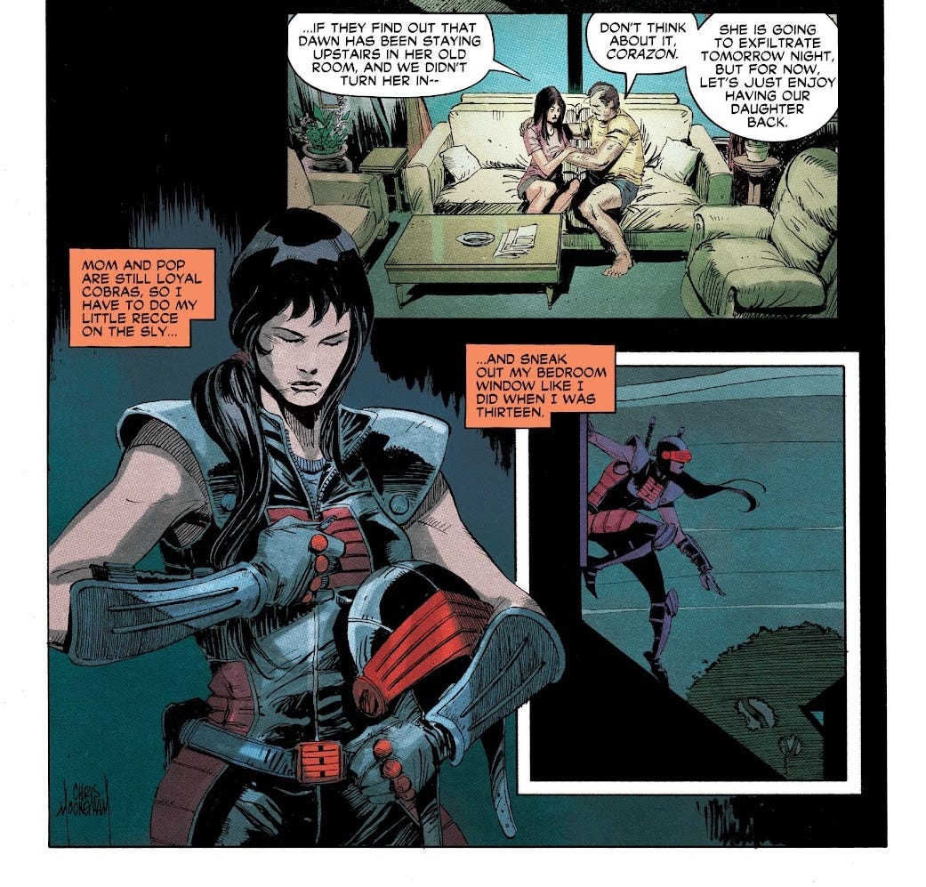
Girl!Snake Eyes is the emotional core of these issues, deep behind enemy lines and relying on her parents not to give her up, while her abilities are tested by Serpentor’s mutant Vipers. She gets relatively few pages in the scheme of things, but that’s not a problem—the fact that there are so many characters and plot threads creates a sense of variety and keeps things moving at a good clip. Between issues, the dialogue slyly refreshes you on what’s happening, making the stakes clear at all times without relying on clumsier forms of exposition. If you’re a lapsed G.I. Joe fan whose interest has been piqued by Skybound’s relaunch, but are worried about not having the context of over a hundred issues published since the ‘80s Marvel run ended—genuinely, I think Larry Hama’s got you covered. Here I am jumping in at #304 and I had no problems.
Chris Mooneyham’s art employs some heavy inks that really sell the moody scenes. It’s Francesco Segala’s colours that really impress me, though, particularly his careful use of halftone to make the book feel like a direct evolution of the newsprint format of the ‘80s Marvel run (tangentially, Skybound has also made the effort to use newsprint for their reprints, which looks and feels fantastic). As I mentioned earlier, Segala is the most prolific colourist across my 100 comics—I forgot to mention his work on Red Sonja, so distracted I was by the Red Sonja of it all—and I think it’s fair by now to conclude that he’s got the goods. Pat Brosseau’s lettering is understated, blending sound effects into the artwork as much as possible and using tried-and-tested conventions for whispering, radio chatter, and robotic speech; I particularly like Alpha-001’s speech, which is slightly blurred, really selling a vocoder vibe. I’m not sure if IDW was putting this kind of talent on Hama’s scripts while they had the license, but it’s really nice to see Skybound take such care over it.
The Cabinet #1 (of 5)
Okay, we still have 21% of my 100 comics left to get through, and they’re all single issues from here on out. Often, a single issue just doesn’t feel like enough to review a whole series—but with The Cabinet, I could’ve done it from just a couple of pages.
Apparently, The Cabinet comes from Image Comics’ “Syzygy Publishing” imprint, run by ex-IDW creatives Chris Ryall and Ashley Wood, whose series Zombies vs Robots was one of the first indie comics I remember reading (lovely art, utterly inscrutable story). I can’t find any mention of The Cabinet on their website, which doesn’t exactly inspire confidence. In press releases and in a gushing letter printed at the back of this first issue, writers Jordan Hart and David Ebeltoft talk about discovering an antique “kabinettschrank” in a museum and being immediately convinced they had a hit story on their hands for some reason. This letter goes on and on, yet somehow communicates absolutely nothing of substance; the best way I can describe it is that it’s like the Key & Peele “Continental Breakfast” sketch in text form.
I’m sort of coming at this backwards here, starting with all this paratextual stuff. The truth is that I read the issue blind and I could guess exactly what the paratext was going to be like. And vice versa: if I’d just read the press release, I would’ve known exactly what the comic would be like. It’s a comic where everything about the presentation—about the very fact that this comic has been produced at all—implies that there should be a baseline competency to the script, a sort of workmanlike paint-by-numbers adequacy. But despite all the enthusiasm of the creatives behind it—and these aren’t first-time writers, nor artists giving it the ol’ college try, these are professionals who are supposedly passionate about writing—they seem to struggle with basic prose, dialogue, structure, and even just coming up with good ideas in the first place. As an attempt at sequential storytelling, this is an outright embarrassment.
Some of the problems are outright mistakes, cases where basic conventions of the medium have been misunderstood or overlooked. Page 1 opens in media res, and it’s only on Page 2—squirreled away on the right, near the centrefold, easy to miss—that we’re given a date marker, 1984. But because this comes over a page turn, and the scene has changed from an interior to an exterior, this creates the impression that only Page 2 onwards is set in 1984, and the first is set in some different timeframe—because that’s how date marks usually work! The first issue is in fact set across multiple timeframes, because we cut to 1991 later. So why defer the date marker, if it matters?
Artist Chiara Raimondi has exacerbated the problems with her colouring; on Page 3, the colours change entirely, with no visual continuity whatsoever from the preceding panel. Is this another, different scene? No, it’s all one sequence. On Page 4, the bottom of the page is a random diagram of how to tie shoelaces. These shoes turn out to belong to a random villain on Page 5, which is coloured entirely differently—except this time, Page 5 is a different scene, taking place outside. So why is the shoelaces-tying scene coloured and presented as part of Page 4, like it’s happening in that scene? And no, the shoes aren’t relevant at all, because of course they aren’t.
On Page 15, Avani is surprised by a security guard, prompting her to exclaim “Trent!”— which looks like she’s recognising the security guard, and there’s a close-up of the guard getting punched in the face, by what we assume is Avani’s fist… but then it turns out actually Trent is a hitherto-unseen and -unmentioned sidekick, and he’s the one punching the security guard. All of these missteps somehow went through two writers, the artist, and editor Chris Ryall, who’s been doing this stuff for decades and should really know better.
I promise this isn’t a skill issue. I handed the book to Lizzie, and she was tripped up on pretty much every page; she couldn’t make head or tail of what was going on. The dialogue itself is just as disjointed as the panel sequencing, prone to non-sequitur. It’s also just bad—as in not fun, or interesting, or even just anything remotely like how people talk. There’s an excruciating scene where the main character is talking herself into pricking her finger: “You can do this. It’s needed. And it’s just blood. Like tropical punch Kool-Aid. But, like, in my veins. And you know this blood. It’s your friend. It pumps your heart and—” It can’t even keep straight whether she’s talking in second person or first person.
On Page 8, we see a fuse getting lit, which on Page 12 turns out to be leading to a large cache of C-4 (literally just drawn as a few randomly-sized crates and barrels marked “C4”) buried beneath the house. Page 12 has an unconventional but not particularly original composition where the whole thing is turned 90 degrees on its side, to create a landscape splash page showing the cross-section of the house. However, the actual drawing itself is full of pointless negative space: the night sky, the side wall of the house, a plesiosaur skeleton underground for no reason, dirt. The big moment of the explosion itself is reduced to a tiny inset panel of a mushroom cloud in the bottom-right corner of this image… except because the whole thing’s turned 90 degrees anticlockwise, this ends up being the top-right corner, effectively no-man’s-land in terms of the page flow. It’s mostly a script problem, admittedly—I dread to think what the art direction was like—but any competent comic artist would nevertheless have been able to construct a good composition from these elements. To start, it probably would have been better in portrait.
Trent and Avani have some presumably-intended-to-be-banter over whether Trent’s names for his wrench weapon—first “the Violator”, then “the Chastiser”—sound “pervy” or not. They have a back-and-forth about how to tell whether a coin is nickel or silver. None of these exchanges feel like they tell us anything about the characters, and they don’t relate to the narrative on any kind of thematic level. Trent is not seen to use his wrench at all. Again, there’s that sense of these two old guys sock-puppeting their strong female protagonist with an attitude, seemingly without any understanding of the emotional reality of any young woman, yet alone a specific young woman we’re supposed to care about.
This might be the worst of my 100 comics so far? It makes me cringe so badly that it’s practically an out-of-body experience. Ebeltoft and Hart self-reportedly had a lot of fun batting this story back and forth, but absolutely none of that fun has made it onto the page. The fundamental premise of this magical “kabinettschrank” is just nothing, I’m sorry. It’s not charming, it’s not whimsical, it’s not meaningful, and it’s not even particularly original. It’s what happens when you get two guys who want to make a comic but have absolutely nothing of meaning to share with the world.
Precious Metal #3 (of 6)
This is another comic from Darcy Van Poelgeest, who wrote Lotus Land, which we discussed earlier. Yeah, it’s basically just more of the same: utterly inscrutable cyberpunk nonsense, pure vibes, an amorphous story with nothing to hold on to. There’s another missing (dead?) girl. This is apparently a prequel to the creators’ earlier series, Little Bird, and I’m coming in at issue #3, so I really don’t stand a chance of being able to summarise it, sorry. The premise appears to be that in this world, there are “mods” that can change people’s biology.
As such, Ian Bertram’s artwork is basically on a biological acid-trip, full of veins and vein-like imagery, unfolding, undulating forms. Bertram’s style has been compared to famous French illustrator Mœbius, and it definitely strikes me as having a Euro-comics sensibility to it, well outside the American comics tradition. Call me crazy, but it’s not, like… good, though? Much of the problem is Van Poelgeest’s fault, because he seems to struggle with basic, comprehensible sequential storytelling. But Bertram’s figures are awkward and offputting, and he makes quite limited use of perspective; characters are always either face-on or side-on, like ancient Egyptian paintings. There’s a bizarre mix of painstakingly-applied textured linework on cartoonish, oversimplified designs—like a modern Pixar film or Alita: Battle Angel, with photorealistic skin and hair stretched over characters made of balloons.
On the bright side, Hassan Otsmane-Elhaou nails the letters as always. I’ve already mentioned all his gimmicks on display in this one—truth be told, he doesn’t get much to do with this script. Graphic designer Ben Didier has done some great work on the cover dress, carrying forward the cube motif from inside the story to the titles themselves; it’s a very slick presentation. But as striking as the comic appears on first impression, I get the sense that it’s meant to be looked at more than read.
Edenwood #4 (of 5)
I sort of got tripped up by the fact that, coming in at issue #4, I had no idea what the present-day timeframe of this comic looked like. It opens on a flashback set “three years ago”, but Page 2 follows a scene transition and has the characters talking about the past, which made me assume the scene was set in the present. In actuality, it’s just one timeframe, and the flashback beginning on Page 5 is actually a flashback within a flashback, going another 25 years earlier. It’s only on Page 10 that we arrive back in the series’ present-day timeframe.
So to try and summarise: Bastille (secretly a demon) is injured and seeks treatment from a witch, Ajinte, who agrees to treat him on the condition that he never wear his magical armour again. Meanwhile, Henrietta (a vampire), Rion and a here-unnamed redhead (both humans, I think) wait in a graveyard. However, they notice that some of the grave markers are for witches, all slain by Bastille! Rion refuses to believe it, but then Bastille returns, still in armour, having decapitated Ajinte as soon as she finished healing him. He admits to being a demon and explains how he got the armour from a dying witch, Jean Luc, long ago. Henrietta flips out, removing the cloak that suppresses her vampirism (?) and attacking Bastille, but Rion stabs her; I presume that in vampire mode Henrietta would’ve killed all of them. They leave a grave marker for Henrietta and carry on. In the present, Rion (having now inherited Bastille’s armour somehow) is in something called a “game room”, which appears to be some sort of illusory space. He’s confronted with a vision of his parents, then attacked by a series of adversaries—with the final one being Jean-Luc, returned to reclaim the armour.
The dialogue namedrops a lot of characters who don’t seem to appear, presumably killed off in previous issues, so I struggled to keep track of it all—again, not really the comic’s fault, it’s 100 comics. Although I find the overall structure of the issue a bit clumsy, Tony S. Daniel nevertheless seems to have a knack for dialogue. The back-and-forth between the characters is humourless, fitting their dire circumstances, but has an intensity of feeling that really comes through in the strong vocabulary and clipped sentences. Taking into account the fact that Tony is foremost an artist, I think it’s strong work. His lines in this issue are faultless, with fierce expressions and strong inks. “None of this puts me in a good light,” says Bastille, rendered practically as a silhouette as the witch’s headless body falls before him.
Supporting Tony are Leonardo Paciarotti, whose colours demonstrate great rendering but don’t really find a strong tone overall, and Nathan Kempf, who doesn’t get much to do with this script but maybe struggles to seamlessly integrate his sound effects with the art.
To be honest, the story and aesthetics overall do nothing for me, but that’s purely a matter of personal taste. The overall genre of the series seems to be a young-adult fantasy-elements-in-the-modern-world story, with mentions of algebra class amidst all the swords and sorcery. If you’re looking for a creator-owned book and like that sort of thing, you could probably do a lot worse than this series?
Quest #4 (of 5)
Fully the first seven pages of this comic are devoted to one of the worst-looking fight scenes I’ve ever seen, where a large band of heroes slay a trio of moderately-sized insect-like demons with flower heads that look like vulvas. It’s not until Page 17 that the yonic imagery of these demon is briefly addressed, when one of the characters makes up a (god-awful) campfire song about the fight. So far as I can tell, it serves absolutely no thematic purpose. If it’s a fetish thing, the art is so awkwardly-drawn that I genuinely could not tell you if the intent is to titillate. If it’s not, then, well, here’s seven pages of drawings of fantasy characters stabbing and slicing giant female genitalia, and you can read into that what you like.
Luna handles nearly all aspects of the comic’s production, and he’s no good at any of them. He’s joined by co-writer Crystal Wood, and laughably, it separately credits “story and script assists” (Luna) and “story assists and script” (Wood), as if either aspect of the writing of this issue is something anyone would want to take credit for.
Apparently, one of Jonathan Luna’s most high-profile series was a collaboration with his brother Joshua, on a comic called Girls, which is (from the Wikipedia summary) about a small town which is “attacked by a group of naked, flesh eating, egg-laying women [and] a giant sperm-like monster”. Much of the plot apparently involves the men revealing that they just couldn’t help having sex with the titular Girls. The Girls only kill women, because they can’t have sex with them. This sucks! It sucks so bad! I’m not a prude, this isn’t about that. As a work of art, it’s not challenging or anything like that, it’s not transgressive. I reject the premise. It’s transparently misogynist.
Anyway, the first 12 pages of this comic are set in a forest, and every single panel is given what may as well be the exact same background: a few thin, straight tree trunks, and a couple of layers of a generic “leaves” Photoshop brush slathered over a pale sky. Just look at it! Christ! There is no sense of spatiality to anything—and you can’t exactly have the comic hinge on a seven-page fight scene without situating the fighters in their environment. There’s no point me talking about the remaining ten pages, because nothing happens in them.
Luna’s colours in general are atrocious, nothing more than toneless flats with a uniform line of pale-blue edge shading applied to nearly every upper outline. Sometimes he treats himself to a radial gradient of that same blue, just sort of put wherever. His lettering is also completely amateur work, often spacing out the individual letters of the sound effects with huge gaps, in a way that Luna presumably thought looked cool but which assuredly doesn’t. His stacking6 is mostly correct, but, like, listen to me— “his stacking is mostly correct”, that’s the nicest thing I have to say about this comic.
Even the name of the series just says it all, doesn’t it? “Quest”. They may as well have titled it “Comic”. Not an ounce of imagination on the cover, and none on the pages either. It’s frankly embarrassing that Image Comics thought this was good enough to put out the door. Like, I’m presuming that they’re not legally obligated to give five issues and a trade paperback to anyone who sends them an email, right? Someone actually looked at this and thought, “Yeah, it’ll do!”
the DEViANT #4 (of 9)
Ooooh, this is comics! I can kind of see what the buzz is with James Tynion IV, in this one. This is a horror-slash-true-crime story centred on someone who killed some teenage boys while dressed as Santa Claus, in the 70s. In a metatextual slant, our protagonist, Michael, is a comic book writer fascinated with this killer, Jeffrey, who was arrested but maintains his innocence. The comic contrasts the protagonist’s life as an openly-gay young man in a relationship in the present, with the killer’s closeted experience at a time when homosexuality was illegal.
This particular issue opens with a flashback to 2019, where Michael and his boyfriend leave a rave early, as Michael is too preoccupied with the proximity of the apartment where Jeffrey committed the murder-cannibalism. Despite Michael’s slightly creepy behaviour, there’s a genuine warmth between the two young men that comes across in their dialogue and body language; they feel quite well-realised.
In keeping with the comic’s overall prestige feel, a whole extra double-spread is added just for the title, barely legible against the black night sky, as cars pass beneath. Kind of gimmicky, but effective!
In the present (well, 2023), Michael is interviewing Jeffrey in prison, discussing the letters the serial killer often receives from gay men. Jeffrey is a magnetic presence, and again there’s a palpable tension between him and Michael. But outside, Michael is assaulted by some older guy named Paul, who… seems to blame Michael for another Santa killing, maybe? His accusation of “I know what you are!” is juxtaposed against a full splash page of the masked Santa wielding a bloody axe, and his screaming victim. Again, incredibly effective.
Finally, we have a scene where Michael’s boyfriend talks to a detective in their home. Their interaction is full of lifelike little details. It’s clear that there’s some distance and tension in the relationship, stemming from Michael’s obsession. On the last page, the inevitable twist: that in Michael’s closet, there’s a mask and a folded-up Santa suit, covered in blood.
I found Joshua Hixson’s artwork to be kind of simplistic and sketchy, with heavy marker, more like what I associate with commercial pre-visualisation work than with comic art. Nevertheless, his figures and expression are very solid; if he’s relying on reference, then he’s making good use of it. There’s a near total absence of sound effects, as this is a very talky comic, but Hassan Otsmane-Elhaou is very careful with his speech bubble placement to highlight the negative spaces in the artwork, which I think adds to the feelings of distance, isolation, and alienation present in the story. Everything is just working together seamlessly, and the sequential storytelling is spot-on; it spends a lot of time on throwaway details, but manages never to feel vapid or decompressed.
Situated at the end of the first trade paperback, this issue apparently marks a major turning point where Michael is implicated in a copycat crime. I’m genuinely curious as to how the mystery works out in the end—if this even is even operating as a murder-mystery in any sense. Maybe the Santa is actually a horrible supernatural force! Maybe it’s just a guy! In the world of 100 comics, there’s no way of knowing.
The Bloody Dozen: A Tale of the Shrouded College #4 (of 6)
So Page 1, I could tell something was up. Sometimes you just look at a drawing and are like, hm. Page 7, and yep, I’ve worked it out: all the female characters in this book have just massive tits. Really I think there are three types of comic artist: those who are bad at composition, those who are good at composition, and those who are good at composition but only in the hyperspecific sense that they can always draw women’s cleavage jutting face-on out of the panel regardless of how they’re posed, what they’re wearing, what’s happening, or anything. Again, I don’t like coming off as a prude—but it’s all about context, isn’t it? This isn’t a horny story, so far as I can tell. If you swapped Alberto Jiménez Alburquerque’s work on this comic with Alessio Petillo’s work on Red Sonja, you would improve both comics immeasurably.
We actually saw his art already, on John Carpenter’s Toxic Commando, and I didn’t notice it then, but looking back—oh, yep, every single background character has crazy tits and a spine twisted at 90 degrees. There’s a bit in this issue where they’re getting hailed by someone on another ship, and she appears as a holographic talking head in the cockpit… except it’s not just her head, no, it’s specifically her head and her boobs. This creates a kind of “boobonarrative dissonance”.7
Anyway, sorry, normally I like to start off by trying to catch up on the basic premise so I can get abreast of— I mean, work out what’s happening, so I can give you a summary, but in this case I got distracted. Uhh, so there’s a group of immortal vampires, the titular— the SO-CALLED The Bloody Dozen, who we meet in flashback this issue. Because they live forever, though, this comic is set in the far future and humanity is in space. I actually recognise the writer, Charles Soule, from having written a bunch of Star Wars comics that I haven’t read, so I guess he’s playing to type here. Three astronauts—a cross-generational family team of grandfather, mother, and daughter—are given the mission to break the vampires out of a prison orbiting the sun, and in this issue they’re flying back to Earth, only to run into complications when a group of “Artisans” (robots?) attack them.
The story is… ehn, I can see the idea, “space vampires”, very cute, but I can’t say this issue impressed me in terms of the execution. It’s very melodramatic. The grandad has an angsty history as a killer for the government. He blames his daughter-in-law for the death of his son. His granddaughter has been abusing painkillers since getting injured in Afghanistan. All three of these characters just sort of suck. As for the vampires—well, in an author’s note at the end of the issue, Soule remarks that he’d intended to use the flashback this issue to let us connect to them as people, but the truth is that they have virtually no characterisation to speak of. A few of them are in love. Whatever? C’mon, I need specificity.
Soule self-admittedly isn’t doing anything too deep with this one—rather, he intends it as a riff on existing tropes and genres. Much of his commentary implies an attitude of “well, X did it one way, so I’m doing it this way instead”. It’s a fairly mechanical approach; he says that as this is issue #4, two-thirds of the way through, it marks the end of Act 2, which is what prompts the big crisis and cliffhanger. Without a clear artistic impetus or personal touch, Soule’s character writing just isn’t rich enough to carry the story. It’s clear that he’s aiming for a fairly bombastic action-heavy series on the whole, but even the big action sequence in this issue didn’t leave much of an impression on me—though again, that may be Alburquerque’s fault, as he struggles to sell key beats, such as an explosive decompression that really should make a much bigger impact. The Shrouded College slate is apparently planned to be a set of seven standalone series like this one, set in the same universe, but if this issue’s quality is typical of the series, I see little reason to bother with any of it.
That said, Rachelle Rosenberg’s colouring is solid, with some bold hues and lovely soft rendering. I also like the messed-up speech balloons Chris Crank employs for the vampires while they’re locked in their coffins, colour-matched to their dialogue in the flashback. It’s the little things!
The Holy Roller #4 (of 9)
God, I know I suck for this, but this is one of my favourites so far. I’ve talked about this phenomenon already, but this really, truly is a case of a comic where its only purpose is to be a pilot for a feature film. Seasoned writer Rick Remender (whose work on Uncanny X-Force and Tokyo Ghost left a big impression on me as a teen) has teamed up with Andy Samberg of all people (The Lonely Island, Palm Springs, other stuff I don’t care about) and Joe Trohman (Fall Out Boy) to write a balls-to-the-walls new concept for a superhero story.
It’s a bowling comic: Levi Coen (drawn with Samberg’s likeness and named for the directors of The Big Lebowski) is a pro bowler who fights Nazis by lobbing killer-gadget bowling-balls at them. This issue begins with a series of very episodic vigilante encounters, where we come across some neo-Nazis harassing people over their race or sexuality, and then Levi shows up, brutally injuring them with his silly balls. We get a brief scene where he reconvenes with his difficult father and his long-suffering friend (who’s making the bowling balls), before heading for the manor-house where the local white-supremacist tech mogul (I guess this is another CEO story?) is convening all the Nazis, setting up issue #5. Looking at reviews, it sounds like preceding issues were largely much of the same.
On paper, this comic is painfully bad, but in practise the thing is that it’s really funny. It’s got a very high quip density, and when the quips aren’t so good, there are quips about the quips. “Who the hell are you?” / “Would you believe I was bitten by a radioactive bowling ball?” Somehow, despite having three credited writers, the narrative feels like a consistent and cohesive whole, with a clear vibe it’s trying to communicate about the social tensions of our time.
Put frankly, I think a lot of superhero comics rely on prejudice as a convenient plot device to remove the moral complication of vigilantism, in a way that often can come off as cartoonish and oversimplified, not seriously interested in engaging with the psychology of evil. This comic isn’t interested in that either, but as it’s not trying to achieve any sort of grounded pathos, it gets away with it just fine. I’m like, sure, make up some guys to get mad at, and bash their heads in.
Artist Roland Boschi genuinely complements the script’s comedy by filling the comic with funny facial expressions; it’s not the crazy level of craft I remember from Remender’s collaborators on the various books of his I used to read, but it’s solid stuff that makes use of good poses and compositions. Colourist Moreno Dinisio really makes Levi into a humorously creepy presence with his bowling-ball helmet, and I like his work overall, though I think he maybe makes excessive use of a white outer stroke to make the characters stand out from the backgrounds; at times, they look like cutouts. We’re also blessed with Rus Wooton on letters, whose sound effects are bespoke to suit the art and sell the force of the impacts—of which there are many.
Blood Commandment #4 (of 4)
The cover for this issue has a big logo for an imprint, “One Man Art Comics”, and unfortunately I think you can tell where I’m going with this. Creator Szymon Kudrański has been a pro comic artist for something like 20 years, but clearly has his own stories he wants to tell, and is here branding himself through a lens of “get you a man who can do both”. The name drives me crazy though—”One Man Art Comics”, just call it “One Man Comics”! Argh!
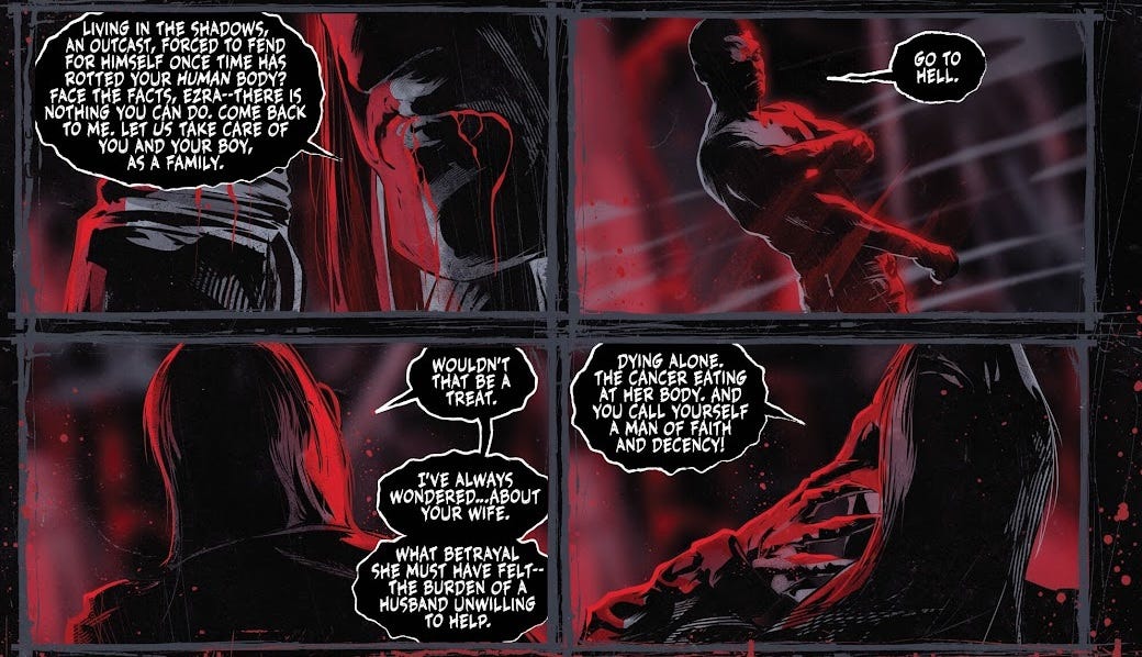
I feel a bit bad ragging on Szymon’s writing, because he’s apparently translating his script from Polish, his first language (editor Atom Morwill is also credited with “translation assistance”). The narration and dialogue have the hallmarks of translation, with awkward use of vocabulary and a generally simplistic, toneless style.
I do think the underlying story also just isn’t very good, though. Our protagonist, Ezra, is a vampire, hiding out with his son, Wil, in the wilderness. With Wil dying, he’s forced to give him a blood transfusion to save his life—making him a vampire in the process, something he had previously refused to do to save his wife, Anna, who died of cancer. Fully six pages go by with no dialogue, instead crammed with narration boxes ruminating on topics like morality, heritage, and God.
These vampires operate under a “bloodlines” rule, where if you successfully kill one of them, all of the vampires they personally turned will revert back to being mortal.8 Ezra finally resolves to confront the one who turned him, Vlad, I think because if either of them die, Wil will turn mortal, sparing him from the curse? Vlad is waiting for Ezra in a bar (in a cute touch, he slits the bartender’s throat to pour himself a drink). They talk for a few pages, with lots of drawings of their stern faces being copied and pasted multiple times to cut down on work. Finally they fight, and Ezra impales both of them on a wooden stake—a piece of jutting timber from the wrecked bar, I think? There’s a couple of pages where a police officer comes across a corpse outside Ezra’s hideout; I’m not sure whether the implication is that Ezra killed him, or Wil, or someone else. The last four pages are given over to Wil reading a goodbye letter from his dad.
Listen, I’m not so hardline on this as to say that all Christian storytelling sucks for the fundamental reason that it’s built on a worldview where there’s such a thing as life after death and also that there are ineffable forces for good and evil in this existence. Again, we need only look at the work of Daniel Warren Johnson, who despite (or sometimes even because of) his Christian faith is able to churn out resonant, interesting, and emotional stories. But there’s definitely a common failure mode in overtly Christian stories, where there’s this fetishization of death and sacrifice, and a belief that everything just sort of balances out in the end, which I have very little patience for these days. In Ezra’s dying letter, he questions why so much of life is suffering, and how to tell right from wrong, and decides that “There is no answer to that… other than through faith.” Which sounds nice and all, but the problem is that none of the thematic machinery of the narrative has actually been working towards this conclusion. It’s begging the question. Kudrański, in his worldview, simply takes as given that faith is the answer, and he’s not a skilled enough storyteller to “show his working” in getting there. There are in fact plenty of secular frameworks for addressing morality and suffering, and I think strong religious storytelling is able to deeply engage with a secular mindset to strengthen the theological argument. The closest this issue comes is a beat where Vlad says something like “Aha, your bible says that you shouldn’t lie, but you haven’t yet told your son about vampires, which is sort of like lying—checkmate, Christian!”
Sorry, I know this is Substack, not Reddit, that’s enough of that. How about the art, hmm? I’ve already mentioned how Kudrański likes to make fairly liberal use of copy/pasting, so you shouldn’t be surprised to hear that he also likes tracing. The police officer at the end of the issue is blatantly drawn with Amy Adams’s likeness; I presume the other characters are as well,9 I’m just bad with faces. I find it really weird to make use of real actors in a comic like this—unless they’re actually involved, Samberg-style. The comic overall is nearly monochrome apart from splashes of red, which I think adds to the impression that it’s been photobashed more than illustrated. Artistically, it just strikes me as lazy and unappealing, with dissonance between the script and visuals and a very poor sense of spatiality. To be crystal clear, I’m seeing stock photography, not AI, but this strikes me as an artist who would very much see the appeal of AI and start using it as soon as he got the hang of it. It’s a sort of bare-minimum approach to getting the story across. There is actually a separately-credited letterer, Marshall Dillon, who clearly doesn’t know what to do with the endless stream of narration boxes, poor guy.
Nights #5 (ongoing)
Man, we’re really getting a lot of vampires, huh. This is one of very few non-franchise books in my 100 comics which is still mid-publication, about halfway through a planned thirty-one-issue run. This issue smacks of being the penultimate part of an arc, and indeed the first trade paperback ends on issue #6. All of the characters are well-acquainted, the stakes are established, and things are blowing up.
One of the most immediately striking things about this issue is that it foregoes to the title page, to have the comic itself begin on the left-hand page instead. Very unusual! There’s only one double-spread splash page, towards the end of the issue. The upshot of this is that it gets to withhold the issue’s title, “Eternal Sunshine of the Vampire Mind”, to the credits page at the end, so as not to spoil what happens.10
Another unusual device is the occasional appearance of song lyrics in the comic itself, karaoke-style along the bottom of the panels, soundtracking the opening scene and a later montage. The songs are named and credited on the title page at the back of the issue, along with a full list of eight tracks intended to soundtrack the whole issue. I’m a sucker for this kind of thing! It’s an interesting one where in TV or film you’d need to pay to license those tracks—but if you’re just quoting them, I presume you don’t? Apparently Nights is getting adapted into an animated series, so I wonder if they’ll try to license the same music at all.
Anyway, this is all minutia. The actual premise of the comic is that it’s set in an alternate 2003 where supernatural beings are openly integrated into human society. Our protagonist is an orphan named Vince, who’s moved in with his cousin, made some kooky friends, and developed a crush on a 185-year-old vampire who looks 19. The romance between them is the main focal point of the comic; in this issue, the gang goes to a waterpark. I think the idea of having a “beach episode” that gets interrupted by the big supernatural threat at the end is a really solid structural choice.
Most of the appeal here is in Wyatt Kennedy’s charming dialogue, which fills the pages with life and specificity. I’m not going to go beat-by-beat, but trust me, it’s funny. I could see myself reading thirty-one issues of this no problem. Although this issue doesn’t spend much time on the worldbuilding—I presume it’s not a focus for the series as a whole—the vibes of the setting feel fairly original and refreshing.
On art duties, Luigi Formisano draws a delightful-looking waterpark and a messed-up-looking vampiric mindscape. He makes great use of visual shorthand from anime—a sweat mark, steam or blood from the nostrils, chibi talking heads, and smear frames. There’s even a panel which looks like it’s trying to replicate the “lightbox” effect of glowing white in anime, though that might be to the credit of colourist Francesco Segala, whose work I’ve already discussed. I’ve also already praised Maria Letizia Mirabella, but she does great work here too—I love the way many of the exclamations pop out from the boundaries of the speech balloons. As this is a very wordy comic, with lots of back-and-forth even in a single panel, she’s really got her work cut out for her.
Obviously, in the scheme of things this is very early days for the series, so I’d be tempted to revisit it once it all wraps up to get a better sense of whether it can stick the landing—but on a micro level, beat-to-beat, all the right ingredients are there.
Geiger #5 (ongoing)
Another sort of confusing publishing situation here: Geiger is a comic set in a “shared universe” called The Unnamed, written by Geoff Johns for his creator-owned company Ghost Machine, which is published via Image Comics; this is issue #5 of the ongoing series, which is distinct from a previous six-issue miniseries under the same title. It’s like, didn’t y’all leave Marvel and DC to get away from all this nonsense?
Ghost Machine makes a big deal of being “the First Fully Shared Creator-Owned Universes!” [sic], which strikes me as an odd thing to make a claim for when Image Comics itself was founded on the idea of a vague shared universe of creator-owned comics. There are like a dozen people listed as having a stake, all of whom have an exclusivity deal with Ghost Machine—is the idea that they all part-own all the comics? I don’t trust it. In a trailer for the group, Johns expressed an interest in creating stories “beyond superheroes”.
In practise, though, Geiger definitely seems like a superhero story. Set in the wake of nuclear war, Tariq Geiger is “The Glowing Man”, who’s joined by the “Nuclear Knight” and a two-headed dog. In this issue, they’re fighting a guy called “The Electrician”, who’s wearing a big suit of armour with built-in tasers. I don’t know, if these characters were invented in the 1930s, maybe they’d be big hits and we’d be looking at an endless stream of summer blockbusters based on them… but we’ve kind of moved past this, haven’t we?
From cultural osmosis, I get the sense that Geoff Johns is a popular writer who’s always made heavy use of fanservice to appeal to your average Joe reading DC Comics. The flipside of working independently, right, is that you have to actually come up with ideas of your own. You can’t rely on any pre-existing cultural cachet. Writing The Unnamed, Johns appears to have filled his toybox using the various wars in American history—but at least in this issue, I can’t discern any sort of thematic significance emerging from this basic iconography. You could substitute that motif for anything else, and it wouldn’t matter, because Johns just sort of wants to write fights, classic hero-vs-villain stuff. The Electrician’s personality is that he’s a sadist. Geiger’s personality is that he doesn’t have one.
There’s a sort of wannabe-rational-fiction sensibility to Johns’s plotting: Geiger keeps his nuclear powers in check using control rods, so The Electrician hits him with boron dust to nullify his powers entirely. Later, Geiger hits the fire alarm, thinking that the water will short-circuit The Electrician’s suit—but aha, The Electrician has anticipated it! “You think I’d allow my electrical suit to be vulnerable to water? That I’m not insulated? Grounded? Protected?” And I’m like, okay, are we doing a clever fight scene, or are we doing the equivalent to playground make-believe where we say “actually I’m fireproof, numb-nuts!” I’m bored of this kind of deconstruction. Again, Worm set the bar for superhero fight scenes back in 2011. Either give me a compelling story, or think hard to come up with an object-level plot that’s actually clever. They win by pushing The Electrician into a meat grinder. Am I supposed to clap because the meat grinder was in the background earlier? What’s the point of any of this?
Gary Frank’s artwork is something, at least. He conveys the dark, dingy interior of the hot dog factory well, he draws some very intense expressions, it’s always very clear what’s going on. I was mostly lukewarm on Brad Anderson’s colouring, but the panels where the whole room is lit up by crackling electricity are fairly effective. Rob Leigh’s letters are mostly fine, but I don’t like the way he renders The Electrician’s laughter as a very stock-looking sound effect.
Considering this is the tentpole title from Ghost Machine, I can’t say it bodes well for the longevity of the collective.
w0rldtr33 #7 (of 16)
So far as I can glean from this interview and online sources, w0rldtr33 is about a group of dorks who come across something called the “undernet”, a supernatural evil internet beneath the internet. Years later, following the death of one of their group, Gabriel, they reconvene to end the threat once and for all. However, their association with Gabriel implicates them in crimes, which means they’re on the run. In this issue, Gabriel’s lawyer shows up. There’s also a flashback involving Gabriel, a scene with the agents investigating the case, a scene about a supernatural character called “Ph34r”, and an incomprehensible scene where someone has her brother tied up in a cabin for some reason, with three other girls also involved. I don’t know.
Although Tynion’s dialogue is still pretty strong, as it was in The DEViANT (being published simultaneously), the choice to have no less than five parallel narrative threads makes this a pretty disjointed read. Perhaps it would read better as a trade paperback. More likely, though, it’s being structured like this with an eye towards a television adaptation like many of his previous series.
Fernando Blanco’s art carries that same feeling of being closer to a storyboard than a finished piece in its own right. It reminds me of the proof-of-concept drawings that get mocked up for urban redevelopment plans; the frame is often positioned slightly elevated, looking down over the characters’ heads. Reference photos appear to have been used for many of the poses and faces; it’s not necessarily bad, but I get the impression that I’m reading a screencap comic of a television show, so it’s like… well, I’d rather just be watching the show!
I’m familiar with Jordie Bellaire’s game because she coloured some of Skybound’s G.I. Joe comics. She has a very strong sense of tone, which frankly ends up being one of this comic’s more appealing elements. Aditya Bidikar’s speech bubbles here are much less elliptical than most of the ones I’ve seen in 100 comics, which isn’t by any means bad—this approach typically obscures less of the art than perfectly round or oval bubbles.
Kill Your Darlings #7 (of 8)
A girl returns to the make-believe world of her childhood, which is now beset by the dark forces of an evil witch. Coming in at the penultimate issue, I’m lacking basically all context for this story: Rose and her friend (?) Elliott have been captured by the witch, who blames Rose’s dead mother for the death of her grandson. As Rose and the witch have it out, Rose’s powers activate, allowing her to turn the tables and flee with the help of one of her cute cuddly animal friends. The entire kingdom of soft animals is being evacuated; only so many can get onto the boats before the witch’s giant crushes the rest of them, which steels Rose’s resolve to defeat the witch in the final issue, which I don’t have.
This is apparently the debut series from writers Ethan S. Parker and Griffin Sheridan, and taking that into account, the writing is… fine. On a prose level, it’s perfectly readable. Still, I don’t feel like this series has all that much going on beneath the surface. All the basic thematic ingredients are there for a Puella Magi Madoka Magica-esque story about loss of innocence, misogyny, and alienation, but nothing’s done with it.
I like the way that Robert Quinn draws people—they’re quite stylised—and his backgrounds are solid, with detailed stonework and houses. I will say, though, I find the way he draws Rose’s animal friends to be very offputting. I also think that his colours are quite dreary on the whole; I get that the kingdom is meant to have gone to seed, but there were still lots of opportunities for tonal variation in this issue. By contrast, John J. Hill’s very colourful lettering ends up looking a little out of place in many cases; a more subtle approach would have integrated better.
I find myself drawing comparisons to Daniel Warren Johnson’s series The Moon is Following Us, which began not long after this one finished serialisation, and covers a very similar premise of a conflict set in a girl’s fantasy dreamworld. In that series, artist Riley Rossmo populates the fantasy world with a real motley crew of characters that are believably plucked right from a young girl’s imagination. The corruption of the dreamscape is visually communicated without watering down its otherworldly nature. I can’t even say I was that hot on The Moon is Following Us, overall, but from this issue alone I see no reason to read Kill Your Darlings over it.
I Hate Fairyland #11 (ongoing)
While illustrating an adaptation of The Wonderful Wizard of Oz for Marvel, Skottie Young had the thought that Dorothy would “be super annoyed by all these characters,” which was the impetus for this creator-owned series about Gertrude, an unaging women stuck in fantasy land. His original run ran for 20 issues, before going on hiatus, and coming back with a new #1, now illustrated by Brett Bean instead of Young himself. I gather that after another 20 issues, it’s switched artists again and gone back to legacy numbering beginning with #41. Comics!
This comic sucks, y’all. It’s just an absolute rag. Skottie Young has obviously made a name for himself on the back of his kooky, cutesy, chibified artwork, but his writing is painful to read. It smacks of “Young spends 29 out of 30 days in the month drawing variant covers, panics, and dribbles out 22 pages of dialogue in a single five-hour sitting.”
In this issue, Gertrude’s nemesis, the evil Queen Cloudia, has escaped to the real world. She’s about to celebrate, but then a lawyer for “the mouse” drives by to hand her a cease-and-desist notice for ripping off Enchanted. She gets hit by a bus, and meanwhile in Fairyland, Gertrude receives news of her death. Paramedics shock Cloudia back to life, but as they drive her to hospital, one of them reads news on his phone that “Baylor Snifft Is A Farter!”, as revealed by her boyfriend “Trabis Belche”. Both of them are so distraught by the shattering of Baylor Snifft’s perfect persona that they drive the ambulance off a bridge, killing Cloudia again. But then she washes up on the shore and gets struck by lightning, which brings her back to life. But then she gets sucked into an airplane turbine. The airplane turns out to be Baylor Snifft’s private jet, and she’s seen to deliberately fart in Trabis Belche’s face. Trabis calls her “Tay Tay”, because Skottie Young appears to have already forgotten the serial-numbers-filed-off name he made up for her. In Fairyland, Gertrude breaks the fourth wall to say that Skottie Young is a hack for making the whole issue “one long fart joke”.
It’s like, yeah, Skottie, you are a hack. Knowing you’re a hack doesn’t make you less of a hack. The very fact that he describes the issue as “one long fart joke” drives me up the wall, because it frames the issue as being the setup to this punchline at the end. But… it’s not? You can say that there’s a fart joke in it, which is that “Taylor Swift likes to fart”. But that comes on Page 9, as a kind of non-sequitur. Then on Page 20, the joke gets repeated, in case you didn’t find it funny enough the first time. Frankly I would have loved if this comic had been “one long fart joke”, because at least then it would have had structure, a building of anticipation, and a payoff at the end.
Taylor Swift is drawn with the names of the comic’s creative team tattooed on her midriff, crossed out one by one. Do you get it? Because she’s had lots of boyfriends! It’s like Young can’t even imply Taylor Swift is a slut without admitting, in the same breath, that he wants to sleep with her, and also he has a fart fetish probably?
I sort of feel bad for the rest of the creative team, but who knows, maybe they get these scripts in the email and think to themselves, “This is gold!” Brett Bean’s style is exactly what I imagine Young’s to have looked like in my head, so no surprises there. Jean-François Beaulieu’s colours are vibrant and well-lit. Nate Piekos is on the letters, and obviously he knows what he’s doing. A frankly unbelievable waste of talent.
Kaya #16 (ongoing)
This particular issue is Part 4 of the five-part story arc “Kaya and the Temple of Shazir”. In a fantasy world being subjugated by a robot empire, Kaya and her half-brother Jin are on the run, seeking refuge with a rebel faction in the city of Shazir. They’re staying at a temple which is built around magical springs, where the purifying water grants visions. Normally it takes years of meditation and “teeny-tiny sips” to receive these visions, but Jin is the chosen one destined to overthrow the robots, so he doesn’t really have time for that; he decides to just slam a whole cupful of the stuff. As he falls unconscious, tormented by the “dark-realm”, Kaya has no choice but to dive into the springs to retrieve a “red lotus” that can cure him.
This is a very long-form science-fantasy story, and truth be told, a single issue gives me very little to go off. I think that Wes Craig’s prose and dialogue is kind of awkward on the micro level, struggling to maintain a good flow from line to line. The supporting cast of rebels in this issue have cute designs, but no discernible personalities; at best, the characters have a bit of the generic fantasy-speke tinge to their dialogue, but without the vocabulary to give it depth. I liked the core character beat of Jin choosing to drink deeply from the springs, but there was very little else to latch onto in the narrative of this issue.
Of course, Craig is an artist foremost, and I do think his work here is very energetic and appealing, standing out from the crowd. He’s buoyed by some fantastic colours from Jason Wordie, who (much like he did in Toxic Commando) fills the issue with striking greens and reds, pushing it from ethereal to noxious with the subtlest of shifts. Tom Napolitano does fine work with the letters here, matching the strokeless gutters of the pages and varying the font size appropriately. Even the overall design of the cover dress, credited to Erika Schnatz and Craig himself, really stands out as being boldly graphical. This is a great-looking book, and perhaps it would capture a young child’s imagination—I just think that teenagers would probably find it a bit simplistic.
Radiant Black #28 (ongoing)
As someone who’s quite sympathetic to the idea of “Power Rangers with swear words”, I was honestly expecting a little more from this one?
Marshall is the second Radiant Black, having taken over the powers from his friend Nathan, killed (?) in a previous issue. Seeking revenge for Nathan, he hits back at the alien robots’ ships. They’ve been subjecting him to a series of challenges, and in this latest one, balls of energy begin appearing in the city; Marshall is so focused on using the ball lightning to hurt the robots that he fails to contain it, leading to the city’s destruction.
In interview, Kyle Higgins talks as if there are themes to be found elsewhere in the series; maybe that’s true, but here we’re six issues deep into an event called “The Catalyst War” and the closest thing to subtext I can discern is the fact that Marshall lets his rage consume him. It’s an almost Saturday-morning emotional arc internal to this issue—which I guess is sort of fitting for the subject matter, but I don’t really feel like that’s the intent.
I can’t help but notice that for this arc, Kyle Higgins is joined by co-writer Joe Clark; I wonder how the script duties actually broke down between them. The series was originated with artist Marcelo Costa, but again, for this arc he’s been replaced by Eduardo Ferigato. Cynically, it feels to me like the book’s commercial success has allowed the creative team to fob it off on other people. Raúl Angulo’s colours are nothing special. I really like the deliberate print registration misalignment used by letterer Becca Carey for one character’s dialogue, but on the other hand, there are a few cases where she’s tried to have exclamations pop out of the speech balloons and the effect looks poor.
I have fond memories of watching Power Rangers as a kid, and have spent some time watching Kamen Rider as an adult, and I definitely think superhero comics could stand to draw on those tropes more often. But Radiant Black almost feels embarrassed of its tokusatsu influence. We’ve got this premise of, the Black Ranger battles aliens—cool! But in practise, there is absolutely nothing to distinguish this comic from any other cape book. There’s no martial arts, no weird gadgets, no crazy creatures, no giant robots, no motorbikes, no secret-identity intrigue, and perhaps worst of all, no weirdly-complex themes of existentialism and morality bubbling away in the background. It’s somehow simultaneously less childish and less mature than its inspiration. It’s just a guy in a suit who flies around. Snooze.
Miscellaneous
Outside the major publishers, there are a handful of smaller publishers that handle the printing of their own series. I didn’t have more than one issue from any of these.
Massive Publishing - Assassin's Creed: Visionaries #2 (of 3)
Originally pitched as a Kickstarter but only making 51% of its goal, this graphic novel anthology nevertheless went ahead as a four-issue series, only to be unceremoniously cancelled with issue #3—and judging from the calibre of the stories in this one, I can’t say I’m surprised.
Studio Lounak is a company that produces comics on commission; in this case, it would’ve been that Ubisoft wanted to make a tie-in comic based on their game series, and lacking an in-house comic team, they approached these guys. Blatantly inspired by Marvel’s What If…?" (which creative director Serge LaPointe talks about like it originated with the MCU—Jesus, man, don’t you work in comics?), this issue has three short stories with original assassins in different time periods, and frankly could not be more throwaway if it tried. A laborious letter from LaPointe introduces the anthology, not exactly putting things off to a good start.
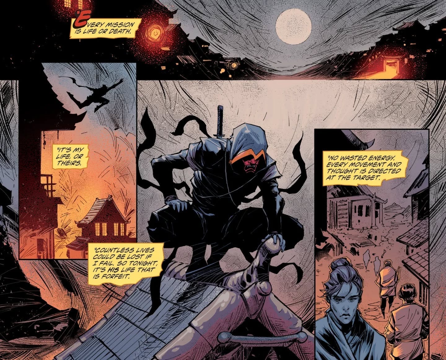
The first story, “Shinobi”, is set in Japan during the Edo period, and sees an assassin take out an evil daimyo in front of the man’s son, only to be accosted by a female shadow warrior with pink hair. The whole story is communicated via the assassin’s inner monologue, which Bray Dornback writes with all the depth and subtlety of your typical 15 year old. Artist Ryan Benjamin makes blatant use of photos-with-filters for a few of the backgrounds, but frankly on this script I don’t blame him; his figure drawing is fine, with some good poses in the action scenes. The colourist is credited only as “John”; it’s fine work, but he’s pretty much just thrown some blue and orange on everything and called it a day.
There’s slightly more ambition in the second story, “Uncivil War”, which takes as its premise that a freed slave is hired to assassinate the assassins who kill President Lincoln. Except, of course, that’s not what happened in real life! At the very end, the assassin is interrupted by someone from the future using the Animus device to communicate with the past, who describes Lincoln as “an appeaser [who] does not see blacks as his equal. His intentions are to send you all to an island of your own.” So, uh, all’s well that ends well. Compared to Dornback’s work, it’s night and day with Chuck Austen’s script, but still nothing to write home about. The artwork is a step up as well, with detailed and realistic linework from Patrick Olliffe coupled with some great range from Lee Loughridge, who delivers some moody nighttime scenes and does a particularly good job of rendering the Animus. Letterer Jérôme Gagnon does a fine job on both these first two stories, but makes some typesetting errors involving em dashes.
Serge LaPointe himself pens the last story, which clocks in at just five pages long and is clearly the work of a man who asked himself the question, “What if Neon Genesis Evangelion was Assassin’s Creed?” I’m pretty sure that’s straightup just a Gundam with the Assassin’s Creed logo on it. Even being as short as it is, this comic could stand to be much shorter, as it has only one story beat to speak of: the mech using a hidden blade to stab the kaiju. Y’know, like the hidden blade in Assassin’s Creed. Moy R. Marco’s mostly-black-and-white manga-inspired artwork is fit for purpose, but nothing special. This is a variant cover stretched to five pages to pad space.
Oni Press - Rick and Morty: Finals Week - BrawlHer #1 (one-shot)
Oni Press made a name for themselves with Scott Pilgrim, probably one of the best-selling indie comics ever.11 In 2019 they got bought out by Lion Forge Comics (which I’ve never heard of), who apparently gutted most of the staff and began trading on Oni Press’s better brand recognition. And that’s the wa-ay the news goes.
Anyway, they’ve been putting out Rick and Morty comics for a decade now. I have no idea how many of them have actually been written by staff writers from the show, but this one-shot isn’t. Finals Week is a series of five forty-page one-shots, each by a different writer, which are apparently “interconnected” but this one transparently reads like a half-baked standalone episode. In it, Summer and Beth must fight their way through a demonic army of “the manosphere” to rescue Morty, Rick and Jerry, who have been trapped in an orb by Mr. Needful from that one episode of the show.
This issue is one of the earliest published works from writer Christof Bogacs, and bluntly, I think they should’ve hired a woman to write it instead—although presumably he originated the idea for the issue, so it’s not like that option was on the table a priori. The theme of sexism is addressed entirely through superficial references: “Feel the fury of my NFTestosterone!” The overall narrative of the issue is very undercooked, a fact Bogacs is constantly self-deprecatingly alluding to through fourth-wall-breaking gags. Rick and Morty is definitely a meta show, but… it’s usually defter than this? Still, I don’t envy Bogacs’ position: I’ve always got the impression that Rick and Morty is one of the trickiest shows to write for, because the platonic ideal of the show is very clever and intricate, with a very idiosyncratic voice, always trying to develop its basic ideas one step further than you’re expecting. It’s why the quality of the show itself is so variable, and this comic doesn’t really reach the bar set by even the worst episodes.
I actually already know the work of illustrator Beck Kubrick, creator of Dead Girls, a couple of idiosyncratic self-published one-shot horror comics which were the only straightup-good small press issues I could find when I visited Gosh! Comics in London a couple of years ago. Most self-published comics aren’t very good! Sadly, I think Kubrick’s style really suffers for needing to stay on-model for the show’s characters. It’s kind of an awkward middle ground, and I would’ve liked to have seen Kubrick push the style a little harder, though I imagine there’s probably editorial mandates about this kind of thing. The backgrounds throughout the issue are also very limited, though I can’t imagine the script gave Kubrick much to work with. Meg Casey’s colours are nice, bringing some sorely-needed tone to the show’s Family Guy-like banality. The letters are credited to “Crank!”, and are basically fine, but it’s easy to tell which sound effects were drawn in by Kubrick and which were added later.
I get the impression that the Rick and Morty comics have originated ideas which were later incorporated into the show itself, so presumably there’s some good stuff buried in there… but without the involvement of the show’s own writers, I think you’d have to be pretty desperate to read this stuff.
Mad Cave Studios - Spectrum #1 (of 6)
We’ve seen comics try to incorporate music to varying degrees of success, but this one is outright advertised as a “music-comic”. It draws on the Y2K existentialism of The Matrix, as Melody, a homeless woman in the midst of the 1999 Seattle WTO protests, who begins experiencing strange visions of musicians throughout history as she’s threatened by a higher-dimensional being called Echo.
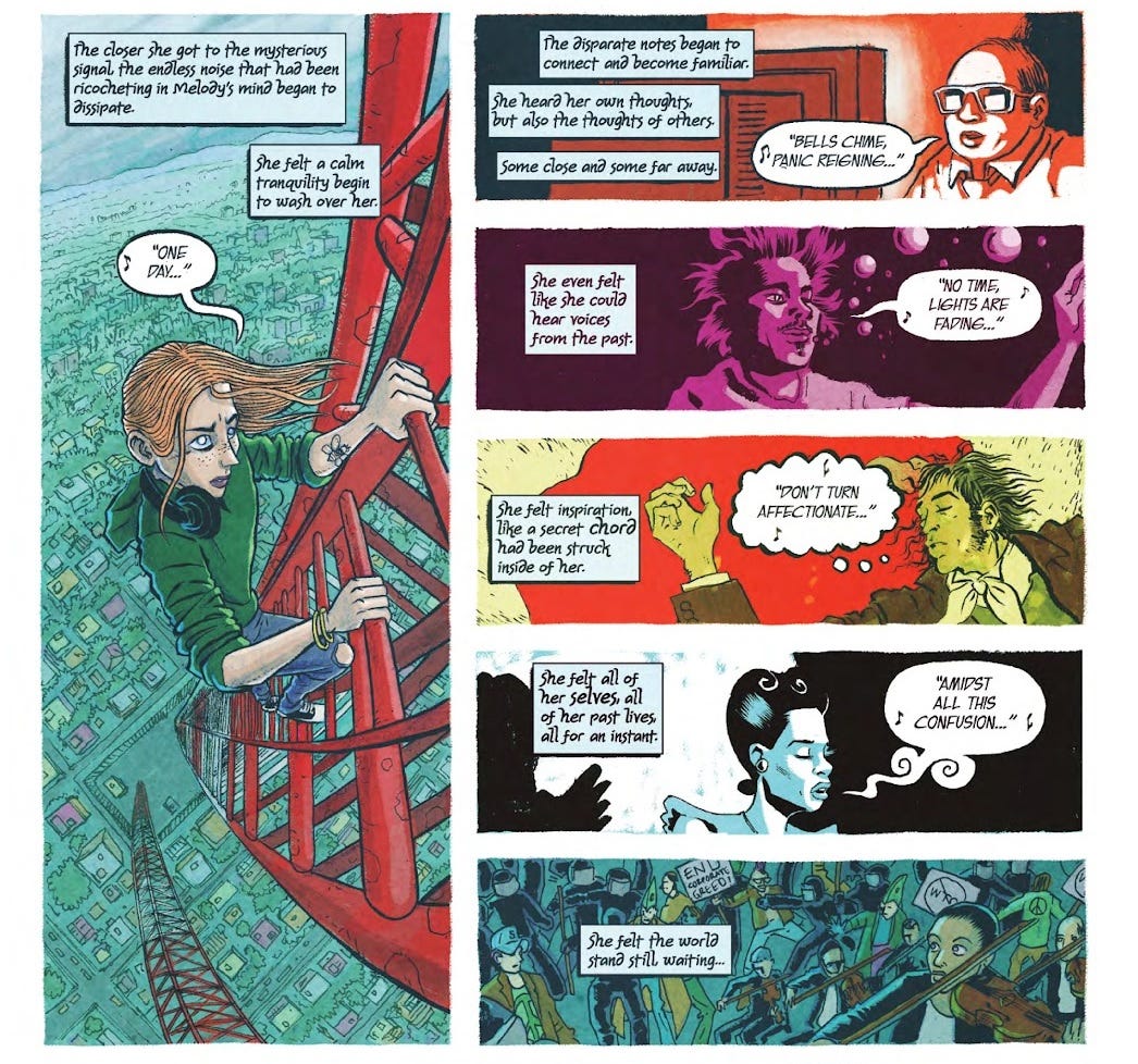
The present-day frame narrative has a few really evocative moments—”Her left wrist had a tattoo of a cicada [….] Melody didn’t know where it came from. She had never gotten a tattoo before.”—but it’s mostly in the vignettes where the comic’s prose really shines. In parallel to possibly-delusional memories from Melody’s early life, we’re bombarded with these biographical sequences of made-up (but remarkably lifelike) musicians experiencing success and dying young, tracing a thread of musical inspiration throughout the 1900s in Memphis. No other comic I’ve discussed has matched this level of detail and specificity. It’s clearly evoking feelings of mental illness, conspiratorial thought processes, and the effect is visceral—but just going off this one issue, it’s hard to tell how profound any of it actually is. The issue ends with Melody jumping from a pylon, which is blatant suicide imagery, only to sprout butterfly wings. Is this anything? The last page skips forward to 2018, introducing a new character. Is this who the remaining five issues will focus on? I have no idea.
Rick Quinn’s intricate script works in perfect concert with Dave Chisholm’s art and letters. Chisholm demonstrates impressive range during the many stylistic breaks. On a pure craft level, some of his poses and faces are kind of off, but that just heightens the trippy feel of the story. His colours and textures are immaculate, helpfully distinguishing the real elements of the story from the supernatural and carrying the overall tone perfectly.
Often, when I’ve found an issue that’s good without caveats, I’ve felt pretty confident in assuming that the series as a whole will live up to that standard. With this one… I’m genuinely could not remotely guess what the rest of this series is like. It might suck, but then again, it might be the best comic ever. Which I guess means it’s worth checking out!
UDON Entertainment - Darkstalkers: Jedah #1 (one-shot)
I’ll never knowingly buy a comic from UDON Entertainment so long as their director of publishing is Matt Moylan, a well-known idiot in the Transformers fandom who’s best known for getting very upset about comics being too woke. Conveniently—or perhaps relatedly—they publish nothing I’m interested in.
This is a tie-in to Capcom’s gothic-fairytale fighting game series, set in a shared universe with UDON’s Street Fighter comics and setting up a Team Darkstalkers series. I have no idea if any of the characters are from Street Fighter; Chun-Li gets mentioned at one point. I know of writer Tim Seeley’s work from a couple of vanishingly-obscure G.I. Joe vs. the Transformers crossover miniseries, but could not remotely have described it to you, so clearly it didn’t leave an impression on me; likewise, his writing here is perfectly generic, with a narrative that’s meaningless nonsense. Joy of joys, we’ve got Alberto Jiménez Alburquerque on art, so everyone’s got absolutely massive honkers. I guess Darkstalkers is just sort of like that by default? Espen Grundetjern’s colours are pretty toneless. We saw Marshall Dillon’s letters before on Blood Commandment, and all I have to say about it here is that his stacking could use some work.
Fit for the bin, this one.
Marvel Comics - Beware the Planet of the Apes #2 (of 4)
Bzzt! You done goofed up, comic shop employee! This is a Marvel book! You let yourself get bamboozled by the big “20th Century Studios” logo in the top-left, and completely missed the little “IN ASSOCIATION WITH MARVEL” logo in the bottom-right! You should’ve charged me £0.20, not £0.10, for the privilege of owning this issue! What is this, amateur hour? Reader, I would not have made this mistake, if they had hired me, let me tell you that much.
Marvel Comics was founded in 1939 as Timely Comics, which later became Atlas Comics, which— okay, okay, I’ll get on with it. Jeez. We’re so close to the end here! Aren’t you enjoying yourself? We should savour what little time we have left together.
This issue begins with a cold-open that honestly floored me on an artistic level, perfectly recapturing the style of 70s comics, down to the colouring and lettering. It looked exactly like one of Marvel’s digitally-recolourised reprints of their older comics… and that’s because it is reprinted, from Adventures on the Planet of the Apes, an adaptation of the first two films. So, uh, not that impressive a feat. These extracts are recontextualised in this issue as prophetic visions of a telepathic mutant human, Ivana. This comic is set before the first film, focusing on the ape characters Dr. Zira and Dr. Cornelius, along with the primitive human Nova, as they now run across the mutant survivors from the second film. All of this stuff is helpfully explained on a wonderful full-spread title page; I haven’t even seen any of these movies, and I was able to follow along with this issue just fine.
Marc Guggenheim’s script is fine, deftly communicating the tensions within the group of mutants. Artist Álvaro López draws in a style that’s realistic without being hugely detailed, which honestly feels like a good compromise for a film tie-in comic; I like the way he draws the characters’ facial deformities, maybe that’s a strange thing to say, I just felt like there was empathy there. On colours, Alex Guimarães doesn’t get much to do, as the comic is going for a muted look. I’m not keen on Joe Caramagna’s speech balloons, but to be fair, he doesn’t get a chance to show off with sound effects or anything. For some reason, there are two of the exact same ad for Jango Fett #1 in this issue—annoying and wasteful! I’ve appreciated how most of the publishers I’ve discussed (not you, Dynamite) don’t interrupt the story with advertisements.
As far as disposable little prequel stories go, this seems perfectly competent on the whole—though I can’t imagine why on Earth you’d read it in the first place, if you’re not doing 100 comics.
ABLAZE Publishing - The Prism #5 (of 7)
No idea who these guys are. This comic was apparently first published in Italian, but there’s no credited translator, so I presume creator Matteo De Longis is just bilingual. It mostly manages not to be stilted, but coming in at issue #5, it’s hard to tell if my difficulty following the story was down to my lack of context (most of the characters don’t get named in this issue) or if it’s just Like That.
From what I can piece together online, there’s this pollution spreading over Earth’s oceans that can only be counteracted by sound. For whatever reason—presumably to make it financially-viable—the plan to deal with it involves sending a band into space. The issue focuses on the tensions between these young artists and the studio execs funding the whole thing, as they arrive on the Moon. The whole thing is played dead seriously, which is fine by me.
Very little happens in this issue, but it’s an extremely pretty comic, so I’m tempted to forgive it. The artwork is the perfect combination of hyper-produced pop-stardom and sci-fi tech. Unremarked upon but not unnoticed is the effort that’s gone to designing near-future fashion that’s not spacesuits… casual wear, tattoos, hairstyles. It’s cool! Sadly, I don’t like Officine Bolzoni’s letters; the font choice is offputting, and the speech bubbles have far too much whitespace in them. Maybe it’s an attempt to imagine what comic book lettering might look like in the future. Either way, it doesn’t work.
DSTLRY - BlasFamous #1 (of 3)
From 2007-2022, comiXology was pretty much the only place to buy comics in digital form—in 2014, they were bought by Amazon, and eventually swallowed up into Amazon’s Kindle ecosystem. In the aftermath of this, DSTLRY was founded by the co-founder of comiXology and its head of content, with the intent of disrupting the digital comics marketplace. See, digital comics always cost pretty much the same as the physical floppies, which is one of those things that has always felt silly to me, particularly because the digital reading experience is just so much worse than being able to hold the artwork in your hands. Digital comics also aren’t something you really own in any meaningful sense, nor can you lend them to others or sell them on. The gimmick with DSTLRY is that digital copies are only made available for sale within the first week; after that, if you want one, you have to buy it from someone who bought a copy in that first week. Every time a sale gets made, the original creators get a small cut. This sort of replicates the collecting aspect of physical comics, in an attempt to increase the desirability of the digital goods through manufactured scarcity, and (naturally) allowing DSTLRY and their creatives to capture more of the profits.
So, like, sounds great for the creators! Kind of sounds like it would suck for the readers? These days, I pretty much hate digital goods in general. It’s all fake. The other big gimmick with DSTLRY is that in print, all the comics are published in an oversized magazine format, perfect bound with a double-length pagecount and high-quality paper stock; this first issue clocks in at $8.99—whoof—or £0.10 in 100 comics terms like everything else.
BlasFamous is one of DSTLRY’s first titles, written and illustrated by Mirka Andolfo. The basic premise is Christianity has had another big cultural schism, with the dominant faction leveraging celebrities to gain the worship and adoration of many more people. We follow the biggest celebrity, a singer named Clelia, and one of her fans, Dorothy, who ends up being hired as Clelia’s psychologist by her agent, Lev. The comic has an overtly satirical edge to it, with lots of serial-numbers-filed-off brands. To me, I found it most reminiscent of Japanese idol culture, but I think the intent is more to criticise Western pop culture and societal norms, depicting the internet, fame, and puritanism as forces that exacerbate mental illness. The comic isn’t pornographic, but it depicts sex and nudity: “Sexy sells. Sexy is good. Sexy, but not sex. Sex is so terribly immoral.” As that one article puts it, “Everyone Is Beautiful and No One Is Horny”. The big twist—well, I suppose it’s not much of a twist—is that actually the church is being run by demons, who’ve successfully wiped out all the angels and are now running the show from heaven.
Listen, I’m not going to act like this is mindblowing stuff or anything—but compared to the many other takes on an angels-vs-demons conflict I’ve discussed in these reviews, this one has much more going on. There’s strong characters and good dialogue, and the slow burn of the story creates a very unsettling effect. Andolfo’s artwork is sexy, but it’s also detailed and expressive, scary when it wants to be. The lighting is exquisite. Stylistically—perhaps in the colour identity as much as anything—the artwork calls to mind the sort of thing I’ve seen getting popular on Webtoon. Fabio Amelia’s letters are absolutely perfect; there’s a typographical gimmick where most of the VIPs’ speech bubbles have a little love-heart at the bottom, which really sells the sickly-sweet dialogue.
Overall, it feels to me like DSTLRY is filling a gap in the market; it doesn’t look like they’ve blown up with a huge number of titles, but hopefully that means that they’re focusing on the quality of what they put out, rather than that the demand just isn’t there.
Anyway… can you believe it? We’ve covered 99 out of 100 comics! This has been a monumental undertaking. We’ve had highs, we’ve had lows. We’ve mostly not laughed, and we haven’t cried at all. If you’ve made it this far, thank you so much for persevering with me. There’s just one issue left—here’s hoping we can go out with a bang!
Wait, what’s this?
Huh. Apparently whoever packed my box of 100 comics has accidentally given me two copies of BlasFamous #1. Yeah, I see—they don’t have the issue numbers printed on the front, so I guess the person just saw Cover A and Cover B, and assumed they were two different comics.
Well, this sucks! The whole point of this was that I’d have 100 things to review! After all that… there’s one review missing!
No, no… it’s okay, I can still salvage this. I’ve got it. We can still get to 100. The answer’s right in front of me.
wadapan - 100 COMICS (one-shot)
The basic premise of 100 COMICS is that I’ve bought a mystery box of 100 indie comics from my local comic shop, and I want to review all of them. It’s like “5 bars. 5 seconds.”, if instead of bars it was comics, and instead of 5 of them there was 100 of them, and if instead of seconds it was words, and instead of 5 of them there was 50,000 of them.
Going publisher by publisher, most of the reviews follow a similar formula: a basic plot summary, followed by my overall feelings on the writing, and finally a paragraph or two about the art, colouring, and lettering. This structure is fairly intuitive—if unoriginal—because it matches the order these credits are typically given in the comic book industry. Some of the reviews deviate from this structure to take a more bigger-picture approach, if I feel like I can use a particular comic as a talking point.
In terms of my prose, I write in a way that’s fairly… conversational, right? I rely heavily on “-ly” adverbs; there’s apparently over a thousand of them in the whole piece, probably half of which are arguably superfluous. There’s a fair density of jargon throughout, which creates interest, sure, but can be cumbersome, incongruous with the chatty tone. Oh and I’m always talking about “vibes”.
I tend to use lists of adjectives where one will do, throwing in extra words simply to create a rhythm: it’s redundant, excessive, and usually unnecessary. This indecision between different adjectives is a major contributing factor to word bloat, and I think it betrays a lack of confidence on my part. Overall, I think my prose is readable, but isn’t anything to write home about.
On close inspection, there’s a lot of defensive writing to be found in the individual reviews. Almost without fail, when I criticise a comic for being difficult to follow, I caveat the critique by reiterating that I’m jumping into a story halfway through. I often undercut my observations with appeals to subjectivity—”I think”, “in my opinion”, “personally”, “to me”—which, apart from being needless to begin with, are straightup dishonest, because I clearly think I am analysing these comics from an objective perspective. The worst example of defensive writing in 100 COMICS is, of course, the big metatextual finale, which aims to pre-emptively raise every possible criticism of 100 COMICS that any possible reader—creator, comics fan, or someone outside of comics entirely—might have to say about it. As I put it during the I Hate Fairyland review: “Knowing you’re a hack doesn’t make you less of a hack.”
How about as a work of critique, then? Does 100 COMICS even have much insight to offer about these stories? Is it fair?
As a reader, my whole schtick is that I’m a huge auteur theorist. It’s my big hammer that I go around swinging at every nail in sight. I often make big assumptions about the intentions of the creators I discuss: where they’re drawing from personal experience, what I think their politics may be, whether they have any particular fixations.
Despite ostensibly trying to limit my observations to the contents of my box of 100 comics—as if I’m an archaeologist trying to piece together what exactly a comic even is solely from this one hoard dating back to 2024—I’m constantly drawing on my background knowledge. Sometimes there are names that I recognise, and if it’s a creator that I like, then I’m positively glowing; conversely, if it’s someone who I dislike, then I go much harder on them than I might otherwise.
And, to put it bluntly, my writing is just more fun when I’m being mean. “Haha, what a wicked and ironic comment bro. now try saying something true and beautiful.” I can’t! I’m left stumbling over myself like I’ve run into the creator in question in the bathroom and am trying to get an autograph. I’m reduced to inane platitudes like “ooorgh it’s so gooood” or “yeah this is comics!!!!!” Why can’t I get a grip?
No, let’s face it: I love to hate. My default outlook skews negative. I’ll talk about something which is just “fine” in the sort of withering backhanded tones most people reserve for their least favourite colleagues. In cases where I’ve identified some sort of moral failing on the part of the creator, it’s like the weighted jacket comes off, and all pretence of even-handedness is dropped. Rip and tear. No blow is too low. I relish being able to mock people for their typos, even though I know I make typos all the time.
And what’s crazy is that… comparing different, individual reviews… there are cases where I’ve used the exact same observation to compliment one comic, and criticise another. A comic with a lot of plot threads might be confusing, crammed, and crawling along; or it might be densely-written, fast-paced, and well-rounded. The contradiction is really down to the fact that ultimately, it’s a superficial observation, right? What makes a comic good or bad—if that’s even a useful framework—is something more ineffable, and in 100 COMICS I don’t even come close to codifying it.
One thing that really frustrates me about 100 COMICS is my use of intertextuality. A seasoned reviewer of comics is able to draw on a rich canon of works to identify broad trends, shared influences, and even just to say “yeah, this other comic did it better”. But because my history with the medium is so limited, I instead keep turning to esoteric examples of other media as points of comparison—which are useless to anyone other than me! There’s this running joke in 100 COMICS where I unfailingly brings up creators’ connections to Transformers in cases where those connections exist, with perhaps the highlight being a beat where I pretend to recognise Tony Fleecs from “the first story in My Little Pony/Transformers: The Magic of Cybertron #3” as if this is any way notable. To me this is very funny, but like… it’s also not a joke? I am just like that?
My relative naïveté as a comics reader maybe means I can be an audience surrogate, for readers with only a passing interest in comics. For the most part, it levels the playing field between longstanding figures in the industry, and new talent. But I can only imagine how frustrating my takes must be for fans embedded in comic culture—how many of my talking points are old hat in the established discourse. I’m sure there are times where I’ve praised a comic as being really unique and imaginative, only for it actually to be derivative of older, better stories. I’m sure I’ve trashed comics that are actually very well-liked by their readerships, simply because I’m not the target audience and the appeal is lost on me.
In fact, because of my negative mindset, I think I often miss out on the comics’ better qualities in general. Instead, I take an error-centric approach, where it feels like I’m waiting for the creative team to “slip up” so that I have something to write about. I’m not saying that any of my nitpicks are wrong. It’s just that the act of nitpicking kind of drives a lot of pop culture, doesn’t it? It’s the preoccupation with continuity errors, with out-of-character behaviour, with on-model drawings. It’s the idea that what makes a good letterer is simply that you don’t even notice their speech bubbles. In other words, a good comic is seen and not heard.
There’s always been discourse in comics culture about which creative roles are most under-valued. We saw this play out on the page in Public Domain, as not!Stan Lee and not!Jack Kirby vied for ownership over their creation. And the thing is, it’s not academic, right? It matters because employers suck, the comics industry particularly sucks, and if we all decide that colouring probably isn’t that hard and anyone can do it and it doesn’t make a big difference anyway, then every colourist is replaceable and nobody is going to be able to pay their bills by colouring comics.
On a craft level, writing, drawing, colouring, and lettering are almost completely different skillsets. And, fundamentally, your typical comic cannot exist without all of these elements in place. A perfectly well-written comic can be turned into a complete laughingstock by amateur lettering. The most beautiful lines in the world can be ruined by colours that are garish, muddy, or badly-lit. I think 100 COMICS mostly tries to separate out these different aspects of production, and makes a point that really good colours or lettering can seriously elevate an otherwise lacklustre story.
But on a deeper level… yeah, I clearly do think the writing is most important, don’t I? And I kind of stand by this belief! Comics is, fundamentally, a narrative medium. When I’m able to really praise a comic’s visuals, it’s in how the creative choices help communicate the narrative—an angry red background for a fight, a wobbly font for a wail, a funny face for a joke. If I didn’t care about stories, then I may as well spend all my time looking at commissions on artists’ Instagrams. I think that, if we’re only interested in the very best comics, then you’ll find that a lot of them have just-okay colours, or just-okay letters, or even just-okay art… but very few of them will have a just-okay script. The most effective possible depiction of a boring story beat will still be boring.12
The thing is, having said all that… most comics have just-okay scripts. And for those comics, the art is at least as important. It’s the difference between a comic being fun to read, and not. In the worst cases, it’s the difference between a comic being legible, and not. Furthermore, from a labour perspective, illustration is much more time-consuming than writing. So what really lets 100 COMICS down—seeing as most of these stories do live or die on the strength of their art—is my inability to meaningfully appraise artwork on a technical level. Coming from a family of artists, I know slightly more than a layperson, but most of the subtleties of the craft are lost on me. I’m sure many of the things I say about the artwork are factually untrue.
100 COMICS is laborious, no doubt about it. It often feels like I’m going through the motions, and I think that there are many points where I actually have nothing to say about a given aspect of the visuals, and I kind of just need to say something for the sake of having said something. Too many sentences boil down to “[person you’ve never heard of] does good work here”—nobody needs my review to tell them that! They can glance at a preview page and make their own mind up! But no, the piece goes on and on. The individual reviews are not numbered (and indeed, often cover more than one issue at once), which combined with their wildly-varying length helps to obfuscate how many comics are left at any given moment. It’s interminable, which is a property it shares with mainstream comic publishing.
To the readers who never made it this far, 100 COMICS is all the comics that you just read issue #1 of, or the first trade paperback; it’s all the comics that you dropped a few issues in: a narrative that may as well be endless. To at least some of the readers who’ve reached this point, 100 COMICS is the ongoing you added to your pull list, and just sort of kept buying on autopilot, month after month, long after it stopped exciting you. Comics aren’t like movies, where you arrive for the trailers (unless you’re late) and don’t walk out unless the film is really bad. With comics, the default is to walk out. Collecting a series, month after month, trade after trade, is a commitment. And I feel like it’s rare for comics to reward that commitment? So many books don’t seem to end, they just… get cancelled, and the writer hits their “break glass in case of emergency” button to wrap things up. Three-page teaser for a sequel which will never get followed up on. Comics is an industry of beginnings, where concept is king. 21% of my 100 comics were issue #1s.
Huh. You know, I’d forgotten this until just now, but when I was a teenager, I got this notion to read every single Marvel comic from the 2010s. Because it’s all in this shared universe, isn’t it? It all relates—at least in theory. But how do you begin to put it all in order? I came across the CMRO (Complete Marvel Reading Order), but looking at it made me feel sick. It was too chronological. I had this idea, this… heuristic, to create a publication-based ordering that wasn’t just reading issue #1 from every series, then issue #2 from every series, and so on. Instead, I’d do it by trade paperback: break down Marvel’s entire output according to the collected editions—with most series being structured so each volume corresponds to an arc—then order those trade paperbacks by the publication-date of their earliest-published issues. If you know anything about comics, you know that this is the work of a sick mind.
And I remember, while I was looking this up—I had thousands of issues listed, copy-pasted from the Marvel website into a plain text document—I found a Reddit thread where a dumbass like me was asking, “Hey, can you just like, read every Marvel comic?” And there was this reply from someone who worked at a comic store, which to the best of my memory, was something like: “Well, people do try that, sometimes. Every now and then a guy will come in and grab one copy of every single book we have. Then, the next week, he comes back, and gets all of that week’s issues. Then I never see him again.” It’s strange to think that I ended up doing that, after all.
I never did finish that reading order; indeed, it would be impossible to. Sometimes I feel like I have spent more time thinking about comics, researching comics, sorting comics, looking for comics and buying comics than I’ve spent reading comics. As a time-sink, it has that over possibly any other medium apart from video games. Like achieving 100% in a video game, comics, too, promises mastery. In this post-postmodern age of information overload, where it is impossible to fully know and fully understand anything, comics says: “Hey, do you want to read every single issue this character has ever appeared in?”
And although 100 COMICS is, superficially, the opposite to what I’m describing—a completely random sample, of mostly-unrelated issues, fundamentally incomplete—it, too, betrays this longing for mastery. Like a breathless, meaningless video essay: “I went to EVERY Rainforest Cafe in the WHOLE country”. That’s the only way most of us will ever be exceptional. I don’t feel like I’m good for anything. I will never be the best in the world at anything. But I can go to the store and pick up every single Marvel comic book they have. I can write the best collection of reviews of this exact set of 100 random issues mostly from two months in 2024 ever written by all of humanity. Category of one.
One of the worst things I can think to say about any given writer or artist is just that they weren’t trying. That they’re lazy, that they’re just phoning it in, that they’re not passionate. And 100 COMICS screams, I’m not lazy. It is, if nothing else, visibly the product of many, many hours.
I think 100 COMICS has a concept that grabs you. It makes intuitive sense. But by its very nature, it cannot take a starting point and build towards an ending. It just chugs along and then it stops, or gets replaced with something else entirely.
Could structuring it differently have helped? Maybe it was a mistake to clump up multiple issues from the same series. Maybe I should have spaced them out, allowing us to check back in on them, creating a semblance of continuity and progression. That way, I could’ve had 100 reviews, too. Maybe I should’ve started with all the issue #1s, then all the issue #2s, and so on. It would’ve ended on… hmm, Spawn #351. Okay, maybe not. I could’ve gone alphabetically; it would have ended on Zawa + the Belly of the Beast. Oh, I don’t like that, either…!
No, wait— isn’t it obvious? I should have just left them in the box! I should’ve just taken them out, one-by-one, without looking. Reverse order to how they went into the box. That would’ve been the 100 COMICS way of doing it.
But no, I cheated. There’s a dissonance internal to 100 COMICS, where it can’t decide whether issue-by-issue reviews are a meaningful way of critiquing comics or not. The very premise of 100 COMICS suggests that it is possible to judge a book by a single issue. But in practise, a significant proportion of my reviews cover more than one issue at once. I had multiple sequential issues from nineteen of the series, accounting for 40% of the comics. And even that wasn’t enough for me, because in many of the reviews, I’ve self-admittedly googled the series to work out what the big-picture plot is supposed to be, what else the creators have worked on, and whatever else might stop me from looking too stupid. What does the Alice Cooper review look like in the timeline where I wrote it without knowing who Alice Cooper was?
Googling my own name, some of my earliest comic reviews were written for a Transformers forum. They had a hookup with IDW Publishing where we’d be sent early copies of certain issues. I wrote a glowing review of Transformers #1, and a glowing review of Transformers: Galaxies #1. And look, it’s not to say that those comics are actually bad or anything like that, but… I’ll admit it, I was brownnosing them. My actual feeling, which I kept to myself, was that neither of those comics were as good as the ones IDW had cancelled in favour of them. But see, I felt like I’d been let in on something. I liked getting the comics early, for free. I was still a teenager and it felt like suddenly my thoughts were being legitimised—the front-page news feed, on the third-biggest Transformers fansite, wowee!—and this was my way in, don’t you see? My compliments were very articulate, my thematic interpretation was astute, and I’d even convincingly faked an interest in lettering. I was such a good reader. I was the best pig at watching.
But nobody gets to be the best pig at watching for long. After those two issues, I never received any more review copies. Shortly after, I staged a coup with the rest of the forum’s Discord moderators to humiliate the site admins, precipitating a chain of events that would ultimately lead to the forums being hacked, wiping decades of Transformers fandom history off the face of the internet. This was completely unrelated but for the purposes of this piece I think it’s funny to pretend it was my revenge for getting cut off from the comics. Hey, if they weren’t going to put my reviews on the site, then what good was the site for, anyway?
No, in hindsight, I’m pretty sure IDW weren’t actually interested in reviews after those issue #1s. Why would they be? And even if they had sent the rest through, month after month, how long before I ran out of anything to say? Both series turned out to be nothing like I’d imagined in those reviews, and by way of apology for my breathless hyperbole, when IDW lost the Transformers license, I re-read the whole run in the space of a day and wrote a definitive 6000-word review, which might be the most anyone ever wrote about that comic. Didn’t pull any punches that time. And—stop the presses—that review was way better for actually being able to talk about the ending.
The truth is that the vast majority of comic series are being written as four, five, or six-issue miniseries, produced by a single creative team with the express intent that they’ll be collected in a trade paperback. Even most ongoing series are written “for the trade” these days. (This is to say nothing of the comics that are blatantly spec-scripts for movies, churned out for the benefit of studio execs who don’t know how to read something if it doesn’t have pictures in it.) Single-issue reviews necessarily need to rely on big assumptions about the ultimate direction of the series, speaking more in terms of the potential quality of the imagined rest-of-the-comic than in terms of the actual quality of what’s on the page. As a model of criticism, it just don’t make any sense at all.
But there’s the rub, isn’t it? Clearly, I do think it’s perfectly possible to judge a series from a single issue, actually. All it takes is a critical eye, good taste, and strong convictions—and I think everything about 100 COMICS screams that I believe I possess these qualities in spades. There’s this old saying, attributed to Stan Lee, that “every comic is someone’s first”, and 100 COMICS is determined to take that idea to its logical extreme. In it, I assume the role of that adversarial first-time reader, that clueless child with pocket-money to burn, that every comic writer has at the back of their mind: the worst-case scenario. On balance of probability, you are the same to me: reading these reviews like “okay, what’s the deal here?”, without any of the built-up goodwill that comes from long-time readership.
Perhaps the 100 comics are just a punching bag. In getting to play the connoisseur, I can demonstrate my mastery over the medium, without actually needing to participate in the medium. Perhaps it’s the same reason that I’m so fixated on Transformers, a franchise of commercials for children with a typically poor standard of storytelling: it lets me feel better, smarter, more creative, by comparison. My last piece of long-form writing, a standalone Transformers novella, was billed as “Transformers if it was good”, because without this point of comparison, it would be nothing special whatsoever.
What I find cringeworthy about 100 COMICS is the way it never quite says, but clearly believes, that I could do better. I’ve written comics before. I said so, plain as day, at the start of the piece: I made a Pokémon fancomic, and gave a copy to the guy at the comic store. As if that was my CV or something. What did I think was going to happen?
I moved to this city to get into the game industry, and after the studio turned me down, I went to work at the video game store—because if working in video games was impossible, then working around video games was the next best thing, right? And after I’d emphatically smothered my dreams of becoming a game designer, I looked at the comic shop, and felt like it was aesthetically a step closer to being a comics writer. That was what galled me about getting ghosted by them, getting strung along—the sense that I was completely beneath their notice. Like I wasn’t even good enough to put comics on the stands in the literal sense, let alone in the figurative sense.
I wanted that box like I wanted to get my own back. Like, you can see the logic, can’t you? 100 comics for £10, that’s practically robbery, except without actually being robbery. Like, I did give them money. But it felt like I’d come out on top. In my head, I guess I thought I’d sell them, eventually. At cover price, I’d only need to sell 3% of the 100 comics to be quids in. I could sell the comics for more than the comic store people had sold them to me. Which, y’know, when you think about it, is sort of like I’m actually better at their job than they are.
I wasn’t actually interested in reading any of them. I was interested in reading all of them—there was something in me, call it completionism, call it wanting, which meant that I knew I was going to read all of them, and write this. But individually, no, I would never have bought any of these comics. I hadn’t wanted to read any of them back in 2024, when they were lined up on the stands, covers on full display. Why would I want to read them now, interred in cardboard?
But over the space of about two weeks, with grim, methodical care, like a stack of pamphlets from the GP… I did read them.
And, you know what, I actually liked some of them. Let’s see, we had… If You Find This, I’m Already Dead; The Witcher: Corvo Bianco; Into the Unbeing; The Displaced; Ranger Academy; Orcs!; The Hunger and the Dusk; Midlife (or How to Hero at Fifty!); The Walking Dead; G.I. Joe; the DEViANT; The Holy Roller; Nights; Spectrum; and Blasfamous. That’s seventeen series, accounting for 23% of my 100 comics, where I actually wanted to read more. Plus a bunch where I was like, “look, not really my thing, but I think the target audience would like this just fine.”
For Christmas, I bought my Witcher-liking friend the trade paperback of that Witcher comic. I also bought a copy of The Holy Roller for my Remender-liking lil bro, but then I thought to double-check whether it was actually any good, and to my dismay discovered that the rest of the series was so bad that I ended up having to buy him something else instead. An explanation as to what precisely was wrong with it, I think, falls outside the purview of 100 COMICS. In fact, simply in giving my verdict on the whole series, I’ve already said too much. But I wanted to mention it, because perhaps the fact that I struck out on that one finally puts the kibosh on the idea that single-issue reviews are a fair mode of appraisal at all. For all I know, all the other titles I just listed are actually just as bad.
My point, though, is that 100 COMICS has in fact given me a window into the medium. I have a much stronger sense of creators and series that I was only peripherally aware of before. I feel like I better understand how script, art, colours and letters cohere into an effective narrative, or the ways in which they can fail to do so. Put simply, reading these comics made me want to read more, instead of less.
And a couple of weeks later, you know what I did? I opened the notes app on my phone, and started to thumb in some lines of dialogue. I cut and folded a piece of paper into a booklet, and I took a pencil, and I started to draw, wretched blobby little two-dimensional people and skew-whiff furniture. For the first time in what seemed like a year, I made a comic.
And a couple of months after that, I finally got another job. I’m working at a charity shop now. It doesn’t quite pay enough to pay my bills, but I’m working on that. Most of what my job involves is rifling through the huge bags of donations people dump at our door. Hundreds of items. And for each of these things, I have to look at it, and decide—is this any good? Would anybody want this? Is it okay?
It’s nice to think that these things, un-needed, unwanted, unbought, unopened, unworn, unread, can be given a second chance. Even if most of it, realistically, belongs in the bin… you’d be surprised, I think, by how good some of the things are that people don’t want.
People donate comics to us, sometimes. I read them, and if they’re any good, I stick a little post-it note on the front with a review. Someone always buys them.
Wait I just realised I could have just reviewed that one Void Rivals issue I stuck in the box right at the start of all this! That could’ve been my 100th comic! Man I didn’t need to say any of that stuff just now!
Thank you for reading 100 COMICS. This has been an immense labour of… well, “love” doesn’t quite cover it. It’s been a labour of love-and-hate.
If you worked on any of the 100 comics, and I didn’t like your work: don’t pay me any mind, I probably got the wrong impression, what with only having a single issue to go off. If I did like your work: probably I was spot-on, and moreover you can extrapolate my same review to every other issue you’ve ever worked on.
Like I say, this year I’m under-employed, trying to make ends meet. If you’d like to support me in any way, you can subscribe here or on Patreon. Even if you aren’t able to donate right now, there are still lots of ways for you to help me out, though! I sincerely appreciate any interest you take in what I do.

Once Upon A Time At The End Of The World - suicide
High on Life - domestic abuse, sexual harassment
The Hunger and the Dusk - sexual assault
Alice Cooper - transphobia, sexual assault
Tenement - AI-generated imagery
Quest - genital mutilation
I Hate Fairyland - misogyny
BlasFamous - suicide
Spectrum - suicide
In the interests of full transparency, I did in fact end up breaking the golden rule of 100 comics—which is that I’m only allowed to look at 100 comics—to try and work out who exactly lettered this issue, and I’m only pretending not to know. The thing is, it really winds me up when people aren’t credited properly. Down here in the metatextual safety of this footnote, we can get to the bottom of this! So, Wynd #1 (as in, issue #1 of the original Wynd series) does actually have a credited letterer: Aditya Bidikar, the same as on that previous Tynion IV book, Christopher Chaos. I’ve done some careful forensic analysis on this issue (I looked at it with my eyes) and have determined that the lettering style in Wynd: The Power of the Blood #1 is an exact match to Wynd #1. This means that it’s probably still Bidikar, and he’s the one piloting the AndWorld Design skinsuit this time around. God only knows why he’s no longer credited by name. Anyway, “that’s a hell of a mystery no one thought was a mystery and didnt even really need solving”, etc, etc.
Again, cards on the table, I’m pretending not to know this but I googled some of Dialynas’ clean pages and they all have sound effects on them like this. Case closed. Great work Michael!
Other reviews for this one indicated that there was a crazy twist in issue #5, and I’m sorry to admit that this sufficiently piqued my interest that I ended up breaking the 100 comics rule again to take a peek at that issue. Unfortunately I can’t tell if I was just missing something or if the twist is not that interesting. It was all a dream! Except maybe it wasn’t? I get the impression that Kyle Starks really wants to be doing an Anthology of the Killer-style overarching theme about how “history is a nightmare—and loving it!!” or whatever, but can’t really pull it off. Frankly, breaking the 100 comics rule was not worth it this time. My shame, my shame…
My girlfriend who I looove~
The relative line lengths of dialogue in a speech bubble. The idea is that, because your speech bubble is elliptical, you shouldn’t sandwich a shorter line of dialogue between two longer ones. This can be tricky if there’s long words at the start or end of a sentence.
I was going to say “mammonarrative dissonance”, which is technically more correct, but when I was running this bit past Lizzie, she literally cut me off and blurted “BOOBonarrative dissonance”. I’m listening and I’m learning.
I tried to work out where this conception of vampires originates, but had no luck—Google turns up lots of results for The Vampire Diaries. I first encountered it in the excellent Alexander Wales short story, Contratto. If you’re a vampire expert and know the answer, hit me up!
As in, drawn like real people. Not drawn like Amy Adams.
Broke the 100 comics rule to see whether this was a one-off thing for this issue, or if it’s standard for this series. Apparently the title page always comes last! Cool.
Apart from being popular, Scott Pilgrim is also straightup excellent. I know it’s a rare and special thing for me to admit that mainstream audiences are right about something so let’s not make a big fuss about it and just enjoy the moment, hmm?
I want to clarify that, historically, a lot of this discourse is driven by the “Marvel method”, where the writer only produces a basic story outline, leaving the artist to work it all out beat-to-beat on the page, before going back over it to write in the speech bubbles. I think that’s a fundamentally different situation to most, if not all of the comics discussed in these reviews. To my eye, an artist working under the Marvel method is a writer.
I often feel a similar impulse to the one behind this project - to take a pile of random junk and inject meaning into it somehow. For me that’s a pile of someone’s old MTG cards, or my obsession with Blaseball while that was a thing. It’s almost like treating them as toys; the same as a kid grabbing whatever action figures they have lying around to turn into some sort of narrative. Then you can see how that extends to a lot of the franchises behind these toys; the people who grew playing with their Transformers like that are the ones who get excited to grab a bunch of obscure characters from the 90s nobody’s ever heard of and make them the center of the story.
Congrats on the new job.
This takes me back to my late high school days, buying random 25c back issues out of the bin. So many terrible zombie comics in 2005. Some good Lapham books, though. I think the average comic is better now than it was then, although certainly worse than it was a few years ago.
Are you familiar with the comics criticism site shelfdust.com?